Archive for 2021

JavaScript performance beyond bundle size

There’s an old story about a drunk trying to find his keys in the streetlight. Why? Well, because that’s where it’s the brightest. It’s a funny story, but also relatable, because as humans we all tend to take the path of least resistance.

I think we have the same problem in the web performance community. There’s a huge focus recently on JavaScript bundle size: how big are your dependencies? Could you use a smaller one? Could you lazy-load it? But I believe we focus on bundle size first and foremost because it’s easy to measure.

That’s not to say that bundle size isn’t important! Just like how you might have left your keys in the streetlight. And heck, you might as well check there first, since it’s the quickest place to look. But here are some other things that are harder to measure, but can be just as important:

  • Parse/compile time
  • Execution time
  • Power usage
  • Memory usage
  • Disk usage

A JavaScript dependency can affect all of these metrics. But they’re less discussed than bundle size, and I suspect it’s because they’re less straightforward to measure. In this post, I want to talk about how I approach bundle size, and how I approach the other metrics too.

Bundle size

When talking about the size of JavaScript code, you have to be precise. Some folks will say “my library is 10 kilobytes.” Is that minified? Gzipped? Tree-shaken? Did you use the highest Gzip setting (9)? What about Brotli compression?

This may sound like hair-splitting, but the distinction actually matters, especially between compressed and uncompressed size. The compressed size affects how fast it is to send bytes over the wire, whereas the uncompressed size affects how long it takes the browser to parse, compile, and execute the JavaScript. (These tend to correlate with code size, although it’s not a perfect predictor.)

The most important thing, though, is to be consistent. You don’t want to measure Library A using unminified, uncompressed size versus Library B using minified and compressed size (unless there’s a real difference in how you’re serving them).

Bundlephobia

For me, Bundlephobia is the Swiss Army knife of bundle size analysis. You can look up any dependency from npm and it will tell you both the minified size (what the browser parses and executes) as well as the minified and compressed size (what the browser downloads).

For instance, we can use this tool to see that react-dom weighs 121.1kB minified, but preact weighs 10.2kB. So we can confirm that Preact really is the honest goods – a React-compatible framework at a fraction of the size!

In this case, I don’t get hung up on exactly which minifier or exactly what Gzip compression level Bundlephobia is using, because at least it’s using the same system everywhere. So I know I’m comparing apples to apples.

Now that said, there are some caveats with Bundlephobia:

  1. It doesn’t tell you the tree-shaken cost. If you’re only importing one part of a module, the other parts may be tree-shaken out.
  2. It won’t tell you about subdirectory dependencies. So for instance, I know how expensive it is to import 'preact', but import 'preact/compat' could be literally anything – compat.js could be a huge file, and I’d have no way to know.
  3. If there are polyfills involved (e.g. your bundler injecting a polyfill for Node’s Buffer API, or for the JavaScript Object.assign() API), you won’t necessarily see it here.

In all the above cases, you really just have to run your bundler and check the output. Every bundler is different, and depending on the configuration or other factors, you might end up with a huge bundle or a tiny one. So next, let’s move on to the bundler-specific tools.

Webpack Bundle Analyzer

I love Webpack Bundle Analyzer. It offers a nice visualization of every chunk in your Webpack output, as well as which modules are inside of those chunks.

Screenshot of Webpack Bundle Analyer showing a list of modules and sizes on the left and a visual tree map of modules and sizes on the right, where the module is larger if it has a greater size, and modules-within-modules are also shown proportionally

In terms of the sizes it shows, the two most useful ones are “parsed” (the default) and “Gzipped”. “Parsed” essentially means “minified,” so these two measurements are roughly comparable with what Bundlephobia would tell us. But the difference here is that we’re actually running our bundler, so we know that the sizes are accurate for our particular application.

Rollup Plugin Analyzer

For Rollup, I would really love to have a graphical interface like Webpack Bundle Analyzer. But the next best thing I’ve found is Rollup Plugin Analyer, which will output your module sizes to the console while building.

Unfortunately, this tool doesn’t give us the minified or Gzipped size – just the size as seen by Rollup before such optimizations occur. It’s not perfect, but it’s great in a pinch.

Other bundle size tools

Other tools I’ve dabbled with and found useful:

I’m sure you can find other tools to add to this list!

Beyond the bundle

As I mentioned, though, I don’t think JavaScript bundle size is everything. It’s great as a first approximation, because it’s (comparatively) easy to measure, but there are plenty of other metrics that can impact page performance.

Runtime CPU cost

The first and most important one is the runtime cost. This can be broken into a few buckets:

  • Parsing
  • Compilation
  • Execution

These three phases are basically the end-to-end cost of calling require("some-dependency") or import "some-dependency". They may correlate with bundle size, but it’s not a one-to-one mapping.

For a trivial example, here is a (tiny!) JavaScript snippet that consumes a ton of CPU:

const start = Date.now()
while (Date.now() - start < 5000) {}

This snippet would get a great score on Bundlephobia, but unfortunately it will block the main thread for 5 seconds. This is a somewhat absurd example, but in the real world, you can find small libraries that nonetheless hammer the main thread. Traversing through all elements in the DOM, iterating through a large array in LocalStorage, calculating digits of pi… unless you’ve hand-inspected all your dependencies, it’s hard to know what they’re doing in there.

Parsing and compilation are both really hard to measure. It’s easy to fool yourself, because browsers have lots of optimizations around bytecode caching. For instance, browsers might not run the parse/compile step on second page load, or third page load (!), or when the JavaScript is cached in a Service Worker. So you might think a module is cheap to parse/compile, when really the browser has just cached it in advance.

Screenshot from Chrome DevTools showing main thread with Compilation followed by execution of some JavaScript anonymous call stacks
Compilation and execution in Chrome DevTools. Note that Chrome does some parsing and compilation off-main-thread.

The only way to be 100% safe is to completely clear the browser cache and measure first page load. I don’t like to mess around, so typically I will do this in a private/guest browsing window, or in a completely separate browser. You’ll also want to make sure that any browser extensions are disabled (private mode typically does this), since those extensions can impact page load time. You don’t want to get halfway into analyzing a Chrome trace and realize that you’re measuring your password manager!

Another thing I usually do is set Chrome’s CPU throttling to 4x or 6x. I think of 4x as “similar enough to a mobile device,” and 6x as “a super-duper slowed-down machine that makes the traces much easier to read, because everything is bigger.” Use whichever one you want; either will be more representative of real users than your (probably) high-end developer machine.

If I’m concerned about network speed, this is the point where I would turn on network throttling as well. “Fast 3G” is usually a good one that hits the sweet spot between “more like the real world” and “not so slow that I start yelling at my computer.”

So putting it all together, my steps for getting an accurate trace are typically:

  1. Open a private/guest browsing window.
  2. Navigate to about:blank if necessary (you don’t want to measure the unload event for your browser home page).
  3. Open the DevTools in Chrome.
  4. Go to the Performance tab.
  5. In the settings, turn on CPU throttling and/or network throttling.
  6. Click the Record button.
  7. Type the URL and press Enter.
  8. Stop recording when the page has loaded.

Screenshot of Chrome DevTools showing a page on about:blank, the CPU Throttling set to 6x, Network Throttling set to Fast 3G, and in a guest browsing window with no extensions

Now you have a performance trace (also known as a “timeline” or “profile”), which will show you the parse/compile/execution times for the JavaScript code in your initial page load. Unfortunately this part can end up being pretty manual, but there are some tricks to make it easier.

Most importantly, use the User Timing API (aka performance marks and measures) to mark parts of your web application with names that are meaningful to you. Focus on parts that you worry will be expensive, such as the initial render of your root application, a blocking XHR call, or bootstrapping your state object.

You can strip out performance.mark/performance.measure calls in production if you’re worried about the (small) overhead of these APIs. I like to turn it on or off based on query string parameters, so that I can easily turn on user timings in production if I want to analyze the production build. Terser’s pure_funcs option can also be used to remove performance.mark and performance.measure calls when you minify. (Heck, you can remove console.logs here too. It’s very handy.)

Another useful tool is mark-loader, which is a Webpack plugin that automatically wraps your modules in mark/measure calls so that you can see each dependency’s runtime cost. Why try to puzzle over a JavaScript call stack, when the tool can tell you exactly which dependencies are consuming exactly how much time?

Screenshot of Chrome DevTools showing User Timing section with bars marked for Three, Moment, and React. The JavaScript callstacks underneath mostly say "anonymous"
Loading Three.js, Moment, and React in production mode. Without the User Timings, would you be able to figure out where the time is being spent?

One thing to be aware of when measuring runtime performance is that the costs can vary between minified and unminified code. Unused functions may be stripped out, code will be smaller and more optimized, and libraries may define process.env.NODE_ENV === 'development' blocks that don’t run in production mode.

My general strategy for dealing with this situation is to treat the minified, production build as the source of truth, and to use marks and measures to make it comprehensible. As mentioned, though, performance.mark and performance.measure have their own small overhead, so you may want to toggle them with query string parameters.

Power usage

You don’t have to be an environmentalist to think that minimizing power use is important. We live in a world where people are increasingly browsing the web on devices that aren’t plugged into a power outlet, and the last thing they want is to run out of juice because of a misbehaving website.

I tend to think of power usage as a subset of CPU usage. There are some exceptions to this, like waking up the radio for a network connection, but most of the time, if a website is consuming excessive power, it’s because it’s consuming excessive CPU on the main thread.

So everything I’ve said above about improving JavaScript parse/compile/execute time will also reduce power consumption. But for long-lived web applications especially, the most insidious form of power drain comes after first page load. This might manifest as a user suddenly noticing that their laptop fan is whirring or their phone is growing hot, even though they’re just looking at an (apparently) idle webpage.

Once again, the tool of choice in these situations is the Chrome DevTools Performance tab, using essentially the same steps described above. What you’ll want to look for, though, is repeated CPU usage, usually due to timers or animations. For instance, a poorly-coded custom scrollbar, an IntersectionObserver polyfill, or an animated loading spinner may decide that they need to run code in every requestAnimationFrame or in a setInterval loop.
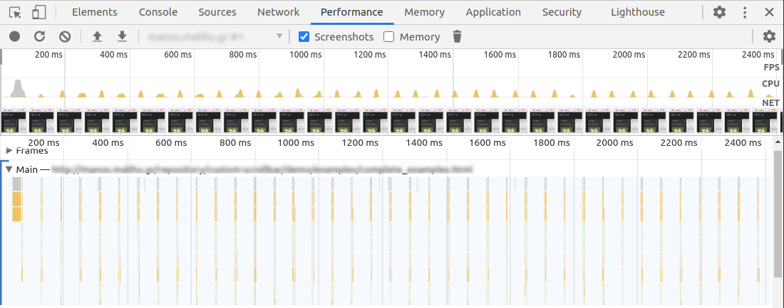
Screenshot of Chrome DevTools showing little peaks of yellow JavaScript usage periodically in the timeline
A poorly-behaved JavaScript widget. Notice the little peaks of JavaScript usage, showing constant CPU usage even while the page is idle.

Note that this kind of power drain can also occur due to unoptimized CSS animations – no JavaScript required! (In that case, it would be purple peaks rather than yellow peaks in the Chrome UI.) For long-running CSS animations, be sure to always prefer GPU-accelerated CSS properties.

Another tool you can use is Chrome’s Performance Monitor tab, which is actually different from the Performance tab. I see this as a sort of heartbeat monitor of how your website is doing perf-wise, without the hassle of manually starting and stopping a trace. If you see constant CPU usage here on an otherwise inert webpage, then you probably have a power usage problem.

Screenshot of Chrome Performance Monitor showing steady 8.4% cpu usage on a chart, along with a chart of memory usage in a sawtooth pattern, going up and down
The same poorly-behaved JavaScript widget in Performance Monitor. Note the constant low hum of CPU usage, as well as the sawtooth pattern in the memory usage, indicating memory constantly being allocated and de-allocated.

Also: hat tip to the WebKit folks, who added an explicit Energy Impact panel to the Safari Web Inspector. Another good tool to check out!

Memory usage

Memory usage is something that used to be much harder to analyze, but the tooling has improved a lot recently.

I already wrote a post about memory leaks last year, but it’s important to remember that memory usage and memory leaks are two separate problems. A website can have high memory usage without explicitly leaking memory. Whereas another website could start small, but eventually balloon to a huge size due to runaway leaks.

You can read the above blog post for how to analyze memory leaks. But in terms of memory usage, we have a new browser API that helps quite a bit with measuring it: performance.measureUserAgentSpecificMemory (formerly performance.measureMemory, which sadly was much less of a mouthful). There are several advantages of this API:

  1. It returns a promise that automatically resolves after garbage collection. (No more need for weird hacks to force GC!)
  2. It measures more than just JavaScript VM size – it also includes DOM memory as well as memory in web workers and iframes.
  3. In the case of cross-origin iframes, which are process-isolated due to Site Isolation, it will break down the attribution. So you can know exactly how memory-hungry your ads and embeds are!

Here is a sample output from the API:

{
  "breakdown": [
    {
      "attribution": ["https://pinafore.social/"],
      "bytes": 755360,
      "types": ["Window", "JS"]
    },
    {
      "attribution": [],
      "bytes": 804322,
      "types": ["Window", "JS", "Shared"]
    }
  ],
  "bytes": 1559682
}

In this case, bytes is the banner metric you’ll want to use for “how much memory am I using?” The breakdown is optional, and the spec explicitly notes that browsers can decide not to include it.

That said, it can still be finicky to use this API. First off, it’s only available in Chrome 89+. (In slightly older releases, you can set the “enable experimental web platform features” flag and use the old performance.measureMemory API.) More problematic, though, is that due to the potential for abuse, this API has been limited to cross-origin isolated contexts. This effectively means that you have to set some special headers, and if you rely on any cross-origin resources (external CSS, JavaScript, images, etc.), they’ll need to set some special headers too.

If that sounds like too much trouble, though, and if you only plan to use this API for automated testing, then you can run Chrome with the --disable-web-security flag. (At your own risk, of course!) Note, though, that measuring memory currently doesn’t work in headless mode.

Of course, this API also doesn’t give you a great level of granularity. You won’t be able to figure out, for instance, that React takes up X number of bytes, and Lodash takes up Y bytes, etc. A/B testing may be the only effective way to figure that kind of thing out. But this is still much better than the older tooling we had for measuring memory (which is so flawed that it’s really not even worth describing).

Disk usage

Limiting disk usage is most important in web application scenarios, where it’s possible to reach browser quota limits depending on the amount of available storage on the device. Excessive storage usage can come in many forms, such as stuffing too many large images into the ServiceWorker cache, but JavaScript can add up too.

You might think that the disk usage of a JavaScript module is a direct correlate of its bundle size (i.e. the cost of caching it), but there are some cases were this isn’t true. For instance, with my own emoji-picker-element, I make heavy use of IndexedDB to store the emoji data. This means I have to be cognizant of database-related disk usage, such as storing unnecessary data or creating excessive indexes.
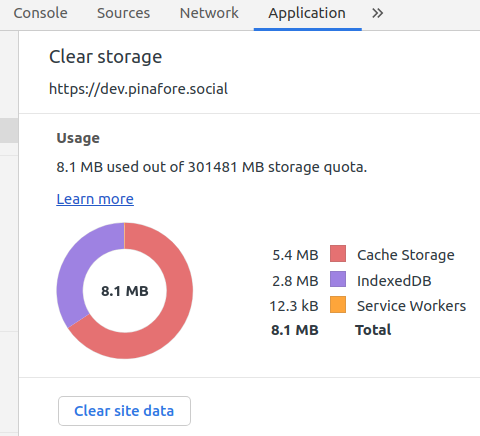
Screenshot of Chrome DevTools Application tab under "Clear Storage" which a pie chart showing megabytes taken up in Cache Storage as well as IndexedDB, and a button saying "Clear Storage"

The Chrome DevTools has an “Application” tab which shows the total storage usage for a website. This is pretty good as a first approximation, but I’ve found that this screen can be a little bit inconsistent, and also the data has to be gathered manually. Plus, I’m interested in more than just Chrome, since IndexedDB has vastly different implementations across browsers, so the storage size could vary wildly.

The solution I landed on is a small script that launches Playwright, which is a Puppeteer-like tool that has the advantage of being able to launch more browsers than just Chrome. Another neat feature is that it can launch browsers with a fresh storage area, so you can launch a browser, write storage to /tmp, and then measure the IndexedDB usage for each browser.

To give you an example, here is what I get for the current version of emoji-picker-element:

Browser IndexedDB directory size
Chromium 2.13 MB
Firefox 1.37 MB
WebKit 2.17 MB

Of course, you would have to adapt this script if you wanted to measure the storage size of the ServiceWorker cache, LocalStorage, etc.

Another option, which might work better in a production environment, would be the StorageManager.estimate() API. However, this is designed more for figuring out if you’re approaching quota limits rather than performance analysis, so I’m not sure how accurate it would be as a disk usage metric. As MDN notes: “The returned values are not exact; between compression, deduplication, and obfuscation for security reasons, they will be imprecise.”

Conclusion

Performance is a multi-faceted thing. It would be great if we could reduce it down to a single metric such as bundle size, but if you really want to cover all the bases, there are a lot of different angles to consider.

Sometimes this can feel overwhelming, which is why I think initiatives like the Core Web Vitals, or a general focus on bundle size, aren’t such a bad thing. If you tell people they need to optimize a dozen different metrics, they may just decide not to optimize any of them.

That said, for JavaScript dependencies in particular, I would love if it were easier to see all of these metrics at a glance. Imagine if Bundlephobia had a “Nutrition Facts”-type view, with bundle size as the headline metric (sort of like calories!), and all the other metrics listed below. It wouldn’t have to be precise: the numbers might depend on the browser, the size of the DOM, how the API is used, etc. But you could imagine some basic stats around initial CPU execution time, memory usage, and disk usage that wouldn’t be impossible to measure in an automated way.

If such a thing existed, it would be a lot easier to make informed decisions about which JavaScript dependencies to use, whether to lazy-load them, etc. But in the meantime, there are lots of different ways of gathering this data, and I hope this blog post has at least encouraged you to look a little bit beyond the streetlight.

Thanks to Thomas Steiner and Jake Archibald for feedback on a draft of this blog post.

Managing focus in the shadow DOM

Update: I wrote a more recent follow-up to this post.

One of the trickiest things about the shadow DOM is that it subverts web developers’ expectations about how the DOM works. In the normal rules of the game, document.querySelectorAll('*') grabs all the elements in the DOM. With the shadow DOM, though, it doesn’t work that way: shadow elements are encapsulated.

Other classic DOM APIs, such as element.children and element.parentElement, are similarly unable to traverse shadow boundaries. Instead, you have to use more esoteric APIs like element.shadowRoot and getRootNode(), which didn’t exist before shadow DOM came onto the scene.

In practice, this means that a lot of JavaScript libraries designed for the pre-shadow DOM era might not work well if you’re using web components. This comes up more often than you might think.

The problem

For example, sometimes you want to iterate through all the tabbable elements on a page. Maybe you’re doing this because you want to build a focus trap for a modal dialog, or because you’re implementing arrow key navigation for KaiOS devices.

Now, without doing anything, elements inside of the shadow DOM are already focusable or tabbable just like any other element on the page. For instance, with my own emoji-picker-element, you can tab through its <input>, <button>s, etc.:

When implementing a focus trap or arrow key navigation, we want to preserve this existing behavior. So the first challenge is to emulate whatever the browser normally does when you press Tab or Shift+Tab. In this case, shadow DOM makes things a bit more complicated because you can’t just use a straightforward querySelectorAll() (or other pre-shadow DOM iteration techniques) to find all the tabbable elements.

Pedantic note: an element can be focusable but not tabbable. For instance, when using tabindex="-1", an element can be focused when clicking, but not when tabbing through the page.

While researching this, I found that a lot of off-the-shelf JavaScript libraries for focus management don’t handle the shadow DOM properly. For example, focusable provides a query selector string that you’re intended to use like so:

import focusable from 'focusable'

document.querySelectorAll(focusable)

Unfortunately, this can’t reach inside the shadow DOM, so it won’t work for something like emoji-picker-element. Bummer.

To be fair to focusable, though, many other libraries in the same category (focus traps, “get all tabbable elements,” accessible dialogs, etc.) have the same problem. So in this post, I’d like to explain what these libraries would need to do to support shadow DOM.

The solution

I’ve written a couple of JavaScript packages that deal with shadow DOM: kagekiri, which implements querySelectorAll() in a way that can traverse shadow boundaries, and arrow-key-navigation, which makes the left and right keys change focus.

To understand how these libraries work, let’s first understand the problem we’re trying to solve. In a non-shadow DOM context, what does this do?

document.querySelectorAll('*')

If you answered “grab all the elements in the DOM,” you’re absolutely right. But more importantly: what order are the elements returned in? It turns out that they’re returned in a depth-first tree traversal order, which is crucial because this is the same order as when the user presses Tab or Shift+Tab to change focus. (Let’s ignore positive tabindex values for the moment, which are an anti-pattern anyway.)

In the case of shadow DOM, we want to maintain this depth-first order, while also piercing into the shadow DOM for any shadow roots we encounter. Essentially, we want to pretend that the shadow DOM doesn’t exist.

There are a few ways you can do this. In kagekiri, I implemented a depth-first search myself, whereas in arrow-key-navigation, I used a TreeWalker, which is a somewhat obscure API that traverses elements in depth-first order. Either way, the main insight is that you need a way to enumerate a node’s “shadow children” as well as its actual children (which can be mixed together in the case of slotted elements). You also need to be able to run the reverse logic: finding the “light” parent of a shadow tree. And of course, this has to be recursive, since shadow roots can be nested within other shadow roots.

Rather than bore you with the details, suffice it to say that you need roughly a dozen lines of code, both for enumerating an element’s children and finding an element’s parent. In the non-shadow DOM world, these would be equivalent to a simple element.children and element.parentElement respectively.

Why the browser should handle this

Here’s the thing: I don’t particularly want to explain every line of code required for this exercise. I just want to impress upon you that this is a lot of heavy lifting for something that should probably be exposed as a web API. It feels silly that the browser knows perfectly well which element it would focus if I typed Tab or Shift+Tab, but as a web developer I have to reverse-engineer this behavior.

You might say that I’m missing the whole point of shadow DOM: after all, encapsulation is one of its major selling points. But I’d counter that a lot of folks are using shadow DOM because it’s the only way to get native CSS encapsulation (similar to “scoped” CSS in frameworks like Vue and Svelte), not necessarily DOM API encapsulation. So the fact that it breaks querySelectorAll() is a downside rather than an upside.

Here’s a sketch of my dream API:

element.getNextTabbableElement()
element.getPreviousTabbableElement()

Perhaps, like getRootNode(), these APIs could also offer an option for whether or not you want to pierce the shadow boundary. In any case, an API like this would obviate the need for the hacks described in this post.

I’d argue that browsers should provide such an API not only because of shadow DOM, but also because of built-in elements like <video> and <audio>. These behave like closed-shadow roots, in that they contain tabbable elements (i.e. the pause/play/track controls), but you can’t reach inside to manipulate them.

Screenshot of GNOME Web (WebKit) browser on an MDN video element demo page showing the dev tools open with a closed use agent shadow content for the controls of the video
WebKit’s developer tools helpfully shows the video controls as “shadow content (user agent).” You can look, but you can’t touch!

As far as I know, there’s no way to implement a WAI-ARIA compliant modal dialog with a standard <video controls> or <audio controls> inside. Instead, you would have to build your own audio/video player from scratch.

Brief aside: dialog element

There is the native <dialog> element now implemented in Chrome, and it does come with a built-in focus trap if you use showModal(). And this focus trap actually handles shadow DOM correctly, including closed shadow roots like <video controls>!

Unfortunately, though, it doesn’t quite follow the WAI-ARIA guidelines. The problems are that 1) closing the dialog doesn’t return focus to the previously focused element in the document, and 2) the focus trap doesn’t “cycle” through tabbable elements in the modal – instead, focus escapes to the browser chrome itself.

The first issue is irksome but not impossible to solve: you just have to listen for dialog open/close events and keep track of document.activeElement. It’s even possible to patch the correct behavior onto the native <dialog> element. (Shadow DOM, of course, makes this more complicated because activeElement can be nested inside shadow roots. I.e., you have to keep drilling into document.activeElement.shadowRoot.activeElement, etc.).

As for the second issue, it might not be considered a dealbreaker – at least the focus is trapped, even if it’s not completely compliant with WAI-ARIA. But it’s still disappointing that we can’t just use the <dialog> element as-is and get a fully accessible modal dialog, per the standard definition of “accessible.”

Update: After publishing this post, Chris Coyier clued me in to the inert attribute. Although it’s not shipped in any browser yet, I did write a demo of building a modal dialog with this API. After testing in Chrome and Firefox with the right flags enabled, though, it looks like the behavior is similar to <dialog> – focus is correctly trapped, but escapes to the browser chrome itself.

Second update: After an informal poll of users of assistive technologies, the consensus seems to be that having focus escape to the browser chrome is not ideal, but not a show-stopper as long as you can Shift+Tab to get back into the dialog. So it looks like when inert or <dialog> are more widely available in browsers, that will be the only way to deal with <video controls> and <audio controls> in a focus trap.

Last update (I promise!): Native <dialog> also seems to be the only way to have the Esc key dismiss the modal while focus is inside the <video>/<audio> controls.

Conclusion

Handling focus inside of the shadow DOM is not easy. Managing focus in the DOM has never been particularly easy (see the source code for any accessible dialog component for an example), and shadow DOM just makes things that much trickier by complicating a basic routine like DOM traversal.

Normally, DOM traversal is the kind of straightforward exercise you’d expect to see in a web dev job interview. But once you throw shadow DOM into the mix, I’d expect most working web developers to be unable to come up with the correct algorithm off the tops of their heads. (I know I can’t, and I’ve written it twice.)

As I’ve said in a previous post, though, I think it’s still early days for web components and shadow DOM. Blog posts like this are my attempt to sketch out the current set of problems and working solutions, and to try to point toward better solutions. Hopefully the ecosystem and browser APIs will eventually adapt to support shadow DOM and focus management more broadly.

More discussion about native <dialog> and Tab behavior can be found in this issue.

Thanks to Thomas Steiner and Sam Thorogood for feedback on a draft of this post.

Options for styling web components

When I released emoji-picker-element last year, it was my first time writing a general-purpose web component that could be dropped in to any project or framework. It was also my first time really kicking the tires on shadow DOM.

In the end, I think it was a natural fit. Web components are a great choice when you want something to be portable and self-contained, and an emoji picker fits the bill: you drop it onto a page, maybe with a button to launch it, and when the user clicks an emoji, you insert it into a text box somewhere.

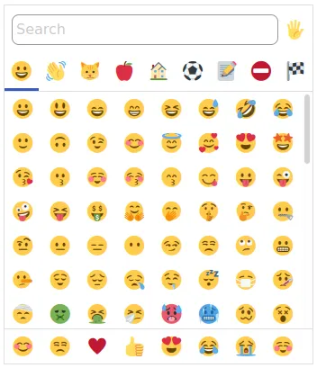
Screenshot of an emoji picker with a search box, a row of emoji categories, and a grid of emoji

What wasn’t obvious to me, though, was how to allow users to style it. What if they wanted a different background color? What if they wanted the emoji to be bigger? What if they wanted a different font for the input field?

This led me to researching all the different ways that a standalone web component can expose a styling API. In this post, I’ll go over each strategy, as well as its strengths and weaknesses from my perspective.

Shadow DOM basics

(Feel free to skip this section if you already know how shadow DOM works.)

The main benefit of shadow DOM, especially for a standalone web component, is that all of your styling is encapsulated. Like JavaScript frameworks that automatically do scoped styles (such as Vue or Svelte), any styles in your web component won’t bleed out into the page, and vice versa. So you’re free to pop in your favorite resets, like so:

* {
  box-sizing: border-box;
}

button {
  cursor: pointer;
}

Another impact of shadow DOM is that DOM APIs cannot “pierce” the shadow tree. So for instance, document.querySelectorAll('button') won’t list any buttons inside of the emoji picker.

Brief interlude: open vs closed shadow DOM

There are two types of shadow DOM: open and closed. I decided to go with open, and all of the examples below assume an open shadow DOM.

In short, closed shadow DOM does not seem to be heavily used, and the drawbacks seem to outweight the benefits. Basically, “open” mode allows some limited JavaScript API access via element.shadowRoot (for instance, element.shadowRoot.querySelectorAll('button') will find the buttons), whereas “closed” mode blocks off all JavaScript access (element.shadowRoot is null). This may sound like a security win, but really there are plenty of workarounds even for closed mode.

So closed mode leaves you with an API surface that is harder to test, doesn’t give users an escape hatch (see below), and doesn’t offer any security benefits. Also, the framework I chose to use, Svelte, uses open mode by default and doesn’t have an option to change it. So it didn’t seem worth the hassle.

Styling strategies

With that brief tangent out of the way, let’s get back to styling. You may have noticed in the above discussion that shadow DOM seems pretty isolated – no styles go in, no styles get out. But there are actually some well-defined ways that styles can be tweaked, and these give you the opportunity to offer an ergonomic styling API to your users. Here are the main options:

  1. CSS variables (aka custom properties)
  2. Classes
  3. Shadow parts
  4. The “escape hatch” (aka inject whatever CSS you want)

One thing to note is that these strategies aren’t “either/or.” You can happily mix all of them in the same web component! It just depends on what makes the most sense for your project.

Option 1: CSS variables (aka custom properties)

For emoji-picker-element, I chose this option as my main approach, as it had the best browser support at the time and actually worked surprisingly well for a number of use cases.

The basic idea is that CSS variables can actually pierce the shadow DOM. No, really! You can have a variable defined at the :root, and then use that variable inside any shadow DOM you like. CSS variables at the :root are effectively global across the entire document (sort of like window in JavaScript).

Here is a CodePen to demonstrate:

Early on, I started to think of some useful CSS variables for my emoji picker:

  • --background to style the background color
  • --emoji-padding to style the padding around each emoji
  • --num-columns to choose the number of columns in the grid

These actually work! In fact, these are some of the variables I actually exposed in emoji-picker-element. Even --num-columns works, thanks to the magic of CSS grid.

However, it would be pretty awful if you had multiple web components on your page, and each of them had generic-sounding variables like --background that you were supposed to define at the :root. What if they conflicted?

Conflicting CSS variables

One strategy for dealing with conflicts is to prefix the variables. This is how Lightning Web Components, the framework we build at Salesforce, does it: everything is prefixed by --lwc-.

I think this makes sense for a design system, where multiple components on a page may want to reference the same variable. But for a standalone component like the emoji picker, I opted for a different strategy, which I picked up from Ionic Framework.

Take a look at Ionic’s button component and modal component. Both of them can be styled with the generic CSS property --background. But what if you want a different background for each? Not a problem!

Here is a simplified example of how Ionic is doing it. Below, I have a foo-component and a bar-component. They each have a different background color, but both are styled with the --background variable:

From the user’s perspective, the CSS is quite intuitive:

foo-component {
  --background: hotpink;
}

bar-component {
  --background: lightsalmon;
}

And if these variables are defined anywhere else, for instance at the :root, then they don’t affect the components at all!

:root {
  --background: black; /* does nothing */
}

Instead, the components revert back to the default background colors they each defined (in this case, lightgreen and lightblue).

How is this possible? Well, the trick is to declare the default value for the variable using the :host() pseudo-class from within the shadow DOM. For instance:

/* inside the shadow DOM */
:host {
  --background: lightblue; /* default value */
}

And then outside the shadow DOM, this can be overridden by targeting the foo-component, because it trumps :host in terms of CSS specificity:

/* outside the shadow DOM */
foo-component {
  --background: hotpink; /* overridden value */
}

It’s a bit hard to wrap your head around, but for anyone using your component, it’s very straightforward! It’s also unlikely to run into any conflicts, since you’d have to be targeting the custom element itself, not any of its ancestors or the :root.

Of course, this may not be enough reassurance for you. Users can still shoot themselves in the foot by doing something like this:

* {
  --background: black; /* this will override the default */
}

So if you’re worried, you can prefix the CSS variables as described above. I personally feel that the risk is pretty low, but it remains to be seen how the web component ecosystem will shake out.

When you don’t need CSS variables

As it turns out, CSS variables aren’t the only case where styles can leak into the shadow DOM: inheritable properties like font-family and color will also seep in.

For something like fonts, you can use this to your advantage by… doing nothing. Yup, just leave your spans and inputs unstyled, and they will match whatever font the surrounding page is using. For my own case, this was just one less thing I had to worry about.

If inheritable properties are a problem for you, though, you can always reset them.

Option 2: classes

Building on the previous section, we get to the next strategy for styling web components: classes. This is another one I used in emoji-picker-element: if you want to toggle dark mode or light mode, it’s as simple as adding a CSS class:

<emoji-picker class="dark"></emoji-picker>
<emoji-picker class="light"></emoji-picker>

(It will also default to the right one based on prefers-color-scheme, but I figured people might want to customize the default behavior.)

Once again, the trick here is to use the :host pseudo-class. In this case, we can pass another selector into the :host() pseudo-class itself:

:host(.dark) {
  background: black;
}
:host(.light) {
  background: white;
}

And here is a CodePen showing it in action:

Of course, you can also mix this approach with CSS variables: for instance, defining --background within the :host(.dark) block. Since you can put arbitrary CSS selectors inside of :host(), you can also use attributes instead of classes, or whatever other approach you’d like.

One potential downside of classes is that they can also run into conflicts – for instance, if the user has dark and light classes already defined elsewhere in their CSS. So you may want to avoid this technique, or use prefixes, if you’re concerned by the risk.

Option 3: shadow parts

CSS shadow parts are a newer spec, so the browser support is not as widespread as CSS variables (still pretty good, though, and improving daily).

The idea of shadow parts is that, as a web component author, you can define “parts” of your component that users can style. CSS Tricks has a good breakdown, but the basic gist is this:

/* outside the shadow DOM */
custom-component::part(foo) {
  background: lightgray;
}
<!-- inside the shadow DOM -->
<span part="foo">
  My background will be lightgray!
</span>

And here is a demo:

I think this strategy is fine, but I actually didn’t end up using it for emoji-picker-element (not yet, anyway). Here is my thought process.

Downsides of shadow parts

First off, it’s hard to decide which “parts” of a web component should be styleable. In the case of the emoji picker, should it be the emoji themselves? What about the skin tone picker, which also contains emoji? What are the right boundaries and names here? (This is not an unsolvable problem, but naming things is hard!)

To be fair, this same criticism could also be applied to CSS variables: naming variables is still hard! But as it turns out, I already use CSS variables to organize my code internally; it just jives with my own mental model. So exposing them publicly didn’t involve a lot of extra naming for me.

Second, by offering a ::part API, I actually lock myself in to certain design decisions, which isn’t necessarily the case with CSS variables. For instance, consider the --emoji-padding variable I use to control the padding around an emoji. The equivalent way of doing this with shadow parts might be:

emoji-picker::part(emoji) {
  padding: 2em;
}

But now, if I ever decide to define the padding some other way (e.g. through width or implicit positioning), or if I decide I actually want a wrapper div to handle the padding, I could potentially break anyone who is styling with the ::part API. Whereas with CSS variables, I can always redefine what --emoji-padding means using my own internal logic.

In fact, this is exactly what I do in emoji-picker-element! The --emoji-padding is not a padding at all, but rather part of a calc() statement that sets the width. I did this for performance reasons – it turned out to be faster (in Chrome anyway) to have fixed cell sizes in a CSS grid. But the user doesn’t have to know this; they can just use --emoji-padding without caring how I implemented it.

Finally, shadow parts expand the API surface in ways that make me a bit uncomfortable. For instance, the user could do something like:

emoji-picker::part(emoji) {
  margin: 1em;
  animation: 1s infinite some-animation;
  display: flex;
  position: relative;
}

With CSS shadow parts, there are just a lot of unexpected ways I could break somebody’s code by changing one of these properties. Whereas with CSS variables, I can explicitly define what I want users to style (such as the padding) and what I don’t (such as display). Of course, I could use semantic versioning to try to communicate breaking changes, but at this point any CSS change on any ::part is potentially breaking.

In (mild) defense of shadow parts

That said, I can definitely see where shadow parts have their place. If you look at my colleague Greg Whitworth’s Open UI definition of a <select> element, it has well-defined parts for everything that makes up a <select>: the button, the listbox, the options, etc. In fact, one of the main goals of the project is to standardize these parts across frameworks and specs. For this kind of situation, shadow parts are a natural fit.

Shadow parts also increase the expressiveness of the user’s CSS: the same thing that makes me squeamish about breaking changes is also what allows users to go hog-wild with styling any ::part however they choose. Personally, I like to restrict the API surface of the code that I ship, but there is an inherent tradeoff here between customizability and breakability, so I don’t believe there is one right answer.

Also, although I organized my own internal styling with CSS variables, it’s actually possible to do this with shadow parts as well. Inside the shadow DOM, you can use :host::part(foo), and it works as expected. This can make your shadow parts less brittle, since they’re not just a public API but also used internally. Here is an example:

Once again: these strategies aren’t “either/or.” If you’d like to use a mix of variables, parts, and classes, then by all means, go ahead! You should use whatever feels most natural for the project you’re working on.

Option 4: the escape hatch

The final strategy I’ll mention is what I’ll call “the escape hatch.” This is basically a way for users to bolt whatever CSS they want onto your custom element, regardless of any other styling techniques you’re using. It looks like this:

const style = document.createElement('style')
style.innerHTML = 'h1 { font-family: "Comic Sans"; }'
element.shadowRoot.appendChild(style)

Because of the way open shadow DOM works, users aren’t prevented from appending <style> tags to the shadowRoot. So using this technique, they always have an “escape hatch” in case the styling API you expose doesn’t meet their needs.

This strategy is probably not the one you want to lean on as your primary styling interface, but it is kind of nice that it always exists. This means that users are never frustrated that they can’t style something – there’s always a workaround.

Of course, this technique is also fragile. If anything changes in your component’s DOM structure or CSS classes, then the user’s code may break. But since it’s obvious to the user that they’re using a loophole, I think this is acceptable. Appending your own <style> tag is clearly a “you broke it, you bought it” kind of situation.

Conclusion

There are lots of ways to expose a styling API on your web component. As the specs mature, we’ll probably have even more possibilities with constructable stylesheets or themes (the latter is apparently defunct, but who knows, maybe it will inspire another spec?). Like a lot of things on the web, there is more than one way to do it.

Web components have a bit of a bad rap, and I think the criticisms are mostly justified. But I also think it’s early days for this technology, and we’re still figuring out where web components work well and where they need to improve. No doubt the web components of 2021 will be even better than those of 2020, due to improved browser specs as well as the community’s understanding of how best to use this tool.

Thanks to Thomas Steiner for feedback on a draft of this blog post.
2020 book review

Like most people, 2020 was a weird year for me. I found myself retreating into the cloistered comfort of my living room, playing a lot more videogames and doing less reading.

Maybe I just needed the escapism, or maybe reading itself felt more stressful when all the headlines were so dire. Either way, my Switch reports that I spent hundreds of hours on immersive games like Zelda: Breath of the Wild, Stardew Valley, and Octopath Traveler.

Those are all great games! But since I’ve made a tradition of it, here is a (somewhat shorter) list of the books I read and enjoyed in 2020.

Quick links

Fiction

Nonfiction

Fiction

The Masters of Solitude by Marvin Kaye and Parke Godwin (1978)

I’ve mentioned it before, but post-apocalyptic fiction is one of my favorite genres. (I’m a natural pessimist, I guess!) This book is a bit of a hidden gem – it’s out of print, and if you check the reviews on Goodreads, you’ll see lots of comments saying that it’s a great book that almost nobody’s ever heard of. It’s also my top pick for 2020.

The book takes place hundreds of years in the future, focusing on a religious conflict between now-dominant Wiccans and minority Christians in present-day America. There are lots of fun, subtle references to places on the east coast: “Shando” I assume is Shenandoah, “Charzen” is maybe Charleston, “Mrika” is America (but not the whole continent, more of a “Holy Roman Empire” kind of thing). The book also keeps you at arm’s length by not revealing too many of its secrets early on.

The mythology and world-building are pretty rich here, and I found myself sucked in even without (yet) checking out the second book in the series. For a moment, you can even forget that it’s supposed to take place in the future, as there are elements of magic and fantasy mixed in with the sci-fi. Overall it’s strongly recommended if you’re a sci-fi/fantasy fan.

Parable of the Sower and Parable of the Talents by Octavia Butler (1993, 1998)

Apparently a lot of people read the Earthseed books back in high school or earlier, but these ones weren’t on my radar until this year. The first book in particular I deeply enjoyed: its vision of the future is disturbing, but frankly it’s one of the more believable sci-fi books I’ve read. It’s less about whiz-bang excursions to Alpha Centauri and more about the daily struggle of life on Earth in a warming climate.

It’s also impressive that this series was written back in the 90s, at a time when climate change wasn’t being taken as seriously as today. Nowadays it feels downright prescient – especially when you get to the so-unbelievable-I-had-to-check-the-publish-date depiction of a populist demagogue being elected on a familiar slogan. Overall I found the first book stronger than the second, but both are worth reading.

The Southern Reach Trilogy (Annihilation, Authority, Acceptance) by Jeff VanderMeer (2014)

An interesting and somewhat maddening set of sci-fi books. Unfortunately I feel that, like a lot of mysteries, the first book writes checks that the later ones can’t quite cash. You’ll probably get the most enjoyment out of it if you read the first book and ignore the rest entirely.

Just let all the mysteries from the first book sit in your mind as a delicious enigma. The second and third books don’t do a great job of clearing things up anyway.

Nonfiction

Working in Public: The Making and Maintenance of Open Source Software by Nadia Eghbal (2020)

I’m a bit biased toward this book, since I’m actually quoted in it a couple of times, but I absolutely loved this book. More than just a recapitulation of what I already know after working on open-source software for years, this book actually illuminated some things about modern open-source culture, and even some of my own motivations for writing OSS, that hadn’t really been clear to me before.

In particular, the way she draws a parallel between OSS developers and social media “content creators” was especially eye-opening for me. When you stop treating GitHub issues and pull requests as “contributions,” and start thinking of them more like comments on a YouTube video, the social dynamics start to make a lot more sense. Probably one of the best books on software I’ve ever read, up there with Don’t Make Me Think and The Design of Everyday Things in my personal pantheon.

It Doesn’t Have to Be Crazy at Work by Jason Fried and David Heinemeier Hansson (2018)

This book confirmed a lot of what I already believed, but it’s still nice to see it put to paper in a succinct way. Basecamp seems like a genuinely nice place to work, and a good example for other companies to follow.

If anything, it seems to me that software should be the opposite of an industry where people are encouraged to work 12-hour days, answer emails at all hours, and work on the weekend. The whole point of the job is to automate things so that the systems mostly run themselves. If you get into a purely reactive mode, then it can be a kind of death-spiral where you’re constantly inserting humans into the critical paths of the overall system, which makes everything more fragile and doesn’t play to the strengths of computing in general.

Twilight of Democracy: The Seductive Lure of Authoritarianism by Anne Applebaum (2020)

Over the past few years, I’ve been kind of obsessed with the question of why we’re experiencing a worldwide shift towards illiberalism. I think previous entries in my year-end book reviews do a better job of answering that question, but Applebaum’s book is a more intimate, insider’s story of what it feels like to see this shift play out even among one’s closest friends.

I get the feeling that, among conservatives in particular, the Cold War created an odd set of alliances and bedfellows (free-marketers, foreign-policy hawks, evangelicals), that’s starting to break down. This book is worth reading if you’re interested in those kinds of larger ideological shifts.

The New Class War: Saving Democracy from the Managerial Elite by Michael Lind (2017)

I picked up this book because it was recommended alongside Ezra Klein’s similar Why We’re Polarized. I didn’t actually finish Klein’s book (probably because I picked up enough bits and pieces from his excellent podcast), but I did read this, and I find it to be maybe a more complete picture of why politics feels so fractured nowadays.

The basic argument of the book is that policy decisions in western democracies are increasingly being made by a technocratic elite, and that a backlash is underway from the broader populace that doesn’t feel represented in the new system. In the broad strokes of history, that may be a pretty familiar picture, but the book tells an interesting story of how we got there. A good pairing would be Listen, Liberal by Thomas Frank, about how the Democratic party gradually lost its working-class base.