In my previous blog post, I introduced emoji-picker-element, a custom element that acts as an emoji picker. In the post, I said that accessibility “shouldn’t be an afterthought,” and made it clear that I took accessibility seriously.
But I didn’t explain how I actually made the component accessible! In this post I’ll try to make up for that oversight.
Reduce motion
If you have motion-based animations in your web app, one of the easiest things you can do to improve accessibility is to disable them with the prefers-reduced-motion CSS media query. (Note that this applies to transform animations but not opacity animations, as it’s my understanding that opacity changes don’t cause nausea for those with vestibular disorders.)
There were two animations in emoji-picker-element that I had to consider: 1) a small “indicator” under the currently-selected tab button, which moves as you click tab buttons, and 2) the skin tone dropdown, which slides down when you click it.
For the tab indicator, the fix was fairly simple:
.indicator {
  will-change: opacity, transform;
  transition: opacity 0.1s linear, transform 0.25s ease-in-out;
}

@media (prefers-reduced-motion: reduce) {
  .indicator {
    will-change: opacity;
    transition: opacity 0.1s linear;
  }
}
Note that there is also an opacity transition on this element (which plays when search results appear or disappear), so there is a bit of unfortunate repetition here. But the core idea is to remove the transform animation.
For the skin tone dropdown, the fix was a bit more complicated. The reason is that I have a JavaScript transitionend event listener on the element:
element.addEventListener('transitionend', listener);
If I were to remove the transform animation completely, then this listener would never fire. So I borrowed a technique from the cssremedy project, which looks like this:
@media (prefers-reduced-motion: reduce) {
  .skintone-list {
    transition-duration: 0.001s;
  }
}
Based on my testing in Safari, Firefox, and Chrome, this effectively removes the animation while ensuring that transitionend still fires. (There are other tricks mentioned in that thread, but I found that this solution was sufficient for my use case.)
With these fixes in place, the potentially-nauseating animations are removed for those who prefer things that way. The easiest way to test this is in the Chrome DevTools “Rendering” tab, under “Emulate CSS media feature prefers-reduced-motion”:

Here it is with motion reduced:
As you can see, the elements no longer move around. Instead, they instantly pop in or out of place.
Screen reader and keyboard accessibility
When testing screen reader accessibility, I use four main tools:
- NVDA in Firefox on Windows (with SpeechViewer enabled so I can see the text)
- VoiceOver in Safari on macOS
- Chrome’s Accessibility panel in DevTools (Firefox also has nice accessibility tools! I use them occasionally for a second opinion.)
- The axe extension (also available in Lighthouse)
I like testing in actual screen readers, because they sometimes have bugs or differing behavior (just like browsers!). Testing in both NVDA and VoiceOver gives me more confidence that I didn’t mess anything up.
In the following sections, I’ll go over the basic semantic patterns I used in emoji-picker-element, and how those work for screen reader or keyboard users.
Tab buttons and tab panel
For the main emoji picker UI, I decided to use the tab panel pattern with manual activation. This means that each emoji category (“Smileys and emoticons,” “People and body”) is a tab button (role=tab), and the list of emoji underneath is a tab panel (role=tabpanel).
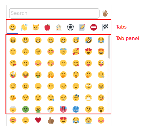
The only thing I had to do to make this pattern work was to add ← and → keydown listeners to move focus left and right between tabs. (Technically I should also add Home and End – I have that as a todo!)
Aside from that, clearly each tab button should be a <button> (so that Enter and Spacebar fire correctly), and it should have an aria-label for assistive text. I also went ahead and added titles that echo the content of aria-label, but I’m considering replacing those since they aren’t accessible to keyboard users. (I.e. title appears when you hover with a mouse, but not when you focus with the keyboard. Plus it sometimes adds extra spoken text in NVDA, which is less than ideal.)
Skin tone dropdown
The skin tone dropdown is modeled on the collapsible dropdown listbox pattern. In other words, it’s basically a fancy <select> element.

The button that triggers the dropdown is just a regular <button>, whereas the listbox has role=listbox and its child <button>s have role=option. To implement this, I just used the DevTools to analyze the W3C demo linked above, then tested in both NVDA and VoiceOver to ensure that my implementation had the same behavior as the W3C example.
One pro tip: since the listbox disappears on the blur event, which would happen when you click inside the DevTools itself, you can use the DevTools to remove the blur event and make it easier to inspect the listbox in its “expanded” state.

Removing this blur listener may make debugging a bit easier.
Search input and search results
For the search input, I decided to do something a bit clever (which may or may not burn me later!).
By default, the emoji in the tabpanel are simple <button>s aligned in a CSS Grid. They’re given role=menuitem and placed inside of a role=menu container, modeled after the menu pattern.
However, when you start typing in the search input, the tabpanel emoji are instantly replaced with the search results emoji:
Visually, this is pretty straightforward, and it aligns with the behavior of most other emoji pickers. I also found it to be good for performance, because I can have one single Svelte #each expression, and let Svelte handle the list updates (as opposed to clearing and re-creating the entire list whenever something changes).
If I had done nothing else, this would have been okay for accessibility. The user can type some text, and then change focus to the search results to see what the results are. But that sounded kind of awkward, so I wanted to do one better.
So instead, I implemented the combobox with listbox popup pattern. When you start typing into the input (which is <input type=search> with role=combobox), the menu with menuitems immediately transforms into a listbox with options instead. Then, using aria-activedescendant and aria-controls, I link the listbox with the combobox, allowing the user to press ↑ or ↓ down to cycle through the search results. (I also used an aria-describedby to explain this behavior.)
In the above video, you can see NVDA reading out the expanded/collapsed state of the combobox, as well as the currently-selected emoji as I cycle through the list by pressing ↑ and ↓. (My thanks to Assistiv Labs for providing a free account for OSS testing! This saved me a trip to go boot up my Windows machine.)
So here’s the upshot: from the perspective of a screen reader user, the search input works exactly like a standard combobox with a dropdown! They don’t have to know that the menu/menuitem elements are being replaced at all, or that they’re aligned in a grid.
Now, this isn’t a perfect pattern: for a sighted user, they might find it more intuitive to press ← and → to move horizontally through the grid of emoji (and ↑ and ↓ to move vertically). However, I found it would be tricky to properly handle the ← /→ keys, as the search input itself allows you to move the cursor left and right when it has focus. Whereas the ↑ and ↓ are unambiguous in this situation, so they’re safe to use.
Plus, this is really a progressive enhancement – mouse or touch users don’t have to know that these keyboard shortcuts exist. So I’m happy with this pattern for now.
Testing
To test this project, I decided to use Jest with testing-library. One of my favorite things about testing-library is that it forces you to put accessibility front-and-center. By design, it makes it difficult to use simple CSS selectors, and encourages you to query by ARIA roles instead.
This made it a bit harder to debug, since I had to inspect the implicit accessibility tree of my component rather than the explicit DOM structure. But it helped keep me honest, and ensure that I was adding the proper ARIA roles during development.
If I had one criticism of this approach, I would say that I find it inherently harder to test using Jest and JSDom rather than a real browser. Rather than having access to the browser DevTools, I had to set debugger statements and use node --inspect-brk to walk through the code in the Chrome Node inspector.
It also wasn’t always clear when one of my ARIA role queries wasn’t working properly. Perhaps when the Accessibility Object Model gains wider adoption, it will become as easy to test the accessibility tree as it is to test CSS selectors.
Conclusion
To get accessibility right, it helps to consider it from the get-go. Like performance, it can be easy to paint yourself into a corner if you quickly build a solution based only on the visuals, without testing the semantics as well.
While building emoji-picker-element, I found that I often had to make tweaks to improve performance (e.g. using one big Svelte #each expression) or accessibility (e.g. changing the aria-hidden and tabindex attributes on elements that are visually hidden but not display: none). I also had to think hard about how to merge the menu component with the listbox to allow the search to work properly.
I don’t consider myself an accessibility expert, so I’m happy to hear from others who have ideas for improving accessibility. For instance, I don’t think the favorites bar is easily reachable to screen reader or keyboard users, and I’m still noodling on how I might improve that. Please feel free to open a GitHub issue if you have any ideas for what I can do better!

 Read the Tea Leaves