Posts Tagged ‘keepscore’

KeepScore version 1.2.2: you asked for it, you got it

My favorite part about working on a software project with real-world users is the feedback I get. It’s often said by industry veterans that you don’t know what kind of app you’re building until your users actually get their hands on it, and the wisdom of this statement has proven itself to me over and over.

With KeepScore, the app itself is pretty simple – it just keeps score. And each time I write an update, I tell myself, “Welp, that’s about all it’ll ever need.” Then I get an email from an interested user with a cool new use case, and I just can’t help but code it up.

So the app keeps growing and growing, but at each step I have to be extra-careful to keep the UI itself streamlined, simple, and dead-easy to use. With KeepScore version 1.2.2 (released today), I think I’ve managed to strike a good balance between functionality and usability.

Here are the new features:

Share

As many of you requested, you can now share your KeepScore games with a friend. You can send a single game, specific games, or all your games.

Just choose the games you want, hit the “Share” button up top, and KeepScore will create a special XML file that a friend can open with KeepScore on their own device.

The "Share" feature.

The “Share” feature.

This feature also allows you to back up your saved games to Dropbox, Google Drive, or your favorite cloud storage service.

Automatic backups

Speaking of backups, there’s no more do-it-yourself! KeepScore automatically saves a backup whenever you start a new game. Look for them in the “Restore” popup.

All your games are automatically backed up.

All your games are automatically backed up.

These files are gzipped, so they take up a minimal amount of space on your external storage.

Export spreadsheet

As board gamers, we’re geeks. And as geeks, we love analyzing our board game habits in a number of different ways. Who wins the most games? Who’s scored the most points? What games do we play the most often?

The "Export Spreadsheet" feature.

The “Export Spreadsheet” feature.

Rather than create a separate screen to answer each of these questions, KeepScore now offers an “Export Spreadsheet” feature. The spreadsheet may be imported into Excel, LibreOffice, Google Docs, or any document editor that accepts CSV files.

Data nerds rejoice.

Data nerds rejoice.

Once you’ve opened up the spreadsheet, you can slice and dice the data to your geeky heart’s content.

More Holo goodness

KeepScore 1.2.2 expands support for the Android “Holo” theme, which means it will look more beautiful and more consistent across different Android devices.

Holo everywhere.

Holo everywhere.

Additionally, I’ve revamped the default “Light” theme to be more clean and minimalist. It’s inspired by the “card” interface from Google Now, which I adore.

The new, Holo-style look.

The new, Holo-style look.

And if you’re scared by change, the old look is still available in the settings under Color Scheme -> Classic Light.

The classic look.

The classic look.

Whose turn is it?

A perennial complaint from users is that it’s hard to know if you’ve forgotten to add a player’s score. For round-based games (like Hearts) or games where the scoring order is important (like cribbage) this can be a real nuisance.

KeepScore 1.2.2 solves this problem using a clever suggestion from my buddy Alex Lougheed: add a little bullet icon to show which player was updated last. This means you can go player-by-player, totaling up the individual scores, without ever losing your place.

The blue bullet indicates who was scored last.

The blue bullet indicates who was scored last.

And if you’re playing a game where the player order doesn’t matter, you can disable the bullet in the settings.

Zoom in on the chart

On many devices, the history chart doesn’t show up very well, because it either gets cut off or it’s too small to see. Rather than fiddle with the presets for every possible screen size, I’ve added some handy zoom in/zoom out buttons.

Zoom in, out, and all around.

Zoom in, out, and all around.

Of course, pinch-to-zoom would be even nicer, but this works in a pinch (no pun intended!).

Internationalization

As always, KeepScore is localized into French and Japanese by yours truly. The German translation is out of date, though, and no other languages are currently supported.

Parlez-vous nippon?

Parlez-vous nippon?

According to the Play Store statistics, the top languages of KeepScore users are:

  1. English (United States)
  2. English (United Kingdom)
  3. French (France)
  4. English (Canada)
  5. German (Germany)
  6. English (Australia)
  7. Japanese (Japan)
  8. Dutch (Netherlands)
  9. Italian (Italy)

So if you speak German, Dutch, or Italian, and if you have some free time, please offer a translation!

Donate

This isn’t really a new feature, but I’ve added a Donate version of KeepScore to the Google Play store for $2.99.

Since I started work on this app, many people have asked where they could throw some change in my jar. But I resisted adding a Donate button, because after all, it’s just a counting app.

Recently, though, I noticed that the number of code commits to the KeepScore repository has actually surpassed any other Android app I’ve written (even CatLog and Pokédroid!). So I’ve had to admit to myself that this little counting app has morphed into quite the serious project.

So if you’d like to support KeepScore, you can download the Donate version from the Google Play Store, or just donate via PayPal.

Rest assured, though, that I will continue working on KeepScore regardless of your donations. For me, it’s just a fun app to write, and plus there’s still a lot of work to do. Next up: colors per player and battery-saving enhancements.

KeepScore version 1.2: more style, more substance

KeepScore v1.2

I had always thought of KeepScore as a fairly simple app. Functional, yes. But beautiful? Meh.

It’s a counting app. Counting apps only have to do one thing right, and that’s count. This is not brain surgery, people. Just keep it simple, and you’re already 95% of the way there.

A few weeks ago, though, I decided to make KeepScore my guinea pig for trying out some new design elements from the “Holo” theme, introduced in Android 3.0. At the same time, I also added some fit-and-finish features that were sorely needed, giving the app a much more coherent feel.

The result is KeepScore version 1.2, probably the biggest update I’ve ever written for the app. It looks and functions so differently now, I feel like I barely recognize my own app.

What I like most about this update, though, is that it adds a fresh coat of paint without subtracting anything from the usability. In fact, I think KeepScore is actually much easier to use than it was before, to the point where I feel a little embarrassed for having bragged about it in previous posts.

New home screen

The new home screen is a design I’ve been wanting to do for awhile. Here’s a side-by-side comparison of the old and new looks:

Out with the old, in with the new.

The new design basically takes the “Load Game” screen and transplants it onto the welcome screen. I find it’s a huge improvement. There was a ton of wasted space with the old design, and plus it took two clicks to get to your saved games. Now everything the user needs is front and center, without sacrificing any usability or app branding.

I also wanted to make sure that the new design wasn’t so cluttered that it would confuse first-time users. Their experience is still pretty streamlined: there’s a big “New Game” button the size of a barn that you can’t possibly miss.

Big gray squares. Your thumb is drawn to them.

The new home screen also makes use of the “Action Bar” paradigm, which was introduced in Android 3.0 and back-ported thanks to the wonderful Action Bar Sherlock library.

The in-game view

In-game, not a whole lot has changed. If it ain’t broke, why fix it? All I added was a very small graphical flourish:

Never change, KeepScore. Never change.

Did ya miss it? The last score in the score history now has a “fade-out” gradient, to indicate that the list has been cut off at the bottom.

This is to solve a common problem I heard from users, which is that they could never remember whether the list was ordered top-down or bottom-up. Hell, I kept forgetting myself! So hopefully this subtle change will make that clearer.

Rematch button

This is something I struggled with for a long time. In early versions of KeepScore, I had a “Reset” button, which prompted the user with “Overwrite game or start new game with same players?” Knowing that users don’t read anything, though, I was unsatisfied with this dialog.

The old, confusing dialog.

In later versions, I replaced it with “Reset” and “Copy Game”:

“Reset” and “Copy Game” buttons.

Now I’ve combined them both into “Rematch”:

New “Rematch” button.

What I realized about “Reset” and “Copy Game” is that they’re an inelegant solution to a common problem. 99% of the time, if you’re still using the app after the game is over, it’s because you want to start a new game with the same players. However, I didn’t want users to overwrite their old scores, because then they’d lose all their history from the previous game. Hence the option of copying the game before resetting it.

“Rematch” captures this concept much more succinctly than “Copy Game” and “Reset.” And plus, it makes it more difficult for users to shoot themselves in the foot, i.e. by overwriting their scores.

Unfortunately I can’t take the credit for this idea. I borrowed it from Rounds, which is a pretty slick round-based score keeper that was actually originally built on KeepScore’s source code. When I saw the “Rematch” button in that app, I slapped myself on the forehead and wondered how I’d never thought of it.

Edit Players

This is a pretty nifty new feature. In the previous versions, I had an “Add Player” button and a “Shuffle” button, but there was no way to manually reorder players or delete players.

Every day I’m shuffling, and adding, players.

Now all of that is handled in a separate “Edit Players” screen, which makes it a breeze to change players mid-game. You can even touch and drag to get the order exactly right.

Clearly, Storm Eagle should go after Mega Man.

This screen also makes it easier to change players’ names. Previously, the only way to do that was to long-press on a player’s name, which is kind of low on discoverability. But hopefully the button with the pencil icon is a lot easier to figure out.

A tip of my hat goes to Carl Bauer for the drag-and-drop list implementation.

History chart

One occasionally-requested feature was a line chart to show the players’ scores over time. Well, ask and ye shall receive:

Fact: nerds love data. And gamers are all nerds.

Players’ scores are on the Y axis, rounds on the X axis. It’s probably useless for any non-round-based game, but kind of neat nonetheless.

I realize the history chart is probably the most unpolished out of the new visual features I added. The colors are pretty bland, and it’s all very MS Paint-esque, because Android has no native graphing library, so I had to whip this up from scratch. But I’m not too concerned, since most people don’t bother going into the History anyway. And for those that do, I think it’s a nice little feature.

Other new features

Besides all the UI changes, I also added some new functionality:

  • Backup/restore. Back up your games to an XML file on USB storage, and load them later. Duplicates are handled automatically based on unique game IDs.
  • Undo/redo. Self-explanatory. Any action in-game can be undone or redone, i.e. scores subtracted, scores added, etc.
  • Better German translations. Germany is the Mecca of modern-day board gaming, so this has got to be worth something. The app is already available in French and Japanese.
  • Dropped support for pre-Eclair devices. Android 1.5 and 1.6 only account for 0.5% of the user base, and the new backup/restore feature required some XML libraries from Eclair. Sorry, Cupcake and Donut! You were delicious while you lasted.

So there you have it. KeepScore v1.2 has a fresh new look, a better UI, and it’s still free and open-source. So go grab it from the Google Play Store!

A slight makeover for KeepScore

Recently I went to the trouble of de-uglifying the “Load Games” screen for KeepScore. The whole screen is just one big ListView, so taking a cue from my own recent post, I added some fast scroll sections divided by date. I think the effect is more pleasing to the eye, and it also makes it easier to navigate through your past games.

The old version of the UI is on the left, and the new one is on the right:

There. Isn’t that much nicer? The important information (i.e. the player names) pops right out, whereas the other stuff is banished to a light gray subtitle. The icons to the left give the user the feeling that each row refers to some tangible object, saved somewhere, and the checkmarks on the right are useful for doing bulk-delete operations.

Here are some more screenshots:

I’m especially proud of the little row of buttons there at the bottom. They pop up when any boxes are checked, and gracefully recede when the boxes are unchecked, similar to the Gmail app. It was really tough to get them to actually hover over the ListView as they animate upwards, and then have the ListView concede screen space once the animation is complete. I report with some satisfaction that even the Gmail app (version 2.3.5.2) doesn’t do this – when the animation starts, the ListView jumps upward, leaving an awkward little white space for the buttons to pop over.

Awkward white space in Gmail

No awkward space in KeepScore

Overall, the new UI is cleaner, prettier, and more usable. And the code is open source for anyone who wants to borrow it.

One-star reviews are lousy bug reports

Puzzling over cryptic bug reports is a frustrating and unavoidable part of being a developer. When users want to complain to you about a bug, they just usually don’t think through all the pieces of data that might help solve the problem.

What OS are you using? What version of the software? What were you doing to cause the bug? When users are angry, they don’t want to deal with such tedious details. They just want to vent.

This happens with large software companies, small software companies, and indie developers alike. It’s such a common gripe among developers that it’s not even worth describing any further. Any seasoned dev knows what I’m talking about.

In the Android world, dealing with bug reports is even more frustrating, because they usually come in the form of 1-star reviews on the Android Market. 1-star reviews provide all the cathartic venting that users desire, without any of the useful information that could actually solve the problem.

Here are some actual 1- and 2-star reviews I’ve gotten on the Android Market:

  • didn’t open… gutted
  • There is no sound on moment would give higher rating when fixed
  • always forced close on samsung galaxy s. I have to uninstall it.

Yeah, not so helpful. Figuring out a bug from comments like these is like trying to solve a detective story with half the pages torn out.

Worst of all, these kinds of comments are dispiriting for developers, because star ratings are so crucial to getting your application to be highly ranked in the Market. My own recent app KeepScore had only 4- and 5-star reviews, and was starting to get ranked pretty highly, before receiving an onslaught of these nasty little comments:

Angry? Yes. Helpful? No.

KeepScore is designed to save scores automatically. In particular, it’s supposed to automatically save your scores whenever the app leaves the foreground, as shown here in the source code.

I couldn’t reproduce the data loss described in these reviews. Even when an incoming call disrupts an ongoing game, KeepScore gracefully exits and displays a comforting message saying, “Game automatically saved.” I’ve never seen it lose data.

So what happened here? Did the Android system kill the app before it could call the onPause() method and save the data (which, according to the Android Activity Lifecycle, shouldn’t happen)? Did the users just accidentally create a new game, so that it replaced the old one in the “Resume Last Game” section, making them think that the data had been lost? Who knows. Without a proper bug report, I have no idea what to make of this.

Bad reviews make the author feel better, but they rarely lead to better applications. I’m going to try not to let these reviews sour my experience with KeepScore, though, or discourage me from putting more effort into it. I want to get to the root of this problem.

So, loyal KeepScore users, have any of you run into this particular issue? If so, please report it on the GitHub page, and let’s squash this bug! Oh, and if I do manage to fix it, please leave a nice little comment for my trouble, will ya? It’d be nice to have some good reviews to offset all these bug reports.

A small improvement for KeepScore

This week at the pub I took KeepScore for its first test run in a little game of four-person cribbage. It got high marks from my friends, who agreed that KeepScore was better than the other Android scoring apps we had tried. (But of course my friends would say that.) Still, I also received some useful criticism that informed an update I wrote later in the week.

It seems the biggest problem was that the bolded history items were too small, and therefore difficult to read. In light of this, I considered just upping the text size on all the history items, but then I realized: the only history item you’re usually interested in is the most recent one. When you’re trying to tap the button 7 times to add 7 points, you want to verify that you’ve actually added 7, instead of 6 or 8. But after you’ve given the player his/her points, you tend to stop paying attention until the next time you need to add points.

Before

After

So instead of the bold text, I decided to use little “badges” over the numbers (or “blibbets,” as we called them at my old company). I think they’re pretty neat looking, and they also make it dead simple to tell how many points you’ve added. After 10 seconds of inactivity, the badges disappear and move over to the history column instead. This has the added benefit of drawing a clear distinction between the modifiable and unmodifiable parts of the history.

Something else I noticed was that, in the long-press popup, the buttons were also too small and too hard to read. So I simply enlarged the text and gave the buttons more space relative to the EditText (which no one at the table used anyway).

Before

After

Both of these problems stemmed from the fact that I had only tested the app with the phone held in my hand, rather than flat on a table within reach of multiple people – which is how it’s actually used. Held in my hand, all the text on the screen is perfectly easy to read, but in the middle of a dimly-lit bar table, it’s another story.

In the end, this turned out to be one of those slap-yourself-on-the-forehead-it’s-so-obvious kinds of problems that you can only really discover through usability testing.

Building a better counting app

Last week I was in a pub having drinks with some friends when we decided to play a little cribbage. Crib is a great card game – it’s fun and fast-paced, it works well with anywhere between 2 and 4 players, and you can finish a round in about a half-hour. It’s pretty much the perfect card game.

We didn’t have any pens or paper to keep score, though, so we turned to the Android Market to try to find a good scoring application. The first one we tried out, Score, crashed on us halfway through without saving our game. The second, Scorer, was workable but awkward. In the end, we were able to score our game, but it would have been much easier to just use pen and paper. Something about that struck me as wrong – this is the 21st century! Why can’t my damned smartphone keep score?

I like thinking about user interface problems, so I followed this rabbit hole all the way to the end. I tested the most popular scoring apps on the Android Market, found them all to be underwhelming, and then finally wrote my own. My app, KeepScore, only took one weekend to write, but I think it’s already better and more usable than every other scoring app on the Market.

KeepScore

What makes it better? My first advantage is simple hindsight. Since the other apps came out first, I was able to test them and see which design decisions worked and which ones didn’t. I remembered the frustrations that came with our impromptu game of cribbage: I pressed the wrong button! It didn’t save our scores! The screen fell asleep! Based on this experience, I knew what to avoid in KeepScore.

My second advantage is that I read and applied the principles in Joel Spolsky’s User Interface Design for Programmers. I mention this book a lot in my blog, but I just can’t emphasize enough how reading it can help make you a better UI designer. If there were two principles from this book that I wish every app developer would follow, it’s these:

  1. Assume your users are illiterate. They won’t read anything.
  2. Assume your users have big, fat thumbs. They can’t press anything accurately.

I won’t try to justify these principles here, because I think I already did a decent job in this post. Instead, I’m just going to review each app in turn and show how KeepScore improves upon them.

Score

Score is actually a decent app, and it’s where I got most of my inspiration for the design of KeepScore. The “new game” wizard in particular is a great idea – it’s simple, it’s intuitive, and it allows you to start up a game in seconds. However, Score suffers from a few flaws that make it nigh-unusable:

  1. The screen doesn’t stay awake. In a game like cribbage, where you need to update someone’s score every 20-60 seconds, this is unacceptable. When we played, the game kept grinding to a halt every time the phone fell asleep.
  2. The game doesn’t save automatically. My friends aren’t used to my Nexus One, so they kept accidentally hitting the home key or the back key. Each time, we would have to enter all our scores again.
  3. The buttons are too close together. When your users are going to be juggling a handful of cards or game pieces while simultaneously trying to guide a finger towards the smartphone screen, there’s no reason to bunch up the buttons so close together. In Score, it’s easy to accidentally decrement one player’s tally when you meant to increment another’s.

On top of this, Score just seems to suffer from sloppy execution. When you long-press on the “+” or “-” button, you get a popup allowing you to add a custom value, but it actually adds one less than whatever you enter. Many users have complained about this in the Android Market comments, but the dev doesn’t seem to have gotten the memo.

Scorer

Like Score, Scorer is a mix of good design and bad design. One feature I really like is the configurable buttons at the bottom – they make it easy to add large numbers to a player’s score (e.g. to add 12, press “+10” once and “+1” twice). Another highlight is the green and red increment markers next to each player’s name, which make it easy to see how much you’ve already added to someone’s score. (I borrowed both ideas for KeepScore.) Scorer also keeps the screen awake and saves automatically, although unfortunately it can’t save more than one game at a time.

Scorer’s biggest flaw, though, is just its basic layout design. Rather than having separate buttons for each user, Scorer requires you to tap a player’s name before altering their score. This doesn’t sound like a big deal, but in practice it makes scoring very cumbersome. When playing cribbage, my friends and I would often accidentally add a score to the wrong player, and then we would have to figure out how much we added, backtrack, and add it to the correct player.

Another problem is that the green/red markers only “commit” if you press the OK button. So if we wanted to make sure we could backtrack the correct amount, we’d have to keep pressing OK to add the score in. This meant at least three touches were required just to update a player’s score! Tap, tap, tap. It doesn’t sound like much, but it’s a minor inconvenience that adds up over the course of a game.

Advanced Tally Counter

I’m not even sure where to start with this one. This is a good example of the kind of graphic design I really hate: the developer has gone out of his way to deviate from the basic Android themes, and the result is an ugly and distracting presentation. On top of that, the app is very wordy and heavy on explanations. Touch the big button in the corner, and you’ll see a toast saying, “Please long click on this button to reset the counters.” Touch the back button and you’ll see “Press back again to exit the app.” Touch back twice and you’ll get a popup asking you to rate the app before you exit. Start up the app for the first time and you’ll get a popup asking you to download another app. And of course, there’s an ad banner over the top. The app seems determined to direct your attention toward everything except just keeping score.

Other than that, the app is pretty basic. Press “+” to increment by one, and press “-” to decrement. There’s no way to add larger values at once, and if you long-press on the “+” or “-” buttons, you’ll get a long list of hardware buttons you can use in place of the on-screen button. I find this feature pretty useless, though, given that more and more Android devices are getting rid of keyboards, buttons, and trackballs. Also, if you press the “+” or “-” button rapidly, the current score won’t update at first – it’ll just sort of vibrate for awhile until finally updating at the end. I found that confusing.

All in all, there’s no reason to use Advanced Tally Counter when there are less ugly and distracting alternatives. Also, the fact that the app has ad banners and a bewildering “Pro” version (I still can’t figure out what it does) reflects pretty poorly on the dev. Come on, dude. You’ve written a counting app. Are you really so hard-up that you need to try to make money off this thing?

Simple Score Sheet

First off, let me compliment the graphic design here. This is a case where a developer has deviated from the standard Android themes, but unlike Advanced Tally Counter, I think the result is really pleasing to the eye. The motif is simple and unobtrusive, and the custom font lends itself well to the whole “pen and paper” theme. Even the stylized buttons are cute and not at all distracting. So I give the developer high marks for designing a really beautiful app.

Unfortunately, the big problem with Simple Score Sheet is that it violates every principle of simple UI design. Whenever the developer had a choice between simplicity and complexity, he’s clearly chosen complexity. Just starting up a new game is like filling out a census form – it’s long, it’s tedious, and you have to think hard before you answer every question.

Just look at the screenshots above. Everything above “Start game” on the first screen is totally unnecessary for 99% of the app’s users. What’s the starting score? Who cares – I probably just want it to be zero! The whole “Game ends after…” and “Player with highest/lowest score wins” questionnaire is also the height of arrogance. Why do I need to tell the app who’s won the game? Why are you forcing me to start thinking about how many rounds the game has? Before I’ve started using your app, I don’t even know how it keeps track of rounds! I just want to start tallying some scores, damn it!

Even worse is the fact that the app will not let you complete the wizard unless you fill out all the information it deems necessary. If you try to press “Start game” without entering any information, it will complain: “Please enter a value for game ending option.” If you try to add a player without a name, it will complain again. All of these are pretentious moments where the developer is slapping the user on the wrist for not following his own complicated directions, like those old GPS navigation devices that would scold you for taking a detour. It makes the user think, and like the title of the famous book goes, Don’t Make Me Think!

Once you finally make it past the bureaucracy and into the scoring app itself, the usual complaints apply. It doesn’t automatically save, it’s hard to tell how much you’ve already added to someone’s score, and it’s hard to add values larger than 1. In fact, its system for adding large values is particularly bad. The way it works is that, if you long-press on the “+” button, the counter will start to increase on its own, accelerating as you keep holding it down. This would be pretty convenient, except that it also gets set off if you tap multiple times in quick succession. In practice, this means that the score will often start zooming off like a runaway car, and then good luck trying to get the value back to what it was before. It’s a neat idea, but it’s just not executed very well.

KeepScore

Enter KeepScore. KeepScore, I believe, is the best scoring app on the Android Market mostly because it just tries to do what the name says: keep score. The UI is designed to be as simple and unobtrusive as possible, without any distractions or extraneous options. Let’s walk through it step-by-step.

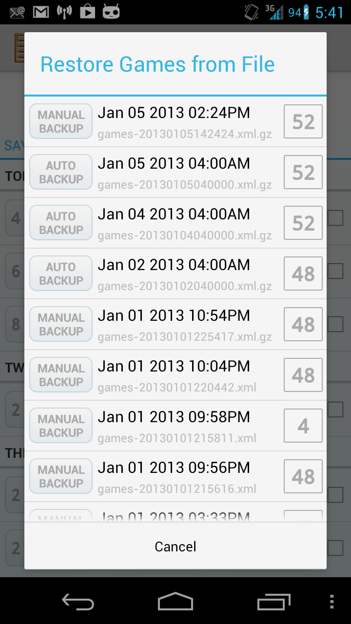
The startup screen and the “New Game” wizard are almost exactly the same as in Score. I added a “Resume Last Game” button, though, to provide a subtle hint that the game will be saved automatically. Other than that, it’s pretty basic, and when you open the app for the first time, it’s clear what you need to do: pound the “New Game” button.

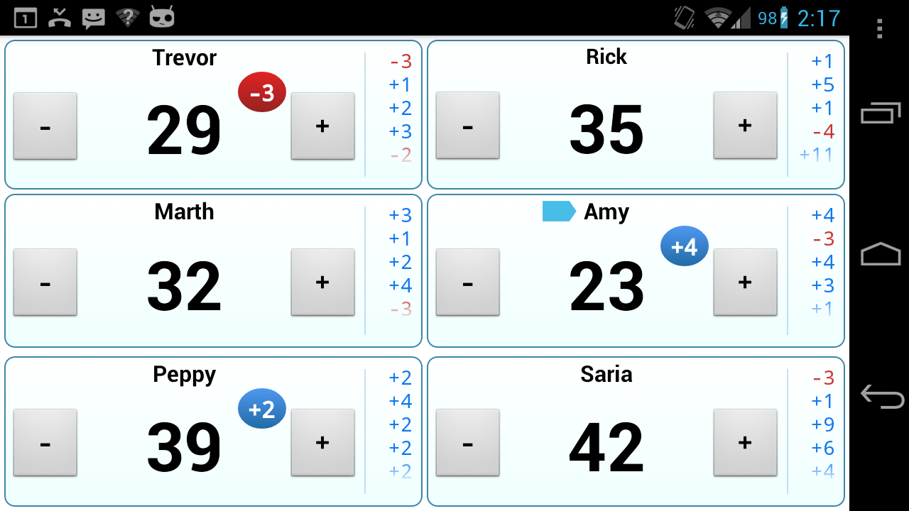
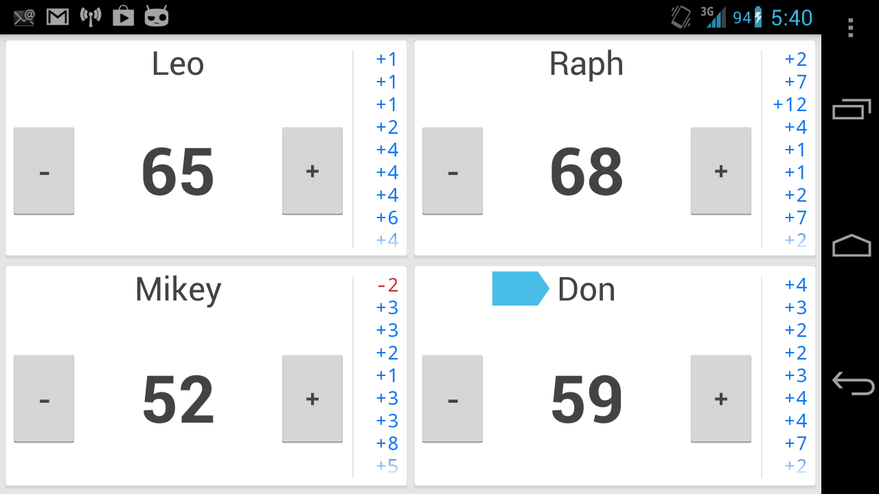
As you go through the “New Game” wizard, all information except for the number of players is optional. If no players are named, then the name simply displays as “Player 1,” “Player 2,” etc. (Contrast this with Score, where only blank text is shown.) The scoring interface itself is very simple – two big buttons for each player, evenly spaced so that you’re not likely to accidentally press the wrong one.

As soon as you start adding or subtracting values, you’ll see that the pane to the side starts to get filled with past values you’ve already entered. The most recent value stays bold for 10 seconds (configurable), during which time you can keep pressing “+” or “-” to change it. After 10 seconds of inactivity, the bolded value will unbold to indicate that it is no longer modifiable. At this point it’s now part of the scoring “history.”

All of this becomes clear to the user after just playing with the app for a few minutes, with no explanations needed. It’s a handy feature that eliminates a lot of the problems of “Oh, I accidentally added too much to your score. How much was it?” With KeepScore, you have a full history of every change you’ve made to a player’s score, so you don’t have to try to remember what you added. You can also long-press on the history to undo the last change. (Or you can just subtract, which is what I imagine most users will do.)

And of course, the app saves automatically. Whenever you exit, it displays a comforting toast saying “Game saved automatically,” just so the user can be sure that everything is good and saved. If you accidentally exit, you’ll notice upon reopening the app that the “Resume Last Game” button is no longer disabled. Most users will probably just make a beeline for that button, which is why I put it on the main screen.

If you want to add values greater than 1, you can long-press on the “+” or “-” button. This pops up a dialog that allows you to input a number with the keyboard or just tap buttons with large increments like “+5” and “+10” (once again, configurable). It does worry me that this feature is “hidden” behind the long-press, but I think most users will figure it out if they know what they are looking for. Many of the other scoring apps let you long-press for additional options, so they might have set a precedent there. In any case, the app is still perfectly usable even without this feature.

Unlike Simple Score Sheet, most of the configurations can be found in the Settings section rather than the main wizard, where it would just be clutter. There’s a concept in software engineering called “convention over configuration,” which basically means that the standard use-case should be the default, and the user should only need to use configurations if they want to do something unusual. I think KeepScore applies this principle pretty well, and that it makes for a smoother user experience. Any user actually looking for strange options (a starting score other than 0, customized button values, etc.) is probably savvy enough to know where to look for them.

Other neat options include the ability to save more than one game, a separate screen to explore the game’s complete scoring history, and the ability to change a player’s name mid-game. Most users will not bother with these options, though, so I tried to keep them out of the way as much as I could.

So there you have it. With just a little common sense and the restraint to not clutter up your app with unnecessary options and verbiage, you can create a dead-simple scoring app that actually beats pen and paper. It’s kind of sad that the Android Market went so long without an app that could do something so basic, but I’m just glad I finally have something worthy of my next cribbage game.

And the best part: KeepScore is free and open-source. You can download it from the Android Market here or get the source code here.