Archive for September, 2012

KeepScore version 1.2: more style, more substance

KeepScore v1.2

I had always thought of KeepScore as a fairly simple app. Functional, yes. But beautiful? Meh.

It’s a counting app. Counting apps only have to do one thing right, and that’s count. This is not brain surgery, people. Just keep it simple, and you’re already 95% of the way there.

A few weeks ago, though, I decided to make KeepScore my guinea pig for trying out some new design elements from the “Holo” theme, introduced in Android 3.0. At the same time, I also added some fit-and-finish features that were sorely needed, giving the app a much more coherent feel.

The result is KeepScore version 1.2, probably the biggest update I’ve ever written for the app. It looks and functions so differently now, I feel like I barely recognize my own app.

What I like most about this update, though, is that it adds a fresh coat of paint without subtracting anything from the usability. In fact, I think KeepScore is actually much easier to use than it was before, to the point where I feel a little embarrassed for having bragged about it in previous posts.

New home screen

The new home screen is a design I’ve been wanting to do for awhile. Here’s a side-by-side comparison of the old and new looks:

Out with the old, in with the new.

The new design basically takes the “Load Game” screen and transplants it onto the welcome screen. I find it’s a huge improvement. There was a ton of wasted space with the old design, and plus it took two clicks to get to your saved games. Now everything the user needs is front and center, without sacrificing any usability or app branding.

I also wanted to make sure that the new design wasn’t so cluttered that it would confuse first-time users. Their experience is still pretty streamlined: there’s a big “New Game” button the size of a barn that you can’t possibly miss.

Big gray squares. Your thumb is drawn to them.

The new home screen also makes use of the “Action Bar” paradigm, which was introduced in Android 3.0 and back-ported thanks to the wonderful Action Bar Sherlock library.

The in-game view

In-game, not a whole lot has changed. If it ain’t broke, why fix it? All I added was a very small graphical flourish:

Never change, KeepScore. Never change.

Did ya miss it? The last score in the score history now has a “fade-out” gradient, to indicate that the list has been cut off at the bottom.

This is to solve a common problem I heard from users, which is that they could never remember whether the list was ordered top-down or bottom-up. Hell, I kept forgetting myself! So hopefully this subtle change will make that clearer.

Rematch button

This is something I struggled with for a long time. In early versions of KeepScore, I had a “Reset” button, which prompted the user with “Overwrite game or start new game with same players?” Knowing that users don’t read anything, though, I was unsatisfied with this dialog.

The old, confusing dialog.

In later versions, I replaced it with “Reset” and “Copy Game”:

“Reset” and “Copy Game” buttons.

Now I’ve combined them both into “Rematch”:

New “Rematch” button.

What I realized about “Reset” and “Copy Game” is that they’re an inelegant solution to a common problem. 99% of the time, if you’re still using the app after the game is over, it’s because you want to start a new game with the same players. However, I didn’t want users to overwrite their old scores, because then they’d lose all their history from the previous game. Hence the option of copying the game before resetting it.

“Rematch” captures this concept much more succinctly than “Copy Game” and “Reset.” And plus, it makes it more difficult for users to shoot themselves in the foot, i.e. by overwriting their scores.

Unfortunately I can’t take the credit for this idea. I borrowed it from Rounds, which is a pretty slick round-based score keeper that was actually originally built on KeepScore’s source code. When I saw the “Rematch” button in that app, I slapped myself on the forehead and wondered how I’d never thought of it.

Edit Players

This is a pretty nifty new feature. In the previous versions, I had an “Add Player” button and a “Shuffle” button, but there was no way to manually reorder players or delete players.

Every day I’m shuffling, and adding, players.

Now all of that is handled in a separate “Edit Players” screen, which makes it a breeze to change players mid-game. You can even touch and drag to get the order exactly right.

Clearly, Storm Eagle should go after Mega Man.

This screen also makes it easier to change players’ names. Previously, the only way to do that was to long-press on a player’s name, which is kind of low on discoverability. But hopefully the button with the pencil icon is a lot easier to figure out.

A tip of my hat goes to Carl Bauer for the drag-and-drop list implementation.

History chart

One occasionally-requested feature was a line chart to show the players’ scores over time. Well, ask and ye shall receive:

Fact: nerds love data. And gamers are all nerds.

Players’ scores are on the Y axis, rounds on the X axis. It’s probably useless for any non-round-based game, but kind of neat nonetheless.

I realize the history chart is probably the most unpolished out of the new visual features I added. The colors are pretty bland, and it’s all very MS Paint-esque, because Android has no native graphing library, so I had to whip this up from scratch. But I’m not too concerned, since most people don’t bother going into the History anyway. And for those that do, I think it’s a nice little feature.

Other new features

Besides all the UI changes, I also added some new functionality:

  • Backup/restore. Back up your games to an XML file on USB storage, and load them later. Duplicates are handled automatically based on unique game IDs.
  • Undo/redo. Self-explanatory. Any action in-game can be undone or redone, i.e. scores subtracted, scores added, etc.
  • Better German translations. Germany is the Mecca of modern-day board gaming, so this has got to be worth something. The app is already available in French and Japanese.
  • Dropped support for pre-Eclair devices. Android 1.5 and 1.6 only account for 0.5% of the user base, and the new backup/restore feature required some XML libraries from Eclair. Sorry, Cupcake and Donut! You were delicious while you lasted.

So there you have it. KeepScore v1.2 has a fresh new look, a better UI, and it’s still free and open-source. So go grab it from the Google Play Store!

Relatedness Calculator: Part Deux

Recently I added a ton of features and improvements to the Relatedness Calculator. Not only is the new app faster, lighter, prettier, and lower-cholesterol, but it’s also made me a savvier web developer in the process. How about that! I find myself actually learning a lot about web development, and slowly correcting my shameful n00b errors from the first version.

Version One

Now, I think the first version of the Relatedness Calculator was pretty cool. Neato, even. It solved the original problem that got me excited about this project in the first place, which was:

How closely related am I to my grandma’s cousin’s daughter?

— A dude on a message board

Answering this question in an automated way required writing a parser, defining a hell of a lot of English relationships, and writing an algorithm to calculate the relatedness coefficient for arbitrarily chained relationships (e.g. “X’s X’s X’s (…) X”).

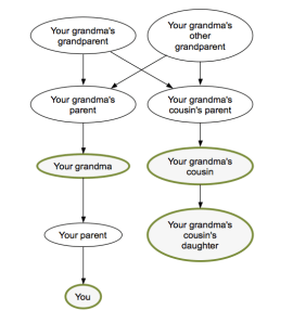
Grandma's cousin's daughter

Nothing could be simpler.

As it turns out, there’s a lot you have to know about genealogy in order to write such a system. At the minimum, you have to read something like Richard Dawkins’ essay on genesmanship from The Selfish Gene. But then there are also a lot of non-obvious things you learn that go beyond genealogy 101.

For instance, I learned that there’s a whole class of relationships that can be expressed with “half” – it’s not just half-brothers and half-sisters. There are half-cousins, half-uncles, half-second cousins, and even half-great-nieces too. What they all have in common is having two common ancestors in the family tree, which get reduced to just one in the “half” versions. Neat, huh?

There’s also a sort of “relatedness addition” that goes into calculating the relatedness coefficients for chained relations. If, for instance, I was parsing “uncle’s daughter,” I discovered I could take the common ancestors for “uncle” and the common ancestors for “daughter,” then use what the math geeks call matrix addition to get the right set of common ancestors. And it worked! I have no idea if it’s justified mathematically, but it made my unit tests pass, so that’s all I care about. (Man, am I a computer programmer, or what?)

There are also some relations that don’t make sense when you chain them together – for instance, “cousin’s brother” or “father’s son.” Examples like these kept screwing up the relatedness addition, because in fact they were redundant ways of expressing a much simpler concept. I.e., “cousin’s brother” is really just a cousin, and “father’s son” is really just you, or possibly your brother. The app had to handle all these errors to avoid barfing up nonsensical results, such as arbitrarily reduced relatedness coefficients for “father’s son’s father’s son’s father’s son’s…” etc.

So essentially, version one was an academic exercise. I barely paid any attention to the UI, and instead just made sure that the core logic was bulletproof. But all that changed with the second version.

User Confusion

From looking at the logs, I could see that users were typing a lot of unexpected queries that completely broke the system:

  • step-cousin twice removed on my mother’s side
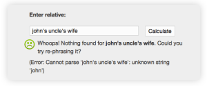
  • john’s uncle’s wife
  • identical twin
  • father’s 2nd wife’s son
  • 4th great-grandfather’s granddaughter

The worst part about a user typing something the system doesn’t understand is that they get a big fat error page. Most users will probably leave the site the first time something like that happens. After all, they went to all the trouble of typing a query out, and the system puked. Who would want to waste their time on a site like that?

Yes, my anonymous Internet application knows all about your friend John.

Obviously some of these queries are things I can fix – “identical twin” and “twice removed” are all features I added in version two. But other things don’t really make any sense in terms of calculating relatedness. Who is “John”? How am I supposed to know if you’re biologically related to his wife? And you’re not biologically related to your step-cousins, either!

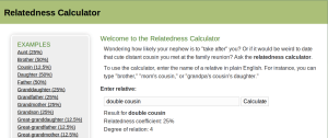
I decided the biggest problem here was not that the system was throwing error messages, but rather that users didn’t know what kind of input the system expected. This is a classic autocompletion problem. People hate staring at a blank page. So starting with version two, I added a nice little autocomplete box.

Showing the space of possible queries goes a long way to help increase the user’s comprehension of the system. “Do I have to start with the word ‘my’?” “Do I have to put a space after the word ‘great’?” “Do I have to type ‘grandfather’ or can I just put ‘gramps’?” All these questions are answered in real time, as you type. It also makes playing around with the system rewarding and fun.

Memory usage

One of the biggest problems I ran into after adding autocompletion was OutOfMemoryErrors. I had used a simple trie object to suggest autocompletions, but this was really taxing the available memory on my Amazon EC2 Micro instance (613 MB).

So the first thing I did was add a 1G swap file on the OS. This had the effect of degrading the performance, while avoiding a complete application crash. I knew I still had some work to do.

I deduced that the new trie object was the culprit, given that the system didn’t crash until after the first autocomplete request was made. So using NetBeans to profile the memory usage, I slowly started slimming down the trie.

The original trie used a classic node-based data structure, similar to a linked list:

public class Trie<T> {
    private TrieNode root = new TrieNode();

    private class TrieNode {

        T value;
        Map<Character, TrieNode> next = Maps.newHashMap();

    }

A parameterized Trie<T> could hold any object in the T, and out of laziness I was storing the entire String that led to a leaf TrieNode. So first off I axed that, since the String itself could just be reconstructed from the breadcrumb trail of Characters anyway.

Next, I cut the memory usage of the Trie roughly in half by replacing all instances of HashMap<Character, TrieNode> with a custom SparseCharArray<TrieNode>. My SparseCharArray is basically just an Object array that has some of the behavior of a Map when I need it. I had already used a similar data structure for my Japanese Name Converter.

In the end, the new trie greatly improved the memory usage of the application, to the point where I didn’t even really need the swap space anymore. (But it’s nice to keep, just in case!)

Browser optimization

Having very little experience in building webapps, I didn’t have the faintest clue how to optimize one. Luckily there are a lot of smart folks who have already figured most of this stuff out, and who publish nice, condensed best-practice guides. Also, the debugging tools are incredibly slick these days, and between Firebug and Chrome’s Developer Tools, I had everything I needed to get under the hood and start tinkering around.

As it turned out, the biggest drain on the application’s performance was just resource management. Grails automates a lot of that, and it’s nice when it works, but when it doesn’t, you have to get your hands dirty. I eventually noticed I had a misbehaving plugin that was requesting Javascript resources that didn’t exist, so I was getting 302 (“moved temporarily”) redirects. On my teensy Micro instance running in Oregon, halfway across the globe from me, this was adding a nearly half-second roundtrip for each request. Once I fixed the links, though, the resources could be cached in the browser and therefore loaded in almost 0 time after the first request.

Another basic problem with redirects came from the root of the app itself. Linking to “/relatedness-calculator” instead of “/relatedness-calculator/” (i.e. without the slash), amazingly, also added about half a second to the request, which would occur anytime the user clicked the logo. So the addition of a single character saved me half a second of response time.

De-uglification

I don’t think there’s much that needs to be said here. Just take a look at the before and after pictures:

Before.

After.

Yep, I finally broke down and learned how to use Gimp. Bubbly, glossy Web 2.0 text for the win!

Another subtle visual change I made was to the family tree graph. To make the relationships in the graph clearer, I added emphasis to the nodes that were most relevant to the user’s query. For instance, in the case of “grandpa’s cousin,” the system draws a green border around “you,” “your grandpa,” and “your grandpa’s cousin.”

I don’t think I’ve ever met a single one of my grandpa’s cousins.

Conclusion

In the end, I’m pretty pleased with the changes I made to the Relatedness Calculator, and I’m proud of the end product. The only thing I find that I’m missing is the thrill I always got from Android development, from getting my code immediately into users’ hands and finding out whether an app was a winner or a dud. With Android development, users always seemed to quickly find my apps and give me feedback on them, even if I never did any marketing.

For instance, even my all-time least popular app, App Tracker, has 4,000 downloads, 50 ratings, 30 comments, and a handful of emails I’ve received from interested users. But with the Relatedness Calculator, it’s been out for three months and I haven’t heard a peep about it. It doesn’t seem to rank highly in Google’s search results, and according to the logs it’s only gotten about 250 query hits.

So I suppose the next step with the Relatedness Calculator is to figure out how to get people to use the damn thing. “Search engine optimization” and all that. My first instinct is to start emailing around to genealogy sites to see if any of them would be interested in linking to me, or maybe even running a standalone version on their own servers.

Alternatively, I could just make an Android version and see if my clout on the Play Store helps push it up in the search results. But I’m hesitant to do that, because this isn’t a product that makes a whole lot of sense as a mobile app. And plus, the mobile site works just fine.

In any case, I don’t plan on abandoning the Relatedness Calculator anytime soon. It’s a nice, simple project that gives me an opportunity to write some gnarly regexes while learning a thing or two about web development. And anyway, I’ve got an app that can figure out your relatedness to your identical twin’s children. How cool is that?

CatLog jives with Jelly Bean, goes open-source

CatLog

CatLog is an app I’ve always been immensely proud of. I wrote the initial version in the span of a weekend, and yet it grew to be my second-biggest Android app, after the now-defunct Pokédroid. Even though it’s a pretty esoteric app, and nobody except developers will find it very useful, I’m glad I could contribute something valuable to the Android community and help make Android development a bit less of a pain. It’s cool to see fan-made instructional videos on YouTube and all the forum posts where people say, “Just download CatLog and send me a log report.”

But lo, all is not well in CatLog Land. As of the newest version of Android (4.1 Jelly Bean), Android apps can no longer read each other’s logs using the READ_LOGS permission. You’re limited to your own logs, unless you’re a system app or you gain root privileges. Uh oh.

Now, this is a defensible position on Google’s part. After all, there was a pretty high-profile security hole found in the Facebook Android SDK due to developers carelessly writing sensitive information to the system log. And in general, most apps don’t need to read each other’s logs, so the change is understandable. Stay in your own sandbox and all that.

This change is going to have a big impact on certain varieties of apps, though. Not only will it affect log-reading apps (like CatLog and aLogcat), but also apps that rely on log-reading in some way. For instance, you can say goodbye to the various “app lock”-type programs that rely on reading the system log to determine when other apps are being launched. If you don’t believe me, check out the permissions page for those apps. See where it says “read sensitive log data”? That’s the death knell for these types of apps, unless somebody figures out a smarter way to detect when another app is launched. (My own AppTracker works in the same way. So it’s toast as well.)

So what does this mean for CatLog? Well, in the future, it means it will only work on rooted phones, which basically limits its appeal to developers and root-happy techies. Until now, it had also come in handy for end users, since it gave them a way to easily submit bug reports (in cases where, for whatever reason, the default reporting mechanism wasn’t available). But starting with Jelly Bean, CatLog will require root access, which means it’s basically worthless for Joe Android User now.

So given that this is more or less CatLog’s swan song, I’m taking a pretty radical step with it. I’m open-sourcing it. Yep, CatLog is now free to remix and re-use, released under the ultra-permissive WTFPL license, just like my other apps.

Why such a permissive license? Well, because I honestly don’t care. CatLog was always a free app, and although I’m grateful for the nice pocket change I make from the donate version (about $20 per month), I doubt open-sourcing it will affect the donations much, and anyway the app was never about making money for me. So there’s really no reason to lock down the source code. I mean, yeah, there are already some copycat apps out there that stand to benefit, but they’re not really doing anyone any harm hanging out in sixth or seventh place in the search results. CatLog’s main advantage is its reputation on the Google Play Store.

On the other hand, if you do want to re-use CatLog’s code, the only thing I ask for is attribution. Sure, the WTFPL doesn’t require it, but this is just one of those “don’t-be-a-jerk” requests.

I have another strong reason for wanting to open-source CatLog: I’m bored of it. Frankly, I haven’t been able to give it much attention lately, because I think 99% of its useful features are finished, and everything that’s left is just flourishes and fine-tuning. It needs a facelift and probably some tweaks to the filter syntax, but with the enthusiasm I’ve shown for the app lately, I’m obviously just not the one to do it.

Also, I find myself turning away from Android development in general. I started writing Android apps when the system was still in its infancy, with only two phones available – the HTC Dream and the Magic. I found it a lot more fun when Android was still simple and untamed, when the market wasn’t flooded with glitzy, polished apps all competing for users’ mind-share. Back in those days, you could even write a simple Pokémon app with an ugly UI and people would love you for it. Development was easy, and the exposure was fun.

Nowadays the Play Store is much more crowded, and Android development is more difficult in general, what with supporting hundreds of devices with multiple form factors (including tablets), and multiple Android versions stretching from 1.5 Cupcake to 4.1 Jelly Bean. The APIs have grown incredibly complicated, and I can’t count the number of times I’ve discovered bugs that only appeared on a certain Android version or on a certain phone. It’s a huge headache trying to maintain all this compatibility, which is why I still haven’t updated any of my apps to the new “Holo” theme from ICS.

However, my lack of enthusiasm shouldn’t limit CatLog’s potential. When you’ve lost interest in a software project, I think it’s your duty to make it open-source, so that somebody else has a chance to grab the baton and run with it. And that’s exactly what I’m doing with CatLog. So if you have any features or bugfixes you’d like to write, fork me on GitHub and go nuts!