Posts Tagged ‘ui design’

KeepScore version 1.2: more style, more substance

KeepScore v1.2

I had always thought of KeepScore as a fairly simple app. Functional, yes. But beautiful? Meh.

It’s a counting app. Counting apps only have to do one thing right, and that’s count. This is not brain surgery, people. Just keep it simple, and you’re already 95% of the way there.

A few weeks ago, though, I decided to make KeepScore my guinea pig for trying out some new design elements from the “Holo” theme, introduced in Android 3.0. At the same time, I also added some fit-and-finish features that were sorely needed, giving the app a much more coherent feel.

The result is KeepScore version 1.2, probably the biggest update I’ve ever written for the app. It looks and functions so differently now, I feel like I barely recognize my own app.

What I like most about this update, though, is that it adds a fresh coat of paint without subtracting anything from the usability. In fact, I think KeepScore is actually much easier to use than it was before, to the point where I feel a little embarrassed for having bragged about it in previous posts.

New home screen

The new home screen is a design I’ve been wanting to do for awhile. Here’s a side-by-side comparison of the old and new looks:

Out with the old, in with the new.

The new design basically takes the “Load Game” screen and transplants it onto the welcome screen. I find it’s a huge improvement. There was a ton of wasted space with the old design, and plus it took two clicks to get to your saved games. Now everything the user needs is front and center, without sacrificing any usability or app branding.

I also wanted to make sure that the new design wasn’t so cluttered that it would confuse first-time users. Their experience is still pretty streamlined: there’s a big “New Game” button the size of a barn that you can’t possibly miss.

Big gray squares. Your thumb is drawn to them.

The new home screen also makes use of the “Action Bar” paradigm, which was introduced in Android 3.0 and back-ported thanks to the wonderful Action Bar Sherlock library.

The in-game view

In-game, not a whole lot has changed. If it ain’t broke, why fix it? All I added was a very small graphical flourish:

Never change, KeepScore. Never change.

Did ya miss it? The last score in the score history now has a “fade-out” gradient, to indicate that the list has been cut off at the bottom.

This is to solve a common problem I heard from users, which is that they could never remember whether the list was ordered top-down or bottom-up. Hell, I kept forgetting myself! So hopefully this subtle change will make that clearer.

Rematch button

This is something I struggled with for a long time. In early versions of KeepScore, I had a “Reset” button, which prompted the user with “Overwrite game or start new game with same players?” Knowing that users don’t read anything, though, I was unsatisfied with this dialog.

The old, confusing dialog.

In later versions, I replaced it with “Reset” and “Copy Game”:

“Reset” and “Copy Game” buttons.

Now I’ve combined them both into “Rematch”:

New “Rematch” button.

What I realized about “Reset” and “Copy Game” is that they’re an inelegant solution to a common problem. 99% of the time, if you’re still using the app after the game is over, it’s because you want to start a new game with the same players. However, I didn’t want users to overwrite their old scores, because then they’d lose all their history from the previous game. Hence the option of copying the game before resetting it.

“Rematch” captures this concept much more succinctly than “Copy Game” and “Reset.” And plus, it makes it more difficult for users to shoot themselves in the foot, i.e. by overwriting their scores.

Unfortunately I can’t take the credit for this idea. I borrowed it from Rounds, which is a pretty slick round-based score keeper that was actually originally built on KeepScore’s source code. When I saw the “Rematch” button in that app, I slapped myself on the forehead and wondered how I’d never thought of it.

Edit Players

This is a pretty nifty new feature. In the previous versions, I had an “Add Player” button and a “Shuffle” button, but there was no way to manually reorder players or delete players.

Every day I’m shuffling, and adding, players.

Now all of that is handled in a separate “Edit Players” screen, which makes it a breeze to change players mid-game. You can even touch and drag to get the order exactly right.

Clearly, Storm Eagle should go after Mega Man.

This screen also makes it easier to change players’ names. Previously, the only way to do that was to long-press on a player’s name, which is kind of low on discoverability. But hopefully the button with the pencil icon is a lot easier to figure out.

A tip of my hat goes to Carl Bauer for the drag-and-drop list implementation.

History chart

One occasionally-requested feature was a line chart to show the players’ scores over time. Well, ask and ye shall receive:

Fact: nerds love data. And gamers are all nerds.

Players’ scores are on the Y axis, rounds on the X axis. It’s probably useless for any non-round-based game, but kind of neat nonetheless.

I realize the history chart is probably the most unpolished out of the new visual features I added. The colors are pretty bland, and it’s all very MS Paint-esque, because Android has no native graphing library, so I had to whip this up from scratch. But I’m not too concerned, since most people don’t bother going into the History anyway. And for those that do, I think it’s a nice little feature.

Other new features

Besides all the UI changes, I also added some new functionality:

  • Backup/restore. Back up your games to an XML file on USB storage, and load them later. Duplicates are handled automatically based on unique game IDs.
  • Undo/redo. Self-explanatory. Any action in-game can be undone or redone, i.e. scores subtracted, scores added, etc.
  • Better German translations. Germany is the Mecca of modern-day board gaming, so this has got to be worth something. The app is already available in French and Japanese.
  • Dropped support for pre-Eclair devices. Android 1.5 and 1.6 only account for 0.5% of the user base, and the new backup/restore feature required some XML libraries from Eclair. Sorry, Cupcake and Donut! You were delicious while you lasted.

So there you have it. KeepScore v1.2 has a fresh new look, a better UI, and it’s still free and open-source. So go grab it from the Google Play Store!

Relatedness Calculator: Part Deux

Recently I added a ton of features and improvements to the Relatedness Calculator. Not only is the new app faster, lighter, prettier, and lower-cholesterol, but it’s also made me a savvier web developer in the process. How about that! I find myself actually learning a lot about web development, and slowly correcting my shameful n00b errors from the first version.

Version One

Now, I think the first version of the Relatedness Calculator was pretty cool. Neato, even. It solved the original problem that got me excited about this project in the first place, which was:

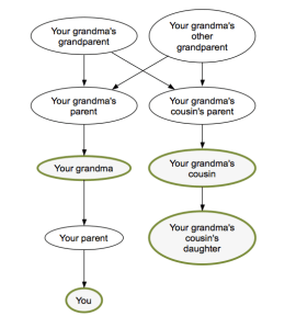
How closely related am I to my grandma’s cousin’s daughter?

— A dude on a message board

Answering this question in an automated way required writing a parser, defining a hell of a lot of English relationships, and writing an algorithm to calculate the relatedness coefficient for arbitrarily chained relationships (e.g. “X’s X’s X’s (…) X”).

Grandma's cousin's daughter

Nothing could be simpler.

As it turns out, there’s a lot you have to know about genealogy in order to write such a system. At the minimum, you have to read something like Richard Dawkins’ essay on genesmanship from The Selfish Gene. But then there are also a lot of non-obvious things you learn that go beyond genealogy 101.

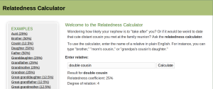
For instance, I learned that there’s a whole class of relationships that can be expressed with “half” – it’s not just half-brothers and half-sisters. There are half-cousins, half-uncles, half-second cousins, and even half-great-nieces too. What they all have in common is having two common ancestors in the family tree, which get reduced to just one in the “half” versions. Neat, huh?

There’s also a sort of “relatedness addition” that goes into calculating the relatedness coefficients for chained relations. If, for instance, I was parsing “uncle’s daughter,” I discovered I could take the common ancestors for “uncle” and the common ancestors for “daughter,” then use what the math geeks call matrix addition to get the right set of common ancestors. And it worked! I have no idea if it’s justified mathematically, but it made my unit tests pass, so that’s all I care about. (Man, am I a computer programmer, or what?)

There are also some relations that don’t make sense when you chain them together – for instance, “cousin’s brother” or “father’s son.” Examples like these kept screwing up the relatedness addition, because in fact they were redundant ways of expressing a much simpler concept. I.e., “cousin’s brother” is really just a cousin, and “father’s son” is really just you, or possibly your brother. The app had to handle all these errors to avoid barfing up nonsensical results, such as arbitrarily reduced relatedness coefficients for “father’s son’s father’s son’s father’s son’s…” etc.

So essentially, version one was an academic exercise. I barely paid any attention to the UI, and instead just made sure that the core logic was bulletproof. But all that changed with the second version.

User Confusion

From looking at the logs, I could see that users were typing a lot of unexpected queries that completely broke the system:

  • step-cousin twice removed on my mother’s side
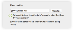
  • john’s uncle’s wife
  • identical twin
  • father’s 2nd wife’s son
  • 4th great-grandfather’s granddaughter

The worst part about a user typing something the system doesn’t understand is that they get a big fat error page. Most users will probably leave the site the first time something like that happens. After all, they went to all the trouble of typing a query out, and the system puked. Who would want to waste their time on a site like that?

Yes, my anonymous Internet application knows all about your friend John.

Obviously some of these queries are things I can fix – “identical twin” and “twice removed” are all features I added in version two. But other things don’t really make any sense in terms of calculating relatedness. Who is “John”? How am I supposed to know if you’re biologically related to his wife? And you’re not biologically related to your step-cousins, either!

I decided the biggest problem here was not that the system was throwing error messages, but rather that users didn’t know what kind of input the system expected. This is a classic autocompletion problem. People hate staring at a blank page. So starting with version two, I added a nice little autocomplete box.

Showing the space of possible queries goes a long way to help increase the user’s comprehension of the system. “Do I have to start with the word ‘my’?” “Do I have to put a space after the word ‘great’?” “Do I have to type ‘grandfather’ or can I just put ‘gramps’?” All these questions are answered in real time, as you type. It also makes playing around with the system rewarding and fun.

Memory usage

One of the biggest problems I ran into after adding autocompletion was OutOfMemoryErrors. I had used a simple trie object to suggest autocompletions, but this was really taxing the available memory on my Amazon EC2 Micro instance (613 MB).

So the first thing I did was add a 1G swap file on the OS. This had the effect of degrading the performance, while avoiding a complete application crash. I knew I still had some work to do.

I deduced that the new trie object was the culprit, given that the system didn’t crash until after the first autocomplete request was made. So using NetBeans to profile the memory usage, I slowly started slimming down the trie.

The original trie used a classic node-based data structure, similar to a linked list:

public class Trie<T> {
    private TrieNode root = new TrieNode();

    private class TrieNode {

        T value;
        Map<Character, TrieNode> next = Maps.newHashMap();

    }

A parameterized Trie<T> could hold any object in the T, and out of laziness I was storing the entire String that led to a leaf TrieNode. So first off I axed that, since the String itself could just be reconstructed from the breadcrumb trail of Characters anyway.

Next, I cut the memory usage of the Trie roughly in half by replacing all instances of HashMap<Character, TrieNode> with a custom SparseCharArray<TrieNode>. My SparseCharArray is basically just an Object array that has some of the behavior of a Map when I need it. I had already used a similar data structure for my Japanese Name Converter.

In the end, the new trie greatly improved the memory usage of the application, to the point where I didn’t even really need the swap space anymore. (But it’s nice to keep, just in case!)

Browser optimization

Having very little experience in building webapps, I didn’t have the faintest clue how to optimize one. Luckily there are a lot of smart folks who have already figured most of this stuff out, and who publish nice, condensed best-practice guides. Also, the debugging tools are incredibly slick these days, and between Firebug and Chrome’s Developer Tools, I had everything I needed to get under the hood and start tinkering around.

As it turned out, the biggest drain on the application’s performance was just resource management. Grails automates a lot of that, and it’s nice when it works, but when it doesn’t, you have to get your hands dirty. I eventually noticed I had a misbehaving plugin that was requesting Javascript resources that didn’t exist, so I was getting 302 (“moved temporarily”) redirects. On my teensy Micro instance running in Oregon, halfway across the globe from me, this was adding a nearly half-second roundtrip for each request. Once I fixed the links, though, the resources could be cached in the browser and therefore loaded in almost 0 time after the first request.

Another basic problem with redirects came from the root of the app itself. Linking to “/relatedness-calculator” instead of “/relatedness-calculator/” (i.e. without the slash), amazingly, also added about half a second to the request, which would occur anytime the user clicked the logo. So the addition of a single character saved me half a second of response time.

De-uglification

I don’t think there’s much that needs to be said here. Just take a look at the before and after pictures:

Before.

After.

Yep, I finally broke down and learned how to use Gimp. Bubbly, glossy Web 2.0 text for the win!

Another subtle visual change I made was to the family tree graph. To make the relationships in the graph clearer, I added emphasis to the nodes that were most relevant to the user’s query. For instance, in the case of “grandpa’s cousin,” the system draws a green border around “you,” “your grandpa,” and “your grandpa’s cousin.”

I don’t think I’ve ever met a single one of my grandpa’s cousins.

Conclusion

In the end, I’m pretty pleased with the changes I made to the Relatedness Calculator, and I’m proud of the end product. The only thing I find that I’m missing is the thrill I always got from Android development, from getting my code immediately into users’ hands and finding out whether an app was a winner or a dud. With Android development, users always seemed to quickly find my apps and give me feedback on them, even if I never did any marketing.

For instance, even my all-time least popular app, App Tracker, has 4,000 downloads, 50 ratings, 30 comments, and a handful of emails I’ve received from interested users. But with the Relatedness Calculator, it’s been out for three months and I haven’t heard a peep about it. It doesn’t seem to rank highly in Google’s search results, and according to the logs it’s only gotten about 250 query hits.

So I suppose the next step with the Relatedness Calculator is to figure out how to get people to use the damn thing. “Search engine optimization” and all that. My first instinct is to start emailing around to genealogy sites to see if any of them would be interested in linking to me, or maybe even running a standalone version on their own servers.

Alternatively, I could just make an Android version and see if my clout on the Play Store helps push it up in the search results. But I’m hesitant to do that, because this isn’t a product that makes a whole lot of sense as a mobile app. And plus, the mobile site works just fine.

In any case, I don’t plan on abandoning the Relatedness Calculator anytime soon. It’s a nice, simple project that gives me an opportunity to write some gnarly regexes while learning a thing or two about web development. And anyway, I’ve got an app that can figure out your relatedness to your identical twin’s children. How cool is that?

A slight makeover for KeepScore

Recently I went to the trouble of de-uglifying the “Load Games” screen for KeepScore. The whole screen is just one big ListView, so taking a cue from my own recent post, I added some fast scroll sections divided by date. I think the effect is more pleasing to the eye, and it also makes it easier to navigate through your past games.

The old version of the UI is on the left, and the new one is on the right:

There. Isn’t that much nicer? The important information (i.e. the player names) pops right out, whereas the other stuff is banished to a light gray subtitle. The icons to the left give the user the feeling that each row refers to some tangible object, saved somewhere, and the checkmarks on the right are useful for doing bulk-delete operations.

Here are some more screenshots:

I’m especially proud of the little row of buttons there at the bottom. They pop up when any boxes are checked, and gracefully recede when the boxes are unchecked, similar to the Gmail app. It was really tough to get them to actually hover over the ListView as they animate upwards, and then have the ListView concede screen space once the animation is complete. I report with some satisfaction that even the Gmail app (version 2.3.5.2) doesn’t do this – when the animation starts, the ListView jumps upward, leaving an awkward little white space for the buttons to pop over.

Awkward white space in Gmail

No awkward space in KeepScore

Overall, the new UI is cleaner, prettier, and more usable. And the code is open source for anyone who wants to borrow it.

Spruce up your ListView by dividing it into sections

If there’s one piece of the core Android framework that every Android dev struggles with, it’s ListView. ListView is incredibly flexible and complex, and you’ll probably find you need it more than once in any decent-sized app. If you haven’t already slammed your keyboard and screamed at ListView before, you probably haven’t been writing Android apps very long. It’s so important, Google even had a whole session about it at their I/O conference in 2010.

ListView is the crucible, the teeth-cutting, the rite of passage for all aspiring Androidians. It’s like Luke seeing Darth Vader in the cave on Dagobah. Once you’ve battled with ListView and emerged from the cave victorious, you’ll know you’re a true Android developer.

This is just one story about ListView.

When I was writing Pokédroid, I came across an interesting problem. The first screen of the app was just a huge list of creatures, but it was too difficult to navigate through. Depending on what game you had, you were only interested in the ones numbered 1-151 (first generation), 152-251 (second gen), 252-386 (third gen), 387-493 (fourth gen), or 494-649 (fifth gen). This meant that the newer (and therefore more interesting) Pokémon were at the bottom, where they were hard to get at. But assuming the National Pokédex numbering, this was just the proper order.

Problem: there were too many goddamn Pokémon.

Too goddamn many.

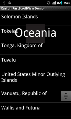
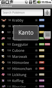
The solution I came up with was to make the list more navigable by showing “fast scroll” overlays with the names of the various Pokémon generations. Named after the games’ regions, they go “Kanto,” “Johto,” “Hoenn,” etc. That way, the user could immediately know what section of the list they were in, and they could quickly scroll between sections.

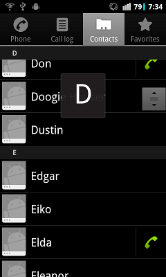
Lots of Android apps do a similar thing. The Contacts and Music apps, for instance, show overlays to let you know which part of the alphabet you’re on:

This is made possible by the use of the “fast scroll thumb,” i.e the little grooved square to the right. It allows you to zoom through your list contents and hone in on the item you want. It’s like blasting down the highway and watching the exit signs, versus crawling down a suburban street, inspecting each house number one-by-one. It’s a much better user experience.

So the fast scroll thumb is awesome. And to use it, all you have to do is add fastScrollEnabled=”true” to your ListView’s XML. The only catch? If you want to use it for anything other than alphabetical sorting, your section overlays are going to look like this:

Bleccch.

Yup, the overlay has a fixed width, so you can only really use it for single characters. What’s a poor Android developer to do?

As it turns out, the only way to fix this problem is to implement your own version of the Contacts app’s internal FastScrollView and hack it yourself. I wasn’t the first to discover this, but I did post some snippets of the solution to Stack Overflow back when I first implemented it in Pokédroid. Since then, I’ve been getting some questions and clarification requests on the original post, so I decided to go ahead and write a full demo app to show how it works. After all, Pokédroid is and will probably always remain closed-source, but this code at least is probably worth sharing.

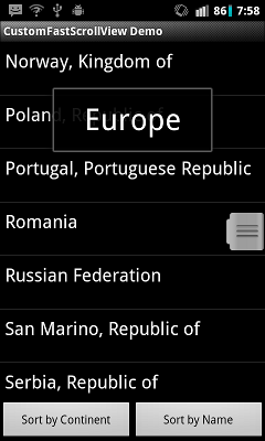
The demo app is on GitHub. Since Pokémon is kind of an esoteric subject, I decided to go with the topic of countries and continents instead. In this example, we’ve got a big list of countries, sorted either by continent or by country name. When you use continent-sorting, you can see overlays of the continents:

…and when you sort by the country name, you see alphabetic overlays instead:

Of course, if you wanted to get really fancy, you could vary the width of the overlay based on what kind of sorting you’re using. But it should be clear enough how to do that from the source code. In any case, with Pokédroid, I had a handful of different sorting mechanisms, but the most common ones had rather long titles, so I just kept the width the same for all of them. In the end, it looked like this:

That’s Pokémon sorted by generation, type, and base HP. The possibilities are pretty endless. You can take your ListView and sort it, divide it, slice-n-dice it however you want.

The important thing is that “fast scroll” sections make for a better user experience. ListViews can hold a lot of data, but that doesn’t mean you should let your list get bloated and then leave all the hard scrolling up to the user. I have an app on my phone where the developer uses an unsectioned ListView with over 200 items. Two hundred! It takes almost five seconds just to scroll from top to bottom! That may not sound like much, but in the UI world, five seconds is an eternity.

Just imagine your poor users, holding their phone in one hand and flipping your ListView with the other hand, over and over again, like they’re trying to light a wet match. Then reflect on how much you could improve that experience with some fast scroll sections.

Well, ListView-abusing Android developers (you know who you are): now you have no excuse. The CustomFastScrollView code is public and open-source, so go use it. Get cracking!

A small improvement for KeepScore

This week at the pub I took KeepScore for its first test run in a little game of four-person cribbage. It got high marks from my friends, who agreed that KeepScore was better than the other Android scoring apps we had tried. (But of course my friends would say that.) Still, I also received some useful criticism that informed an update I wrote later in the week.

It seems the biggest problem was that the bolded history items were too small, and therefore difficult to read. In light of this, I considered just upping the text size on all the history items, but then I realized: the only history item you’re usually interested in is the most recent one. When you’re trying to tap the button 7 times to add 7 points, you want to verify that you’ve actually added 7, instead of 6 or 8. But after you’ve given the player his/her points, you tend to stop paying attention until the next time you need to add points.

Before

After

So instead of the bold text, I decided to use little “badges” over the numbers (or “blibbets,” as we called them at my old company). I think they’re pretty neat looking, and they also make it dead simple to tell how many points you’ve added. After 10 seconds of inactivity, the badges disappear and move over to the history column instead. This has the added benefit of drawing a clear distinction between the modifiable and unmodifiable parts of the history.

Something else I noticed was that, in the long-press popup, the buttons were also too small and too hard to read. So I simply enlarged the text and gave the buttons more space relative to the EditText (which no one at the table used anyway).

Before

After

Both of these problems stemmed from the fact that I had only tested the app with the phone held in my hand, rather than flat on a table within reach of multiple people – which is how it’s actually used. Held in my hand, all the text on the screen is perfectly easy to read, but in the middle of a dimly-lit bar table, it’s another story.

In the end, this turned out to be one of those slap-yourself-on-the-forehead-it’s-so-obvious kinds of problems that you can only really discover through usability testing.

Building a better counting app

Last week I was in a pub having drinks with some friends when we decided to play a little cribbage. Crib is a great card game – it’s fun and fast-paced, it works well with anywhere between 2 and 4 players, and you can finish a round in about a half-hour. It’s pretty much the perfect card game.

We didn’t have any pens or paper to keep score, though, so we turned to the Android Market to try to find a good scoring application. The first one we tried out, Score, crashed on us halfway through without saving our game. The second, Scorer, was workable but awkward. In the end, we were able to score our game, but it would have been much easier to just use pen and paper. Something about that struck me as wrong – this is the 21st century! Why can’t my damned smartphone keep score?

I like thinking about user interface problems, so I followed this rabbit hole all the way to the end. I tested the most popular scoring apps on the Android Market, found them all to be underwhelming, and then finally wrote my own. My app, KeepScore, only took one weekend to write, but I think it’s already better and more usable than every other scoring app on the Market.

KeepScore

What makes it better? My first advantage is simple hindsight. Since the other apps came out first, I was able to test them and see which design decisions worked and which ones didn’t. I remembered the frustrations that came with our impromptu game of cribbage: I pressed the wrong button! It didn’t save our scores! The screen fell asleep! Based on this experience, I knew what to avoid in KeepScore.

My second advantage is that I read and applied the principles in Joel Spolsky’s User Interface Design for Programmers. I mention this book a lot in my blog, but I just can’t emphasize enough how reading it can help make you a better UI designer. If there were two principles from this book that I wish every app developer would follow, it’s these:

  1. Assume your users are illiterate. They won’t read anything.
  2. Assume your users have big, fat thumbs. They can’t press anything accurately.

I won’t try to justify these principles here, because I think I already did a decent job in this post. Instead, I’m just going to review each app in turn and show how KeepScore improves upon them.

Score

Score is actually a decent app, and it’s where I got most of my inspiration for the design of KeepScore. The “new game” wizard in particular is a great idea – it’s simple, it’s intuitive, and it allows you to start up a game in seconds. However, Score suffers from a few flaws that make it nigh-unusable:

  1. The screen doesn’t stay awake. In a game like cribbage, where you need to update someone’s score every 20-60 seconds, this is unacceptable. When we played, the game kept grinding to a halt every time the phone fell asleep.
  2. The game doesn’t save automatically. My friends aren’t used to my Nexus One, so they kept accidentally hitting the home key or the back key. Each time, we would have to enter all our scores again.
  3. The buttons are too close together. When your users are going to be juggling a handful of cards or game pieces while simultaneously trying to guide a finger towards the smartphone screen, there’s no reason to bunch up the buttons so close together. In Score, it’s easy to accidentally decrement one player’s tally when you meant to increment another’s.

On top of this, Score just seems to suffer from sloppy execution. When you long-press on the “+” or “-” button, you get a popup allowing you to add a custom value, but it actually adds one less than whatever you enter. Many users have complained about this in the Android Market comments, but the dev doesn’t seem to have gotten the memo.

Scorer

Like Score, Scorer is a mix of good design and bad design. One feature I really like is the configurable buttons at the bottom – they make it easy to add large numbers to a player’s score (e.g. to add 12, press “+10” once and “+1” twice). Another highlight is the green and red increment markers next to each player’s name, which make it easy to see how much you’ve already added to someone’s score. (I borrowed both ideas for KeepScore.) Scorer also keeps the screen awake and saves automatically, although unfortunately it can’t save more than one game at a time.

Scorer’s biggest flaw, though, is just its basic layout design. Rather than having separate buttons for each user, Scorer requires you to tap a player’s name before altering their score. This doesn’t sound like a big deal, but in practice it makes scoring very cumbersome. When playing cribbage, my friends and I would often accidentally add a score to the wrong player, and then we would have to figure out how much we added, backtrack, and add it to the correct player.

Another problem is that the green/red markers only “commit” if you press the OK button. So if we wanted to make sure we could backtrack the correct amount, we’d have to keep pressing OK to add the score in. This meant at least three touches were required just to update a player’s score! Tap, tap, tap. It doesn’t sound like much, but it’s a minor inconvenience that adds up over the course of a game.

Advanced Tally Counter

I’m not even sure where to start with this one. This is a good example of the kind of graphic design I really hate: the developer has gone out of his way to deviate from the basic Android themes, and the result is an ugly and distracting presentation. On top of that, the app is very wordy and heavy on explanations. Touch the big button in the corner, and you’ll see a toast saying, “Please long click on this button to reset the counters.” Touch the back button and you’ll see “Press back again to exit the app.” Touch back twice and you’ll get a popup asking you to rate the app before you exit. Start up the app for the first time and you’ll get a popup asking you to download another app. And of course, there’s an ad banner over the top. The app seems determined to direct your attention toward everything except just keeping score.

Other than that, the app is pretty basic. Press “+” to increment by one, and press “-” to decrement. There’s no way to add larger values at once, and if you long-press on the “+” or “-” buttons, you’ll get a long list of hardware buttons you can use in place of the on-screen button. I find this feature pretty useless, though, given that more and more Android devices are getting rid of keyboards, buttons, and trackballs. Also, if you press the “+” or “-” button rapidly, the current score won’t update at first – it’ll just sort of vibrate for awhile until finally updating at the end. I found that confusing.

All in all, there’s no reason to use Advanced Tally Counter when there are less ugly and distracting alternatives. Also, the fact that the app has ad banners and a bewildering “Pro” version (I still can’t figure out what it does) reflects pretty poorly on the dev. Come on, dude. You’ve written a counting app. Are you really so hard-up that you need to try to make money off this thing?

Simple Score Sheet

First off, let me compliment the graphic design here. This is a case where a developer has deviated from the standard Android themes, but unlike Advanced Tally Counter, I think the result is really pleasing to the eye. The motif is simple and unobtrusive, and the custom font lends itself well to the whole “pen and paper” theme. Even the stylized buttons are cute and not at all distracting. So I give the developer high marks for designing a really beautiful app.

Unfortunately, the big problem with Simple Score Sheet is that it violates every principle of simple UI design. Whenever the developer had a choice between simplicity and complexity, he’s clearly chosen complexity. Just starting up a new game is like filling out a census form – it’s long, it’s tedious, and you have to think hard before you answer every question.

Just look at the screenshots above. Everything above “Start game” on the first screen is totally unnecessary for 99% of the app’s users. What’s the starting score? Who cares – I probably just want it to be zero! The whole “Game ends after…” and “Player with highest/lowest score wins” questionnaire is also the height of arrogance. Why do I need to tell the app who’s won the game? Why are you forcing me to start thinking about how many rounds the game has? Before I’ve started using your app, I don’t even know how it keeps track of rounds! I just want to start tallying some scores, damn it!

Even worse is the fact that the app will not let you complete the wizard unless you fill out all the information it deems necessary. If you try to press “Start game” without entering any information, it will complain: “Please enter a value for game ending option.” If you try to add a player without a name, it will complain again. All of these are pretentious moments where the developer is slapping the user on the wrist for not following his own complicated directions, like those old GPS navigation devices that would scold you for taking a detour. It makes the user think, and like the title of the famous book goes, Don’t Make Me Think!

Once you finally make it past the bureaucracy and into the scoring app itself, the usual complaints apply. It doesn’t automatically save, it’s hard to tell how much you’ve already added to someone’s score, and it’s hard to add values larger than 1. In fact, its system for adding large values is particularly bad. The way it works is that, if you long-press on the “+” button, the counter will start to increase on its own, accelerating as you keep holding it down. This would be pretty convenient, except that it also gets set off if you tap multiple times in quick succession. In practice, this means that the score will often start zooming off like a runaway car, and then good luck trying to get the value back to what it was before. It’s a neat idea, but it’s just not executed very well.

KeepScore

Enter KeepScore. KeepScore, I believe, is the best scoring app on the Android Market mostly because it just tries to do what the name says: keep score. The UI is designed to be as simple and unobtrusive as possible, without any distractions or extraneous options. Let’s walk through it step-by-step.

The startup screen and the “New Game” wizard are almost exactly the same as in Score. I added a “Resume Last Game” button, though, to provide a subtle hint that the game will be saved automatically. Other than that, it’s pretty basic, and when you open the app for the first time, it’s clear what you need to do: pound the “New Game” button.

As you go through the “New Game” wizard, all information except for the number of players is optional. If no players are named, then the name simply displays as “Player 1,” “Player 2,” etc. (Contrast this with Score, where only blank text is shown.) The scoring interface itself is very simple – two big buttons for each player, evenly spaced so that you’re not likely to accidentally press the wrong one.

As soon as you start adding or subtracting values, you’ll see that the pane to the side starts to get filled with past values you’ve already entered. The most recent value stays bold for 10 seconds (configurable), during which time you can keep pressing “+” or “-” to change it. After 10 seconds of inactivity, the bolded value will unbold to indicate that it is no longer modifiable. At this point it’s now part of the scoring “history.”

All of this becomes clear to the user after just playing with the app for a few minutes, with no explanations needed. It’s a handy feature that eliminates a lot of the problems of “Oh, I accidentally added too much to your score. How much was it?” With KeepScore, you have a full history of every change you’ve made to a player’s score, so you don’t have to try to remember what you added. You can also long-press on the history to undo the last change. (Or you can just subtract, which is what I imagine most users will do.)

And of course, the app saves automatically. Whenever you exit, it displays a comforting toast saying “Game saved automatically,” just so the user can be sure that everything is good and saved. If you accidentally exit, you’ll notice upon reopening the app that the “Resume Last Game” button is no longer disabled. Most users will probably just make a beeline for that button, which is why I put it on the main screen.

If you want to add values greater than 1, you can long-press on the “+” or “-” button. This pops up a dialog that allows you to input a number with the keyboard or just tap buttons with large increments like “+5” and “+10” (once again, configurable). It does worry me that this feature is “hidden” behind the long-press, but I think most users will figure it out if they know what they are looking for. Many of the other scoring apps let you long-press for additional options, so they might have set a precedent there. In any case, the app is still perfectly usable even without this feature.

Unlike Simple Score Sheet, most of the configurations can be found in the Settings section rather than the main wizard, where it would just be clutter. There’s a concept in software engineering called “convention over configuration,” which basically means that the standard use-case should be the default, and the user should only need to use configurations if they want to do something unusual. I think KeepScore applies this principle pretty well, and that it makes for a smoother user experience. Any user actually looking for strange options (a starting score other than 0, customized button values, etc.) is probably savvy enough to know where to look for them.

Other neat options include the ability to save more than one game, a separate screen to explore the game’s complete scoring history, and the ability to change a player’s name mid-game. Most users will not bother with these options, though, so I tried to keep them out of the way as much as I could.

So there you have it. With just a little common sense and the restraint to not clutter up your app with unnecessary options and verbiage, you can create a dead-simple scoring app that actually beats pen and paper. It’s kind of sad that the Android Market went so long without an app that could do something so basic, but I’m just glad I finally have something worthy of my next cribbage game.

And the best part: KeepScore is free and open-source. You can download it from the Android Market here or get the source code here.

Respect your users by treating them like idiots

Working on Pokédroid in the middle of a huge boom in its popularity (it’s gaining 3,000 installs a day – not downloads, but cumulative installs) while reading Joel Spolsky’s User Interface Design for Programmers is teaching me a lot about designing UIs.  You can read some chapters of the book for free online; I especially like this post. I’m learning that Joel is absolutely right about many things, but especially this:

  1. Users don’t read anything.
  2. You must assume that users will not give your app their full attention.

Spolsky explains:

What does it mean to make something easy to use? One way to measure this is to see what percentage of real-world users are able to complete tasks in a given amount of time. For example, suppose the goal of your program is to allow people to convert digital camera photos into a web photo album. If you sit down a group of average users with your program and ask them all to complete this task, then the more usable your program is, the higher the percentage of users that will be able to successfully create a web photo album. To be scientific about it, imagine 100 real world users. They are not necessarily familiar with computers. They have many diverse talents, but some of them distinctly do not have talents in the computer area. Some of them are being distracted while they try to use your program. The phone is ringing. WHAT? The baby is crying. WHAT? And the cat keeps jumping on the desk and batting around the mouse. I CAN’T HEAR YOU!

Now, even without going through with this experiment, I can state with some confidence that some of the users will simply fail to complete the task, or will take an extraordinary amount of time doing it. I don’t mean to say that these users are stupid. Quite the contrary, they are probably highly intelligent, or maybe they are accomplished athletes, but vis-à-vis your program, they are just not applying all of their motor skills and brain cells to the usage of your program. You’re only getting about 30% of their attention, so you have to make do with a user who, from inside the computer, does not appear to be playing with a full deck.

The scroll thumb in Pokédroid

I’ve seen this “not playing with a full deck” situation play out over and over.  Recently, I had a user send me a very polite, carefully-worded email asking if I could make it easier to scroll to the new Black/White Pokémon, which are about 500 down from the top of the list. I was perplexed.  I wrote back and told him that, on my Nexus One, I can scroll down to the new Pokémon in about one second using the fast scroll thumb.  In fact, I implemented the fast scroll thumb to solve this exact problem. Was the fast scroll thumb not working on his phone?

Nope.  It turned out he just hadn’t noticed it.  He didn’t read the popup explaining the new feature, and he didn’t notice the scroll thumb at the right, even though it pops in and out as you scroll and is about 15% the width of the screen.  Now, it’s not that this person wasn’t intelligent – from reading the email, I could tell that he was highly literate.  It’s just that he wasn’t giving the app his full attention, because that’s what users do.

Several other users complained in the Android Market comments that there were no Black/White Pokémon:

  • Would be 5 stars but I can’t find the unova pokemon srry
  • Unova Pokemon don’t so up after update but all together its a good app
  • I just got the update and it had all of the improvements but it didn’t have the Black/White Pokemon
  • Huh?I updated but unova pokemon didn’t come out.HTC legend

This is because they’re updating from an older version of Pokédroid, and their game version is still set on HeartGold/SoulSilver, or some other version.  I told them in the initial popup that they needed to switch it.  I told them in the Android Market description that they needed to switch it.  I even put it at the top of the description preceded by the word “NOTE” in all caps.  Did it work?  Nope.  I still see these comments.

Of course, this is totally predictable given that, as Spolsky puts it so succinctly, “users don’t read anything.”  Again he explains:

This may sound a little harsh, but you’ll see, when you do usability tests, that there are quite a few users who simply do not read words that you put on the screen. If you pop up an error box of any sort, they simply will not read it. This may be disconcerting to you as a programmer, because you imagine yourself as conducting a dialog with the user. Hey, user! You can’t open that file, we don’t support that file format! Still, experience shows that the more words you put on that dialog box, the fewer people will actually read it.

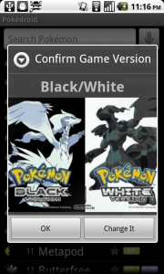
The Black/White popup

So in the upcoming version, I’m implementing a popup to ask the user to confirm their game version when the app starts up.  Now, I know that users don’t read text, and I know that they hate popups, so I’m using some relaxing visuals instead – the box art from the games.  “Confirm Game Version: HeartGold/SoulSilver” pops up with a huge box art in their face.  Bam.  No confusion.  Except there is.  I realized as I was toying around with it that when it says “Confirm Game Version: Black/White,” I felt like I wanted to click on either the Black box art or the White box art.  I felt like it was asking me whether I wanted Black or White.  It was confusing to have to hit “OK” instead.  Which one am I confirming?

So I realized this: most users are going to assume that the game version is Black/White.  Why would they want anything else? Black/White is the most recent game.  If there are older Pokémon games with fewer creatures and different move sets, they sure as hell don’t want to know about it.  They just want to see some damn Pokémon, and they couldn’t care less whether I show the move sets from HeartGold, LeafGreen, or HotCherryPassion. Hardcore Pokémaniacs might scour all the settings and figure it out, but casual users won’t.

So my solution is to only show the popup if they’re on something other than Black/White. Normally, users expect popups when something is wrong, not when everything is A-OK. So new users, whose game version will default to Black/White anyway, would just be confused by a popup. “What happened?  Did I do something wrong?” So I figure: why even show it, if they’re already on the newest version of the game? This way, I can solve the immediate problem (people stuck on HeartGold/SoulSilver) without interrupting the majority of my users.

Another change I’m making is to shorten the introductory dialog and add pictures.  Given that the introductory dialog has traditionally been a wall of text, I should be surprised if users read anything in there.

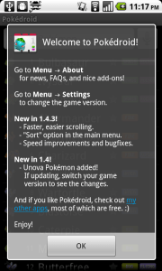
Old intro popup

Just look at my pretentious little dialog, with its list of chores for the user to complete.  Are they really going to want to learn about the settings before they’ve even used the app?  Or where the “About” section can be found? I thought about it, and realized that there are only three pieces of information I need to convey in that dialog:

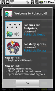
  1. You can download Pokédroid Extras to get footprints and cries.
  2. You can download Pokédroid Donate to get shiny sprites.
  3. The most recent changelog, for the 10% of users who want to know what’s updated and will actually read it.

Anything else, the user will only seek out on a need-to-know basis.  For the most part, they will just plow through the app and assume they can figure out how to use it as they go.  They don’t want pedantic lectures explaining how to change the settings or where to go for more information.  If they want information, they’ll come to me.

Pokédroid Extras and Pokédroid Donate are the only non-obvious components to the app, because you can’t get them in the app itself.  They require a separate download.  So I figure I’ll slap some pictures on the introductory dialog explaining what Extras and Donate do, and hope that the user’s eye will be attracted to the pictures, which will motivate them to read the 6-7 words to the right. They should be able to get the gist of the popup in one glance. They shouldn’t have to break out a cup of coffee and their reading glasses just to start the damn app.

New intro popup

This whole discussion may make it sound like I don’t respect my users.  But the beautiful thing, as Spolsky explains, is that by assuming my users are going to act like airheads, I actually am respecting them.  I’m saying, “I know you don’t care about this app nearly as much as I do.  I know you’re not interested in lectures about how I optimized the database, or all the cool little features I put in and why.  You’re a busy person, and you have better things to do.  You will put in the bare minimum of intellectual effort to understand my app, so that you can complete whatever task you’re trying to complete.  And that’s great.  I’ll be here to help you complete your task, and the rest of the time I’ll try to stay out of your way.”  What I’m doing is showing humility, and respecting my users’ valuable time.

Also, a lot of my conclusions about user behavior come from observations I’ve made about the way I use software (since reading Spolsky’s book, anyway). The fact is, I drive my phone like a reckless drunk drives a semi.  I pound the OK button to skip long dialogs.  I spam the back key to get out of an app.  I never read the changelog, the “About” section, or the manual – or maybe I glance through it, reading in an “F” shape (horizontal at first, then vertical down to the bottom).  If there’s a non-obvious Android feature that I actually use (holding down the home button to see recent apps, holding down the menu button to bring up the keyboard), it’s only because I’m an Android developer myself, so I saw it in the documentation.  It’s certainly not because I read the manual to either of my phones, because I didn’t.

When I download a new app, I usually just try to use it to accomplish one very specific task.  If I can’t figure out how to do that in ten seconds, I uninstall it.  For instance, I recently wanted an app that would let me uninstall other apps by clicking a widget on my home screen.  So I downloaded two or three of those “Task Killer”-type apps and tried to figure out how to do what I wanted.  When I couldn’t, I gave up and uninstalled them.  Each app probably spent all of sixty seconds alive on my phone before I flushed it down the memory hole.

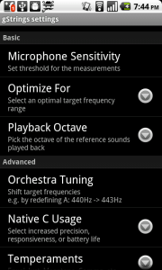
When I manage to accomplish a task in a downloaded app, I rarely fiddle with the settings and just assume that the defaults are okay.  Sometimes this gets me in trouble.  A great example is the gStrings tuner app, which I use to tune my guitar.  The app is wonderful, and I’m happy to have downloaded the premium version to help support the developer.  The guy obviously knows his stuff – the settings are full of fancy options like “Playback Octave,” “Use Orchestra Tuning,” and “Use Harmonic Product Spectrum.”  Of course, I’m not going to change any of these, because they might as well be in Hebrew, but at least they inspire confidence that the developer is a real pro.

gStrings' settings

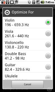
"Optimize For"

However, buried within those options is one called “Optimize For,” with the very scary-sounding description of “select an optimal target frequency range.” After you click on it, it gives you a choice between violin, viola, cello, double bass, guitar, and ukulele, with violin as the default.  When I discovered this, I was surprised.  I figured that, if anything, the guitar would be the default – everybody and their dog plays the guitar, but almost nobody plays the violin.  Also, who in their right mind would actually click on this option in the first place?  The only reason I discovered it myself is that I was evaluating my purchase of gStrings, and I wanted to see the differences between the premium and the free version.

Unfortunately for users of gStrings, this is exactly like my Black/White situation.  Everyone is going to assume that the default setting is guitar – if they even imagine that such a setting exists.  And nobody is going to cuddle up and read the settings menu, slogging through wordy descriptions like “shift target frequencies e.g. by redefining A: 440Hz -> 443Hz,” to figure out if they should change it.  I’m sure if the developer of gStrings did a random survey of 10 users, he or she  would discover that 7 of them play the guitar, but 6 of them have their app set on violin.  The other 3 users play the ukelele, the cello, and the violin, but none of them managed to find the “Optimize For” setting at all. So only two lucky users get to actually have the setting that’s right for their instrument.

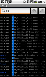
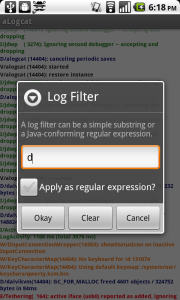
Now that I’ve read Joel Spolsky’s book, I’m starting to see dumb programmer mistakes in every app I use.  Descriptions that are too long and complicated. Unhelpful popups that interrupt the workflow. Optimizing for edge-case usages (like searching by regular expressions), while ignoring common use cases (like just punching in a single letter and searching by the first character).

Searching logs in Catlog. Just start typing and it filters as you go.


Searching logs in aLogcat. Hit Menu, hit Filter, then get a free lesson on how your regular expressions need to conform to Java.

I’m starting to see it in my own apps as well, which is especially frustrating, because I had no idea I was making such elementary mistakes. The most egregious of these is probably App Tracker, which is so bad it deserves a post of its own.

Well, from now on at least, I’m going to work to make simpler, easier-to-use UIs for my apps. Hopefully it will result in a better experience for my users, because they are are all idiots. Just like me.