Working on Pokédroid in the middle of a huge boom in its popularity (it’s gaining 3,000 installs a day – not downloads, but cumulative installs) while reading Joel Spolsky’s User Interface Design for Programmers is teaching me a lot about designing UIs. You can read some chapters of the book for free online; I especially like this post. I’m learning that Joel is absolutely right about many things, but especially this:
- Users don’t read anything.
- You must assume that users will not give your app their full attention.
Spolsky explains:
What does it mean to make something easy to use? One way to measure this is to see what percentage of real-world users are able to complete tasks in a given amount of time. For example, suppose the goal of your program is to allow people to convert digital camera photos into a web photo album. If you sit down a group of average users with your program and ask them all to complete this task, then the more usable your program is, the higher the percentage of users that will be able to successfully create a web photo album. To be scientific about it, imagine 100 real world users. They are not necessarily familiar with computers. They have many diverse talents, but some of them distinctly do not have talents in the computer area. Some of them are being distracted while they try to use your program. The phone is ringing. WHAT? The baby is crying. WHAT? And the cat keeps jumping on the desk and batting around the mouse. I CAN’T HEAR YOU!
Now, even without going through with this experiment, I can state with some confidence that some of the users will simply fail to complete the task, or will take an extraordinary amount of time doing it. I don’t mean to say that these users are stupid. Quite the contrary, they are probably highly intelligent, or maybe they are accomplished athletes, but vis-à-vis your program, they are just not applying all of their motor skills and brain cells to the usage of your program. You’re only getting about 30% of their attention, so you have to make do with a user who, from inside the computer, does not appear to be playing with a full deck.
I’ve seen this “not playing with a full deck” situation play out over and over. Recently, I had a user send me a very polite, carefully-worded email asking if I could make it easier to scroll to the new Black/White Pokémon, which are about 500 down from the top of the list. I was perplexed. I wrote back and told him that, on my Nexus One, I can scroll down to the new Pokémon in about one second using the fast scroll thumb. In fact, I implemented the fast scroll thumb to solve this exact problem. Was the fast scroll thumb not working on his phone?
Nope. It turned out he just hadn’t noticed it. He didn’t read the popup explaining the new feature, and he didn’t notice the scroll thumb at the right, even though it pops in and out as you scroll and is about 15% the width of the screen. Now, it’s not that this person wasn’t intelligent – from reading the email, I could tell that he was highly literate. It’s just that he wasn’t giving the app his full attention, because that’s what users do.
Several other users complained in the Android Market comments that there were no Black/White Pokémon:
- Would be 5 stars but I can’t find the unova pokemon srry
- Unova Pokemon don’t so up after update but all together its a good app
- I just got the update and it had all of the improvements but it didn’t have the Black/White Pokemon
- Huh?I updated but unova pokemon didn’t come out.HTC legend
This is because they’re updating from an older version of Pokédroid, and their game version is still set on HeartGold/SoulSilver, or some other version. I told them in the initial popup that they needed to switch it. I told them in the Android Market description that they needed to switch it. I even put it at the top of the description preceded by the word “NOTE” in all caps. Did it work? Nope. I still see these comments.
Of course, this is totally predictable given that, as Spolsky puts it so succinctly, “users don’t read anything.” Again he explains:
This may sound a little harsh, but you’ll see, when you do usability tests, that there are quite a few users who simply do not read words that you put on the screen. If you pop up an error box of any sort, they simply will not read it. This may be disconcerting to you as a programmer, because you imagine yourself as conducting a dialog with the user. Hey, user! You can’t open that file, we don’t support that file format! Still, experience shows that the more words you put on that dialog box, the fewer people will actually read it.
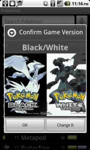
So in the upcoming version, I’m implementing a popup to ask the user to confirm their game version when the app starts up. Now, I know that users don’t read text, and I know that they hate popups, so I’m using some relaxing visuals instead – the box art from the games. “Confirm Game Version: HeartGold/SoulSilver” pops up with a huge box art in their face. Bam. No confusion. Except there is. I realized as I was toying around with it that when it says “Confirm Game Version: Black/White,” I felt like I wanted to click on either the Black box art or the White box art. I felt like it was asking me whether I wanted Black or White. It was confusing to have to hit “OK” instead. Which one am I confirming?
So I realized this: most users are going to assume that the game version is Black/White. Why would they want anything else? Black/White is the most recent game. If there are older Pokémon games with fewer creatures and different move sets, they sure as hell don’t want to know about it. They just want to see some damn Pokémon, and they couldn’t care less whether I show the move sets from HeartGold, LeafGreen, or HotCherryPassion. Hardcore Pokémaniacs might scour all the settings and figure it out, but casual users won’t.
So my solution is to only show the popup if they’re on something other than Black/White. Normally, users expect popups when something is wrong, not when everything is A-OK. So new users, whose game version will default to Black/White anyway, would just be confused by a popup. “What happened? Did I do something wrong?” So I figure: why even show it, if they’re already on the newest version of the game? This way, I can solve the immediate problem (people stuck on HeartGold/SoulSilver) without interrupting the majority of my users.
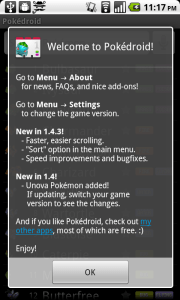
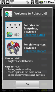
Another change I’m making is to shorten the introductory dialog and add pictures. Given that the introductory dialog has traditionally been a wall of text, I should be surprised if users read anything in there.
Just look at my pretentious little dialog, with its list of chores for the user to complete. Are they really going to want to learn about the settings before they’ve even used the app? Or where the “About” section can be found? I thought about it, and realized that there are only three pieces of information I need to convey in that dialog:
- You can download Pokédroid Extras to get footprints and cries.
- You can download Pokédroid Donate to get shiny sprites.
- The most recent changelog, for the 10% of users who want to know what’s updated and will actually read it.
Anything else, the user will only seek out on a need-to-know basis. For the most part, they will just plow through the app and assume they can figure out how to use it as they go. They don’t want pedantic lectures explaining how to change the settings or where to go for more information. If they want information, they’ll come to me.
Pokédroid Extras and Pokédroid Donate are the only non-obvious components to the app, because you can’t get them in the app itself. They require a separate download. So I figure I’ll slap some pictures on the introductory dialog explaining what Extras and Donate do, and hope that the user’s eye will be attracted to the pictures, which will motivate them to read the 6-7 words to the right. They should be able to get the gist of the popup in one glance. They shouldn’t have to break out a cup of coffee and their reading glasses just to start the damn app.
This whole discussion may make it sound like I don’t respect my users. But the beautiful thing, as Spolsky explains, is that by assuming my users are going to act like airheads, I actually am respecting them. I’m saying, “I know you don’t care about this app nearly as much as I do. I know you’re not interested in lectures about how I optimized the database, or all the cool little features I put in and why. You’re a busy person, and you have better things to do. You will put in the bare minimum of intellectual effort to understand my app, so that you can complete whatever task you’re trying to complete. And that’s great. I’ll be here to help you complete your task, and the rest of the time I’ll try to stay out of your way.” What I’m doing is showing humility, and respecting my users’ valuable time.
Also, a lot of my conclusions about user behavior come from observations I’ve made about the way I use software (since reading Spolsky’s book, anyway). The fact is, I drive my phone like a reckless drunk drives a semi. I pound the OK button to skip long dialogs. I spam the back key to get out of an app. I never read the changelog, the “About” section, or the manual – or maybe I glance through it, reading in an “F” shape (horizontal at first, then vertical down to the bottom). If there’s a non-obvious Android feature that I actually use (holding down the home button to see recent apps, holding down the menu button to bring up the keyboard), it’s only because I’m an Android developer myself, so I saw it in the documentation. It’s certainly not because I read the manual to either of my phones, because I didn’t.
When I download a new app, I usually just try to use it to accomplish one very specific task. If I can’t figure out how to do that in ten seconds, I uninstall it. For instance, I recently wanted an app that would let me uninstall other apps by clicking a widget on my home screen. So I downloaded two or three of those “Task Killer”-type apps and tried to figure out how to do what I wanted. When I couldn’t, I gave up and uninstalled them. Each app probably spent all of sixty seconds alive on my phone before I flushed it down the memory hole.
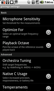
When I manage to accomplish a task in a downloaded app, I rarely fiddle with the settings and just assume that the defaults are okay. Sometimes this gets me in trouble. A great example is the gStrings tuner app, which I use to tune my guitar. The app is wonderful, and I’m happy to have downloaded the premium version to help support the developer. The guy obviously knows his stuff – the settings are full of fancy options like “Playback Octave,” “Use Orchestra Tuning,” and “Use Harmonic Product Spectrum.” Of course, I’m not going to change any of these, because they might as well be in Hebrew, but at least they inspire confidence that the developer is a real pro.
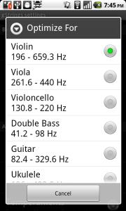
However, buried within those options is one called “Optimize For,” with the very scary-sounding description of “select an optimal target frequency range.” After you click on it, it gives you a choice between violin, viola, cello, double bass, guitar, and ukulele, with violin as the default. When I discovered this, I was surprised. I figured that, if anything, the guitar would be the default – everybody and their dog plays the guitar, but almost nobody plays the violin. Also, who in their right mind would actually click on this option in the first place? The only reason I discovered it myself is that I was evaluating my purchase of gStrings, and I wanted to see the differences between the premium and the free version.
Unfortunately for users of gStrings, this is exactly like my Black/White situation. Everyone is going to assume that the default setting is guitar – if they even imagine that such a setting exists. And nobody is going to cuddle up and read the settings menu, slogging through wordy descriptions like “shift target frequencies e.g. by redefining A: 440Hz -> 443Hz,” to figure out if they should change it. I’m sure if the developer of gStrings did a random survey of 10 users, he or she would discover that 7 of them play the guitar, but 6 of them have their app set on violin. The other 3 users play the ukelele, the cello, and the violin, but none of them managed to find the “Optimize For” setting at all. So only two lucky users get to actually have the setting that’s right for their instrument.
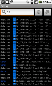
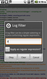
Now that I’ve read Joel Spolsky’s book, I’m starting to see dumb programmer mistakes in every app I use. Descriptions that are too long and complicated. Unhelpful popups that interrupt the workflow. Optimizing for edge-case usages (like searching by regular expressions), while ignoring common use cases (like just punching in a single letter and searching by the first character).
I’m starting to see it in my own apps as well, which is especially frustrating, because I had no idea I was making such elementary mistakes. The most egregious of these is probably App Tracker, which is so bad it deserves a post of its own.
Well, from now on at least, I’m going to work to make simpler, easier-to-use UIs for my apps. Hopefully it will result in a better experience for my users, because they are are all idiots. Just like me.

