People do lots of stuff with that “4 hours ago.” They might make it a permalink:
Post published <a href="/posts/123456">4 hours ago</a>
Or they might give it a tooltip to show the exact datetime upon hover/focus:
Post published
<Tooltip content="December 14, 2025 at 11:30 AM PST">
  4 hours ago
</Tooltip>
Note: I’m assuming some Tooltip component written in your favorite framework, e.g. React, Svelte, Vue, etc. There’s also the bleeding-edge popover="hint" and Interest Invokers API, which would give us a succinct way to do this in native HTML/CSS.
If you’re a pedant about HTML though (like me), then you might use the <time> element:
Post published
<time datetime="2025-12-14T19:30:00.000Z">
  4 hours ago
</time>
This is great! We now have a semantic way to express the exact timestamp of a date. So browsers and screen readers should use this and give us a way to avoid those annoying manual tooltips and… oh wait, no. The <time> element does approximately nothing.
I did some research on this and couldn’t find any browser or assistive technology that actually makes use of the <time> element, besides, you know, rendering it. (Whew!) This is despite the fact that <time> is used on roughly 8% of pageloads per Chrome’s usage tracker.
So what does <time> actually do? As near as I can tell, it’s used by search engines to show date snippets in search results. However, I can’t find any guidelines from Google that specifically advocate for the <time> element, although there is a 2023 post from Search Engine Journal which quotes a Google Search liaison:
Google doesn’t depend on a single date factor because all factors can be prone to issues. That’s why our systems look at several factors to determine our best estimate of when a page was published or significantly updated.
In fact, the only Google documentation I found doesn’t mention <time> at all, and instead recommends using Schema.org’s datePublished and dateModified fields. (I.e., not even HTML.)
So there it is. <time> is a neat idea in theory, but in practice it feels like an unfulfilled promise of semantic HTML. A 2010 CSS Tricks article has a great quote about this from Bruce Lawson (no relation):
The uses of unambiguous dates in web pages aren’t hard to imagine. A browser could offer to add events to a user’s calendar. A Thai-localised browser could offer to transform Gregorian dates into Thai Buddhist era dates. A Japanese browser could localise to “16:00時”.
This would be amazing, and I’d love to see browsers and screen readers make use of <time> like this. But for now, it’s just kind of an inert relic of the early HTML5 days. I’ll still use it, though, because (as Marge Simpson would say), I just think it’s neat.
All web developers know, at some level, that accessibility is important. But when push comes to shove, it can be hard to prioritize it above a bazillion other concerns when you’re trying to center a <div> and you’re on a tight deadline.
A lot of accessibility advocates lead with the moral argument: for example, that disabled people should have just as much access to the internet as any other person, and that it’s a blight on our whole industry that we continually fail to make it happen.
I personally find these arguments persuasive. But experience has also taught me that “eat your vegetables” is one of the least effective arguments in the world. Scolding people might get them to agree with you in public, or even in principle, but it’s unlikely to change their behavior once no one’s watching.
So in this post, I would like to list some of my personal, completely selfish reasons for building accessible UIs. No finger-wagging here: just good old hardheaded self-interest!
Debuggability
When I’m trying to debug a web app, it’s hard to orient myself in the DevTools if the entire UI is “div soup”:
Ah, that’s much better! Now I can easily zero in on a table cell, or a column header, because they’re all named. I’m not wading through a sea of <div>s anymore.
Even just adding ARIA roles to the <div>s would be an improvement here:
Especially if you’re using a CSS-in-JS framework (which I’ve simulated with robo-classes above), the HTML can get quite messy. Building accessibly makes it a lot easier to understand at a distance what each element is supposed to do.
Naming things
As all programmers know, naming things is hard. UIs are no exception: is this an “autocomplete”? Or a “dropdown”? Or a “picker”?
If you read the WAI ARIA guidelines, though, then it’s clear what it is: a “combobox”!
No need to grope for the right name: if you add the proper roles, then everything is already named for you:
combobox
listbox
options
As a bonus, you can use aria-* attributes or roles as a CSS selector. I often see awkward code like this:
The active class is clearly redundant here. If you want to style based on the .active selector, you could just as easily style with [aria-selected="true"] instead.
Also, why call it isActive when the ARIA attribute is aria-selected? Just call it “selected” everywhere:
I also find that thinking in terms of roles and ARIA attributes sharpens my thinking, and gives structure to the interface I’m trying to create. Suddenly, I have a language for what I’m building, which can lead to more “obvious” variable names, CSS custom properties, grid area names, etc.
Testability
I’ve written about this before, but building accessibly also helps with writing tests. Rather than trying to select an element based on arbitrary classes or attributes, you can write more elegant code like this (e.g. with Playwright):
Imagine, though, if your entire UI is full of <div>s and robo-classes. How would you find the right inputs and buttons? You could select based on the robo-classes, or by searching for text inside or nearby the elements, but this makes your tests brittle.
As Kent C. Dodds has argued, writing UI tests based on semantics makes your tests more resilient to change. That’s because a UI’s semantic structure (i.e. the accessibility tree) tends to change less frequently than its classes, attributes, or even the composition of its HTML elements. (How many times have you added a wrapper <div> only to break your UI tests?)
Power users
When I’m on a desktop, I tend to be a keyboard power user. I like pressing Esc to close dialogs, Enter to submit a form, or even / in Firefox to quickly jump to links on the page. I do use a mouse, but I just prefer the keyboard since it’s faster.
So I find it jarring when a website breaks keyboard accessibility – Esc doesn’t dismiss a dialog, Enter doesn’t submit a form, ↑/↓ don’t change radio buttons. It disrupts my flow when I unexpectedly have to reach for my mouse. (Plus it’s a Van Halen brown M&M that signals to me that the website probably messed something else up, too!)
If you’re building a productivity tool with its own set of keyboard shortcuts (think Slack or GMail), then it’s even more important to get this right. You can’t add a lot of sophisticated keyboard controls if the basic Tab and focus logic doesn’t work correctly.
A lot of programmers are themselves power users, so I find this argument pretty persuasive. Build a UI that you yourself would like to use!
Conclusion
The reason that I, personally, care about accessibility is probably different from most people’s. I have a family member who is blind, and I’ve known many blind or low-vision people in my career. I’ve heard firsthand how frustrating it can be to use interfaces that aren’t built accessibly.
Honestly, if I were disabled, I would probably think to myself, “computer programmers must not care about me.” And judging from the miserable WebAIM results, I’d clearly be right:
Across the one million home pages, 50,960,288 distinct accessibility errors were detected—an average of 51 errors per page.
As a web developer who has dabbled in accessibility, though, I find this situation tragic. It’s not really that hard to build accessible interfaces. And I’m not talking about “ideal” or “optimized” – the bar is pretty low, so I’m just talking about something that works at all for people with a disability.
Maybe in the future, accessible interfaces won’t require so much manual intervention from developers. Maybe AI tooling (on either the production or consumption side) will make UIs that are usable out-of-the-box for people with disabilities. I’m actually sympathetic to the Jakob Nielsen argument that “accessibility has failed” – it’s hard to look at the WebAIM results and come to any other conclusion. Maybe the “eat your vegetables” era of accessibility has failed, and it’s time to try new tactics.
That’s why I wrote this post, though. You can build accessibly without having a bleeding heart. And for the time being, unless generative AI swoops in like a deus ex machina to save us, it’s our responsibility as interface designers to do so.
At the same time we’re helping others, though, we can also help ourselves. Like a good hot sauce on your Brussels sprouts, eating your vegetables doesn’t always have to be a chore.
Shadow DOM is a kind of retcon for the web. As I’ve written in the past, shadow DOM upends a lot of developer expectations and invalidates many tried-and-true techniques that worked fine in the pre-shadow DOM world. One potentially surprising example is ARIA.
Quick recap: shadow DOM allows you to isolate parts of your DOM into encapsulated chunks – typically one per component. Meanwhile, ARIA is an accessibility primitive, which defines attributes like aria-labelledby and aria-describeddby that can reference other elements by their IDs.
Do you see the problem yet? If not, I don’t blame you ‒ this is a tricky intersection of various web technologies. Unfortunately though, if you want to use shadow DOM without breaking accessibility, then this is one of the things you will have to grapple with. So let’s dive in.
Sketch of the problem
In shadow DOM, element IDs are scoped to their shadow root. For instance, here are two components:
In this case, the two elements have the same ID of "foo". And yet, this is perfectly valid in the world of shadow DOM. If I do:
document.getElementById('foo')
…it will actually return null, because these IDs are not globally scoped – they are locally scoped to the shadow root of each component:
document.querySelector('custom-label')
  .shadowRoot.getElementById('foo') // returns the <label>

document.querySelector('custom-input')
  .shadowRoot.getElementById('foo') // returns the <input>
So far, so good. But now, what if I want to use aria-labelledby to connect the two elements? I could try this:
<!-- NOTE: THIS DOES NOT WORK -->
<custom-input>
  #shadow-root
    <input type="text" aria-labelledby="foo">
</custom-input>
Why does this fail? Well, because the "foo" ID is locally scoped. This means that the <input> cannot reach outside its shadow DOM to reference the <label> from the other component. (Feel free to try this example in any browser or screen reader – it will not work!)
So how can we solve this problem?
Solution 1: janky workarounds
The first thing you might reach for is a janky workaround. For instance, you could simply copy the text content from the <label> and slam it into the <input>, replacing aria-labelledby with aria-label:
You need to set up a MutationObserver or similar technique to observe whenever the <label> changes.
You need to accurately calculate the accessible name of the <label>, and many off-the-shelf JavaScript libraries donot themselves support shadow DOM. So you have to hope that the contents of the <label> are simple enough for the calculation to work.
This works for aria-labelledby because of the corresponding aria-label, but it doesn’t work for other attributes like aria-controls, aria-activedescendant, or aria-describedby. (Yes there is aria-description, but it doesn’t have full browser support.)
Another workaround is to avoid using the <input> directly, and to instead expose semantics on the custom element itself. For instance:
(ElementInternals, once it’s supported in all browsers, could also help here.)
At this point, though, you’re basically building everything from scratch out of <div>s, including styles, keyboard events, and ARIA states. (Imagine doing this for a radio button, with all of its various keyboard interactions.) And plus, it wouldn’t work with any kind of nesting – forget about having any wrapper components with their own shadow roots.
I’ve also experimented with even jankier workarounds that involve copying entire DOM trees around between shadow roots. It kinda works, but it introduces a lot of footguns, and we’re already well on our way to wild contortions just to replace a simple aria-labelledby attribute. So let’s explore some better techniques.
Solution 2: ARIA reflection
As it turns out, some smart folks at browser vendors and standards bodies have been hard at work on this problem for a while. A lot of this effort is captured in the Accessibility Object Model (AOM) specification.
And thanks to AOM, we have a (partial) solution by way of IDREF attribute reflection. If that sounds like gibberish, let me explain what it means.
In ARIA, there are a bunch of attributes that refer to other elements by their IDs (i.e. “IDREFs”). These are:
aria-activedescendant
aria-controls
aria-describedby
aria-details
aria-errormessage
aria-flowto
aria-labelledby
aria-owns
Historically, you could only use these as HTML attributes. But that carries with it the problem of shadow DOM and ID scoping.
So to solve that, we now have the concept of the ARIA mixin, which basically states that for every aria-* attribute, there is a corresponding aria* property on DOM elements, available via JavaScript. In the case of the IDREF attributes above, these would be:
ariaActiveDescendantElement
ariaControlsElements
ariaDescribedByElements
ariaDetailsElements
ariaErrorMessageElement
ariaFlowToElements
ariaLabelledByElements
ariaOwnsElements
This means that instead of:
input.setAttribute('aria-labelledby', 'foo')
… you can now do:
input.ariaLabelledByElements = [label]
… where label is the actual <label> element. Note that we don’t have to deal with the ID ("foo") at all, so there is no more issue with IDs being scoped to shadow roots. (Also note it accepts an array, because you can actually have multiple labels.)
Now, this spec is very new (the change was only merged in June 2022), so for now, these properties are not supported in all browsers. The patches have just started to land in WebKit and Chromium. (Work has not yet begun in Firefox.) As of today, these can only be used in WebKit Nightly and Chrome Canary (with the “experimental web platform features” flag turned on). So if you’re hoping to ship it into production tomorrow: sorry, it’s not ready yet.
2024 update: implementations have progressed a bit. Chromium has declared an intent to ship and Firefox an intent to prototype. Safari is still the only major browser to ship this API without a flag.
The even more unfortunate news, though, is that this spec does not fully solve the issue. As it turns out, you cannot just link any two elements you want – you can only link elements where the containing shadow roots are in an ancestor-descendant relationship (and the relationship can only go in one direction). In other words:
element1.ariaLabelledByElements = [element2]
In the above example, if one of the following is not true, then the linkage will not work and the browser will treat it as a no-op:
element2 is in the same shadow root as element1
element2 is in a parent, grandparent, or ancestor shadow root of element1
This restriction may seem confusing, but the intention is to avoid accidental leakage, especially in the case of closed shadow DOM. ariaLabelledByElements is a setter, but it’s also a getter, and that means that anyone with access to element1 can get access to element2. Now normally, you can freely traverse up the tree in shadow DOM, even if you can’t traverse down – which means that, even with closed shadow roots, an element can always access anything in its ancestor hierarchy. So the goal of this restriction is to prevent you from leaking anything that wasn’t already leaked.
Update: after this post was written, it was decided that ARIA element references could cross any shadow boundary within the same document, but only for ElementInternals, since that avoids leakage. This may be useful in narrow use cases (e.g. default ARIA semantics on a custom element host), but it doesn’t fully resolve the problem.
Another problem with this spec is that it doesn’t work with declarative shadow DOM, i.e. server-side rendering (SSR). So your elements will remain inaccessible until you can use JavaScript to wire them up. (Which, for many people, is a dealbreaker.)
Solution 3: cross-root ARIA
May 2025 update: the proposal described below has been superseded by Reference Target for Cross-Root ARIA, which is in an origin trial in Chromium as of this writing.
The above solutions are what work today, at least in terms of the latest HTML spec and bleeding-edge versions of browsers. Since the problem is not fully solved, though, there is still active work being done in this space. The most promising spec right now is cross-root ARIA (originally authored by my colleague Leo Balter), which defines a fully-flexible and SSR-compatible API for linking any two elements you want, regardless of their shadow relationships.
The spec is rapidly changing, but here is a sketch of how the proposal looks today:
The spec works with Declarative Shadow DOM (hence I’ve used that format to illustrate).
There are no restrictions on the relationship between elements.
ARIA attributes can be exported (or “delegated”) out of shadow roots, as well as imported (or “reflected”) into shadow roots.
This gives web authors full flexibility to wire up elements however they like, regardless of shadow boundaries, and without requiring JavaScript. (Hooray!)
This spec is still in its early days, and doesn’t have any browser implementations yet. However, for those of us using web components and shadow DOM, it’s vitally important. Westbrook Johnson put it succinctly in this year’s Web Components Community Group meeting at TPAC:
Given all the problems I’ve outlined above, it’s hard for me to quibble with this statement.
What works today?
With the specs still landing in browsers or still being drafted, the situation can seem dire. It’s hard for me to give a simple “just use this API” recommendation.
So what is a web developer with a deadline to do? Well, for now, you have a few options:
Don’t use shadow DOM. (Many developers have come to this conclusion!)
Use elaborate workarounds, as described above.
If you’re building something sophisticated that relies on several aria-* attributes, such as a combobox, then try to selectively use light DOM in cases where you can’t reach across shadow boundaries. (I.e. put the whole combobox in a single shadow root – don’t break it up into multiple shadow roots.)
Use an ARIA live region instead of IDREFs. (This is the same technique used by canvas-based applications, such as Google Docs.) This option is pretty heavy-handed, but I suppose you could use it as a last resort.
Unfortunately there’s no one-size-fits-all solution. Depending on how you’ve architected your web components, one or multiple of the above options may work for you.
Conclusion
I’m hoping this situation will eventually improve. Despite all its flaws, I actually kind of like shadow DOM (although maybe it’s a kind of Stockholm syndrome), and I would like to be able to use it without worrying about accessibility.
For that reason, I’ve been somewhat involved recently with the AOM working group. It helps that my employer (Salesforce) has been working with Igalia to spec and implement this stuff as well. (It also helps that Manuel Rego Casasnovas is a beast who is capable of whipping up specs as well as patches to both WebKit and Chromium with what seems like relative ease.)
If you’re interested in this space, and would like to see it improve, I would recommend taking a look at the cross-root ARIA spec on GitHub and providing feedback. Or, make your voice heard in the Interop 2022 effort – where web components actually took the top spot in terms of web developer desire for more consistency across browsers.
The web is always improving, but it improves faster if web developers communicate their challenges, frustrations, and workarounds back to browser vendors and spec authors. That’s one of my goals with this blog post. So even if it didn’t solve every issue you have with shadow DOM and accessibility (other than maybe to scare you away from shadow DOM forever!), I hope that this post was helpful and informative.
This post is going to get pretty technical, especially when it comes to the nitty-gritty details of accessibility and web standards. If you’re into that, then buckle up! The ride may be a bit bumpy.
Quick recap
Shadow DOM is weird. On paper, it doesn’t actually change what you can do in the DOM – with open mode, at least, you can access any element on the page that you want. In practice, though, shadow DOM upends a lot of web developer expectations about how the DOM works, and makes things much harder.
I credit Brian Kardell for this description of open shadow DOM, which is maybe the most perfect distillation of how it actually works.
Note: Shadow DOM has two modes: open and closed. Closed mode is a lot more restrictive, but it’s less common – the majority of web component frameworks use open by default (e.g. Angular, Fast, Lit, LWC, Remount, Stencil, Svelte, Vue). Somewhat surprisingly, though, open mode is only 3 times as popular as closed mode, according to Chrome Platform Status (9.9% vs 3.5%).
For accessibility reasons, modal dialogs need to implement a focus trap. However, the DOM doesn’t have an API for “give me all the elements on the page that the user can Tab through.” So web developers came up with creativesolutions, most of which amount to:
Unfortunately this is the exact thing that doesn’t work in the shadow DOM. querySelectorAll only grabs elements in the current document or shadow root; it doesn’t deeply traverse.
Like a lot of things with shadow DOM, there is a workaround, but it requires some gymnastics. These gymnastics are hard, and have a complexity and (probably) performance cost. So a lot of off-the-shelf modal dialogs don’t handle shadow DOM properly (e.g. a11y-dialog does not).
Note: My goal here isn’t to criticize a11y-dialog. I think it’s one of the best dialog implementations out there. So if even a11y-dialog doesn’t support shadow DOM, you can imagine a lot of other dialog implementations probably don’t, either.
Update: After this post was published, a11y-dialogadded support for open shadow DOM!
A constructive dialog
“But what about <dialog>?”, you might ask. “The dang thing is called <dialog>; can’t we just use that?”
If you had asked me a few years ago, I would have pointed you to Scott O’Hara’s extensive blog post on the subject, and said that <dialog> had too many accessibility gotchas to be a practical solution.
If you asked me today, I would again point you to the same blog post. But this time, there is a very helpful 2022 update, where Scott basically says that <dialog> has come a long way, so maybe it’s time to give it a second chance. (For instance, the issue with returning focus to the previously-focused element is now fixed, and the need for a polyfill is much reduced.)
To be clear: <dialog> still doesn’t give you 100% of what you’d need to implement a dialog (e.g. you’d need to lock the background scroll), and there are still some lingering discussions about how to handle initial focus. For that reason, Scott still recommends just using a battle-tested library like a11y-dialog.
As always, though, shadow DOM makes things more complicated. And in this case, <dialog> actually has some compelling superpowers:
It automatically limits focus to the dialog, with correct Tab order, even in shadow DOM.
It works with closed shadow roots as well, which is impossible in userland solutions.
It also works with user-agent shadow roots. (E.g. you can Tab through the buttons in a <video controls> or <audio controls>.) This is also impossible in userland, since these elements function effectively like closed shadow roots.
It correctly returns focus to the previously-focused element, even if that element is in a closed shadow root. (This is possible in userland, but you’d need an API contract with the closed-shadow component.)
The Esc key correctly closes the modal, even if the focus is in a user-agent shadow root (e.g. the pause button is focused when you press Esc). This is also not possible in userland.
Note: Eagle-eyed readers may wonder: what if the first tabbable element in the dialog is in a shadow root? Does it correctly get focus? The short answer is: yes in Chrome, no in Firefox or Safari (demo). Let’s hope those browsers fix it soon.
You reach the last tabbable element in the dialog and press Tab.
Correct: focus moves to the first tabbable element in the dialog.
Incorrect (<dialog>): focus goes to the URL bar or somewhere else in the browser chrome.
You reach the first tabbable element in the dialog and press Shift+Tab.
Correct: focus moves to the last tabbable element in the dialog.
Incorrect (<dialog>): focus goes to the URL bar or somewhere else in the browser chrome.
This may seem like a really subtle difference, but the consensus of accessibility experts seems to be that the WAI ARIA APG is correct, and <dialog> is wrong.
Note: I say “consensus,” but… there isn’t perfect consensus. You can read this comment from James Teh or Scott O’Hara’s aforementioned post (“This is good behavior, not a bug”) for dissenting opinions. In any case, the “leaky” focus trap conflicts with the WAI ARIA APG and the way userland dialogs have traditionally worked.
So we’ve reached (yet another!) tough decision with <dialog>. Do we accept <dialog>, because at least it gets shadow DOM right, even though it gets some other stuff wrong? Do we try to build our own thing? Do we quit web development entirely and go live the bucolic life of a potato farmer?
Inert matter
While I was puzzling over this recently, it occurred to me that inert may be a step forward to solving this problem. For those unfamiliar, inert is an attribute that can be used to mark sections of the DOM as “inert,” i.e. untabbable and invisible to screen readers:
As it turns out, this works perfectly for tabbing through elements in the shadow DOM, just like <dialog>! Unfortunately, it has exactly the same problem with focus escaping to the browser chrome. This is no accident: the behavior of <dialog> is defined in terms of inert.
Can we still solve this, though? Unfortunately, I’m not sure it’s possible. I tried a few different techniques, such as listening for Tab events and checking if the activeElement has moved outside of the modal, but the problem is that you still, at some point, need to figure out what the “first” and “last” tabbable elements in the dialog are. To do this, you need to traverse the DOM, which means (at the very least) traversing open shadow roots, which doesn’t work for closed or user-agent shadow roots. And furthermore, it involves a lot of extra work for the web developer, who has probably lost focus at this point and is daydreaming about that nice, quiet potato farm.
Note:inert also, sadly, does not help with the Esc key in user-agent shadow roots, or returning focus to closed shadow roots when the dialog is closed, or setting initial focus on an element in a closed shadow root. These are <dialog>-only superpowers. Not that you needed any extra convincing.
Conclusion
Until the spec and browser issues have been ironed out (e.g. browsers change their behavior so that focus doesn’t escape to the browser chrome, or they give us some entirely different “focus trap” primitive), I can see two reasonable options:
Use something like a11y-dialog, and don’t use shadow DOM or user-agent shadow components like <video controls> or <audio controls>. (Or do some nasty hacks to make it partially work.)
Use shadow DOM, but don’t bother solving the “focus escapes to the browser chrome” problem. Use <dialog> (or a library built on top of it) and leave it at that.
For my readers who were hoping that I’d drop some triumphant “just npm install nolans-cool-dialog and it will work,” I’m sorry to disappoint you. Browsers are still rough around the edges in this area, and there aren’t a lot of great options. Maybe there is some mad-science way to actually solve this, but even that would likely involve a lot of complexity, so it wouldn’t be ideal.
Alternatively, maybe some of you are thinking that I’m focusing too much on closed and user-agent shadow roots. As long as you’re only using open shadow DOM (which, recall, is like the sign that says “I’m a sign, not a cop”), you can do whatever you want. So there’s no problem, right?
Personally, though, I like using <video controls> and <audio controls> (why ship a bunch of JavaScript to do something the browser already does?). And furthermore, I find it odd that if you put a <video controls> inside a <dialog>, you end up with something that’s impossible to make accessible per the WAI ARIA APG. (Is it too much to ask for a little internal consistency in the web platform?)
In any case, I hope this blog post was helpful for others tinkering around with the same problems. I’ll keep an eye on the browsers and standards space, and update this post if anything promising emerges.
One of the trickiest things about the shadow DOM is that it subverts web developers’ expectations about how the DOM works. In the normal rules of the game, document.querySelectorAll('*') grabs all the elements in the DOM. With the shadow DOM, though, it doesn’t work that way: shadow elements are encapsulated.
Other classic DOM APIs, such as element.children and element.parentElement, are similarly unable to traverse shadow boundaries. Instead, you have to use more esoteric APIs like element.shadowRoot and getRootNode(), which didn’t exist before shadow DOM came onto the scene.
In practice, this means that a lot of JavaScript libraries designed for the pre-shadow DOM era might not work well if you’re using web components. This comes up more often than you might think.
Now, without doing anything, elements inside of the shadow DOM are already focusable or tabbable just like any other element on the page. For instance, with my own emoji-picker-element, you can tab through its <input>, <button>s, etc.:
When implementing a focus trap or arrow key navigation, we want to preserve this existing behavior. So the first challenge is to emulate whatever the browser normally does when you press Tab or Shift+Tab. In this case, shadow DOM makes things a bit more complicated because you can’t just use a straightforward querySelectorAll() (or other pre-shadow DOM iteration techniques) to find all the tabbable elements.
Pedantic note: an element can be focusable but not tabbable. For instance, when using tabindex="-1", an element can be focused when clicking, but not when tabbing through the page.
While researching this, I found that a lot of off-the-shelf JavaScript libraries for focus management don’t handle the shadow DOM properly. For example, focusable provides a query selector string that you’re intended to use like so:
import focusable from 'focusable'

document.querySelectorAll(focusable)
Unfortunately, this can’t reach inside the shadow DOM, so it won’t work for something like emoji-picker-element. Bummer.
To be fair to focusable, though, many other libraries in the same category (focus traps, “get all tabbable elements,” accessible dialogs, etc.) have the same problem. So in this post, I’d like to explain what these libraries would need to do to support shadow DOM.
The solution
I’ve written a couple of JavaScript packages that deal with shadow DOM: kagekiri, which implements querySelectorAll() in a way that can traverse shadow boundaries, and arrow-key-navigation, which makes the left and right keys change focus.
To understand how these libraries work, let’s first understand the problem we’re trying to solve. In a non-shadow DOM context, what does this do?
document.querySelectorAll('*')
If you answered “grab all the elements in the DOM,” you’re absolutely right. But more importantly: what order are the elements returned in? It turns out that they’re returned in a depth-first tree traversal order, which is crucial because this is the same order as when the user presses Tab or Shift+Tab to change focus. (Let’s ignore positive tabindex values for the moment, which are an anti-pattern anyway.)
In the case of shadow DOM, we want to maintain this depth-first order, while also piercing into the shadow DOM for any shadow roots we encounter. Essentially, we want to pretend that the shadow DOM doesn’t exist.
There are a few ways you can do this. In kagekiri, I implemented a depth-first search myself, whereas in arrow-key-navigation, I used a TreeWalker, which is a somewhat obscure API that traverses elements in depth-first order. Either way, the main insight is that you need a way to enumerate a node’s “shadow children” as well as its actual children (which can be mixed together in the case of slotted elements). You also need to be able to run the reverse logic: finding the “light” parent of a shadow tree. And of course, this has to be recursive, since shadow roots can be nested within other shadow roots.
Rather than bore you with the details, suffice it to say that you need roughly a dozen lines of code, both for enumerating an element’s children and finding an element’s parent. In the non-shadow DOM world, these would be equivalent to a simple element.children and element.parentElement respectively.
Why the browser should handle this
Here’s the thing: I don’t particularly want to explain every line of code required for this exercise. I just want to impress upon you that this is a lot of heavy lifting for something that should probably be exposed as a web API. It feels silly that the browser knows perfectly well which element it would focus if I typed Tab or Shift+Tab, but as a web developer I have to reverse-engineer this behavior.
You might say that I’m missing the whole point of shadow DOM: after all, encapsulation is one of its major selling points. But I’d counter that a lot of folks are using shadow DOM because it’s the only way to get native CSS encapsulation (similar to “scoped” CSS in frameworks like Vue and Svelte), not necessarily DOM API encapsulation. So the fact that it breaks querySelectorAll() is a downside rather than an upside.
Perhaps, like getRootNode(), these APIs could also offer an option for whether or not you want to pierce the shadow boundary. In any case, an API like this would obviate the need for the hacks described in this post.
I’d argue that browsers should provide such an API not only because of shadow DOM, but also because of built-in elements like <video> and <audio>. These behave like closed-shadow roots, in that they contain tabbable elements (i.e. the pause/play/track controls), but you can’t reach inside to manipulate them.
WebKit’s developer tools helpfully shows the video controls as “shadow content (user agent).” You can look, but you can’t touch!
As far as I know, there’s no way to implement a WAI-ARIA compliant modal dialog with a standard <video controls> or <audio controls> inside. Instead, you would have to build your own audio/video player from scratch.
Brief aside: dialog element
There is the native <dialog> element now implemented in Chrome, and it does come with a built-in focus trap if you use showModal(). And this focus trap actually handles shadow DOM correctly, including closed shadow roots like <video controls>!
Unfortunately, though, it doesn’t quite follow the WAI-ARIA guidelines. The problems are that 1) closing the dialog doesn’t return focus to the previously focused element in the document, and 2) the focus trap doesn’t “cycle” through tabbable elements in the modal – instead, focus escapes to the browser chrome itself.
The first issue is irksome but not impossible to solve: you just have to listen for dialog open/close events and keep track of document.activeElement. It’s even possible to patch the correct behavior onto the native <dialog> element. (Shadow DOM, of course, makes this more complicated because activeElement can be nested inside shadow roots. I.e., you have to keep drilling into document.activeElement.shadowRoot.activeElement, etc.).
As for the second issue, it might not be considered a dealbreaker – at least the focus is trapped, even if it’s not completely compliant with WAI-ARIA. But it’s still disappointing that we can’t just use the <dialog> element as-is and get a fully accessible modal dialog, per the standard definition of “accessible.”
Update: After publishing this post, Chris Coyier clued me in to the inert attribute. Although it’s not shipped in any browser yet, I did write a demo of building a modal dialog with this API. After testing in Chrome and Firefox with the right flags enabled, though, it looks like the behavior is similar to <dialog> – focus is correctly trapped, but escapes to the browser chrome itself.
Second update: After an informal poll of users of assistive technologies, the consensus seems to be that having focus escape to the browser chrome is not ideal, but not a show-stopper as long as you can Shift+Tab to get back into the dialog. So it looks like when inert or <dialog> are more widely available in browsers, that will be the only way to deal with <video controls> and <audio controls> in a focus trap.
Last update (I promise!): Native <dialog> also seems to be the only way to have the Esc key dismiss the modal while focus is inside the <video>/<audio> controls.
Conclusion
Handling focus inside of the shadow DOM is not easy. Managing focus in the DOM has never been particularly easy (see the source code for any accessible dialog component for an example), and shadow DOM just makes things that much trickier by complicating a basic routine like DOM traversal.
Normally, DOM traversal is the kind of straightforward exercise you’d expect to see in a web dev job interview. But once you throw shadow DOM into the mix, I’d expect most working web developers to be unable to come up with the correct algorithm off the tops of their heads. (I know I can’t, and I’ve written it twice.)
As I’ve said in a previous post, though, I think it’s still early days for web components and shadow DOM. Blog posts like this are my attempt to sketch out the current set of problems and working solutions, and to try to point toward better solutions. Hopefully the ecosystem and browser APIs will eventually adapt to support shadow DOM and focus management more broadly.
More discussion about native <dialog> and Tab behavior can be found in this issue.
In my previous blog post, I introduced emoji-picker-element, a custom element that acts as an emoji picker. In the post, I said that accessibility “shouldn’t be an afterthought,” and made it clear that I took accessibility seriously.
But I didn’t explain how I actually made the component accessible! In this post I’ll try to make up for that oversight.
Reduce motion
If you have motion-based animations in your web app, one of the easiest things you can do to improve accessibility is to disable them with the prefers-reduced-motion CSS media query. (Note that this applies to transform animations but not opacity animations, as it’s my understanding that opacity changes don’t cause nausea for those with vestibular disorders.)
There were two animations in emoji-picker-element that I had to consider: 1) a small “indicator” under the currently-selected tab button, which moves as you click tab buttons, and 2) the skin tone dropdown, which slides down when you click it.
Note that there is also an opacity transition on this element (which plays when search results appear or disappear), so there is a bit of unfortunate repetition here. But the core idea is to remove the transform animation.
For the skin tone dropdown, the fix was a bit more complicated. The reason is that I have a JavaScript transitionend event listener on the element:
If I were to remove the transform animation completely, then this listener would never fire. So I borrowed a technique from the cssremedy project, which looks like this:
Based on my testing in Safari, Firefox, and Chrome, this effectively removes the animation while ensuring that transitionend still fires. (There are other tricks mentioned in that thread, but I found that this solution was sufficient for my use case.)
With these fixes in place, the potentially-nauseating animations are removed for those who prefer things that way. The easiest way to test this is in the Chrome DevTools “Rendering” tab, under “Emulate CSS media feature prefers-reduced-motion”:
Here it is with motion reduced:
As you can see, the elements no longer move around. Instead, they instantly pop in or out of place.
Screen reader and keyboard accessibility
When testing screen reader accessibility, I use four main tools:
NVDA in Firefox on Windows (with SpeechViewer enabled so I can see the text)
VoiceOver in Safari on macOS
Chrome’s Accessibility panel in DevTools (Firefox also has nice accessibility tools! I use them occasionally for a second opinion.)
I like testing in actual screen readers, because they sometimes have bugs or differing behavior (just like browsers!). Testing in both NVDA and VoiceOver gives me more confidence that I didn’t mess anything up.
In the following sections, I’ll go over the basic semantic patterns I used in emoji-picker-element, and how those work for screen reader or keyboard users.
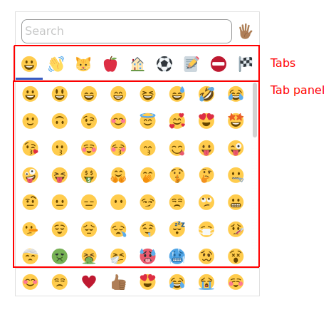
Tab buttons and tab panel
For the main emoji picker UI, I decided to use the tab panel pattern with manual activation. This means that each emoji category (“Smileys and emoticons,” “People and body”) is a tab button (role=tab), and the list of emoji underneath is a tab panel (role=tabpanel).
The only thing I had to do to make this pattern work was to add ← and →keydown listeners to move focus left and right between tabs. (Technically I should also add Home and End – I have that as a todo!)
Aside from that, clearly each tab button should be a <button> (so that Enter and Spacebar fire correctly), and it should have an aria-label for assistive text. I also went ahead and added titles that echo the content of aria-label, but I’m considering replacing those since they aren’t accessible to keyboard users. (I.e. title appears when you hover with a mouse, but not when you focus with the keyboard. Plus it sometimes adds extra spoken text in NVDA, which is less than ideal.)
The button that triggers the dropdown is just a regular <button>, whereas the listbox has role=listbox and its child <button>s have role=option. To implement this, I just used the DevTools to analyze the W3C demo linked above, then tested in both NVDA and VoiceOver to ensure that my implementation had the same behavior as the W3C example.
One pro tip: since the listbox disappears on the blur event, which would happen when you click inside the DevTools itself, you can use the DevTools to remove the blur event and make it easier to inspect the listbox in its “expanded” state.
Removing this blur listener may make debugging a bit easier.
Search input and search results
For the search input, I decided to do something a bit clever (which may or may not burn me later!).
By default, the emoji in the tabpanel are simple <button>s aligned in a CSS Grid. They’re given role=menuitem and placed inside of a role=menu container, modeled after the menu pattern.
However, when you start typing in the search input, the tabpanel emoji are instantly replaced with the search results emoji:
Visually, this is pretty straightforward, and it aligns with the behavior of most other emoji pickers. I also found it to be good for performance, because I can have one single Svelte #each expression, and let Svelte handle the list updates (as opposed to clearing and re-creating the entire list whenever something changes).
If I had done nothing else, this would have been okay for accessibility. The user can type some text, and then change focus to the search results to see what the results are. But that sounded kind of awkward, so I wanted to do one better.
So instead, I implemented the combobox with listbox popup pattern. When you start typing into the input (which is <input type=search> with role=combobox), the menu with menuitems immediately transforms into a listbox with options instead. Then, using aria-activedescendant and aria-controls, I link the listbox with the combobox, allowing the user to press ↑ or ↓ down to cycle through the search results. (I also used an aria-describedby to explain this behavior.)
In the above video, you can see NVDA reading out the expanded/collapsed state of the combobox, as well as the currently-selected emoji as I cycle through the list by pressing ↑ and ↓. (My thanks to Assistiv Labs for providing a free account for OSS testing! This saved me a trip to go boot up my Windows machine.)
So here’s the upshot: from the perspective of a screen reader user, the search input works exactly like a standard combobox with a dropdown! They don’t have to know that the menu/menuitem elements are being replaced at all, or that they’re aligned in a grid.
Now, this isn’t a perfect pattern: for a sighted user, they might find it more intuitive to press ← and → to move horizontally through the grid of emoji (and ↑ and ↓ to move vertically). However, I found it would be tricky to properly handle the ← /→ keys, as the search input itself allows you to move the cursor left and right when it has focus. Whereas the ↑ and ↓ are unambiguous in this situation, so they’re safe to use.
Plus, this is really a progressive enhancement – mouse or touch users don’t have to know that these keyboard shortcuts exist. So I’m happy with this pattern for now.
Testing
To test this project, I decided to use Jest with testing-library. One of my favorite things about testing-library is that it forces you to put accessibility front-and-center. By design, it makes it difficult to use simple CSS selectors, and encourages you to query by ARIA roles instead.
This made it a bit harder to debug, since I had to inspect the implicit accessibility tree of my component rather than the explicit DOM structure. But it helped keep me honest, and ensure that I was adding the proper ARIA roles during development.
If I had one criticism of this approach, I would say that I find it inherently harder to test using Jest and JSDom rather than a real browser. Rather than having access to the browser DevTools, I had to set debugger statements and use node --inspect-brk to walk through the code in the Chrome Node inspector.
It also wasn’t always clear when one of my ARIA role queries wasn’t working properly. Perhaps when the Accessibility Object Model gains wider adoption, it will become as easy to test the accessibility tree as it is to test CSS selectors.
Conclusion
To get accessibility right, it helps to consider it from the get-go. Like performance, it can be easy to paint yourself into a corner if you quickly build a solution based only on the visuals, without testing the semantics as well.
While building emoji-picker-element, I found that I often had to make tweaks to improve performance (e.g. using one big Svelte #each expression) or accessibility (e.g. changing the aria-hidden and tabindex attributes on elements that are visually hidden but not display: none). I also had to think hard about how to merge the menu component with the listbox to allow the search to work properly.
I don’t consider myself an accessibility expert, so I’m happy to hear from others who have ideas for improving accessibility. For instance, I don’t think the favorites bar is easily reachable to screen reader or keyboard users, and I’m still noodling on how I might improve that. Please feel free to open a GitHub issue if you have any ideas for what I can do better!
Over the past year or so, I’ve learned a lot about accessibility, mostly thanks to working on Pinafore, which is a Single Page App (SPA). In this post, I’d like to share some of the highlights of what I’ve learned, in the hope that it can help others who are trying to learn more about accessibility.
One big advantage I’ve had in this area is the help of Marco Zehe, an accessibility expert who works at Mozilla and is blind himself. Marco has patiently coached me on a lot of these topics, and his comments on the Pinafore GitHub repo are a treasure trove of knowledge.
So without further ado, let’s dive in!
Misconceptions
One misconception I’ve observed in the web community is that JavaScript is somehow inherently anti-accessibility. This seems to stem from a time when screen readers did not support JavaScript particularly well, and so indeed the more JavaScript you used, the more likely things were to be inaccessible.
I’ve found, though, that most of the accessibility fixes I’ve made have actually involved writing more JavaScript, not less. So today, this rule is definitely more myth than fact. However, there are a few cases where it holds true:
divs and spans versus buttons and inputs
Here’s the best piece of accessibility advice for newbies: if something is a button, make it a <button>. If something is an input, make it an <input>. Don’t try to reinvent everything from scratch using <div>s and <span>s. This may seem obvious to more seasoned web developers, but for those who are new to accessibility, it’s worth reviewing why this is the case.
First off, for anyone who doubts that this is a thing, there was a large open-source dependency of Pinafore (and of Mastodon) that had several thousand GitHub stars, tens of thousands of weekly downloads on npm, and was composed almost entirely of <div>s and <span>s. In other words: when something should have been a <button>, it was instead a <span> with a click listener. (I’ve since fixed most of these accessibility issues, but this was the state I found it in.)
This is a real problem! People really do try to build entire interfaces out of <div>s and <span>s. Rather than chastise, though, let me analyze the problem and offer a solution.
I believe the reason people are tempted to use <div>s and <span>s is that they have minimal user agent styles, i.e. there is less you have to override in CSS. However, resetting the style on a <button> is actually pretty easy:
99% of the time, I’ve found that this was all I needed to reset a <button> to have essentially the same style as a <div> or a <span>. For more advanced use cases, you can explore this CSS Tricks article.
In any case, the whole reason you want to use a real <button> over a <span> or a <div> is that you essentially get accessibility for free:
For keyboard users who Tab around instead of using a mouse, a <button> automatically gets the right focus in the right order.
When focused, you can press the Space bar on a <button> to press it.
Screen readers announce the <button> as a button.
Etc.
You could build all this yourself in JavaScript, but you’ll probably mess something up, and you’ll also have a bunch of extra code to maintain. So it’s best just to use the native semantic HTML elements.
SPAs must manually handle focus and scroll position
There is another case where the “JavaScript is anti-accessibility” mantra has a kernel of truth: SPA navigation. Within SPAs, it’s common for JavaScript to handle navigation between pages, i.e. by modifying the DOM and History API rather than triggering a full page load. This causes several challenges for accessibility:
You need to manage focus yourself.
You need to manage scroll position yourself.
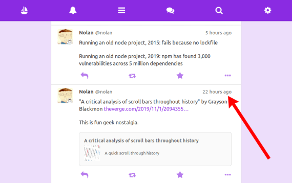
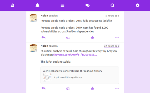
For instance, let’s say I’m in my timeline, and I want to click this timestamp to see the full thread of a post:
When I click the link and then press the back button, focus should return to the element I last clicked (note the purple outline):
For classic server-rendered pages, most browser engines [1] give you this functionality for free. You don’t have to code anything. But in an SPA, since you’re overriding the normal navigation behavior, you have to handle the focus yourself.
This also applies to scrolling, especially in a virtual list. In the above screenshot, note that I’m scrolled down to exactly the point in the page from before I clicked. Again, this is seamless when you’re dealing with server-rendered pages, but for SPAs the responsibility is yours.
Easier integration testing
One thing I was surprised to learn is that, by making my app more accessible, I also made it easier to test. Consider the case of toggle buttons.
A toggle button is a button that can have two states: pressed or not pressed. For instance, in the screenshot below, the “boost” and “favorite” buttons (i.e. the circular arrow and the star) are toggle buttons, because it’s possible to boost or favorite a post, and they start off in unboosted/unfavorited states.
Visually, there are plenty of styles you can use to signal the pressed/unpressed state – for instance, I’ve opted to make the colors darker when pressed. But for the benefit of screen reader users, you’ll typically want to use a pattern like the following:
Incidentally, this makes it easier to write integration tests (e.g. using TestCafe or Cypress). Why rely on classes and styles, which might change if you redesign your app, when you can instead rely on the semantic attributes, which are guaranteed to stay the same?
I observed this pattern again and again: the more I improved accessibility, the easier things were to test. For instance:
When using the feed pattern, I could use aria-posinset and aria-setsize to confirm that the virtual list had the correct number of items and in the correct order.
For buttons without text, I could test the aria-label rather than the background image or something that might change if the design changed.
For hidden elements, I could use aria-hidden to identify them.
Etc.
So make accessibility a part of your testing strategy! If something is easy for screen readers to interpret, then it’ll probably be easier for your automated tests to interpret, too. After all, screen reader users might not be able to see colors, but neither can your headless browser tests!
As pointed out in the talk, it’s not necessarily the case that every mouse-accessible element also needs to be keyboard-accessible. If there are redundant links on the page, then you can skip them in the tabindex order, so a keyboard user won’t have to press Tab so much.
In the case of Pinafore, consider a post. There are two links that lead to the user’s profile page – the profile picture and the user name:
These two links lead to exactly the same page; they are strictly redundant. So I chose to add tabindex="-1" to the profile picture, giving keyboard users one less link to have to Tab through. Especially on a KaiOS device with a tiny d-pad, this is a nice feature!
In the above video, note that the profile picture and timestamp are skipped in the tab order because they are redundant – clicking the profile picture does the same thing as clicking the user name, and clicking the timestamp does the same thing as clicking on the entire post. (Users can also disable the “click the entire post” feature, as it may be problematic for those with motor impairments. In that case, the timestamp is re-added to the tab order.)
Interestingly, an element with tabindex="-1" can still become focused if you click it and then press the back button. But luckily, tabbing out of that element does the right thing as long as the other tabbable elements are in the proper order.
The final boss: accessible autocomplete
After implementing several accessible widgets from scratch, including the feed pattern and an image carousel (which I described in a previous post), I found that the single most complicated widget to implement correctly was autocompletion.
Originally, I had implemented this widget by following this design, which relies largely on creating an element with aria-live="assertive" which explicitly speaks every change in the widget state (e.g. “the current selected item is number 2 of 3”). This is kind of a heavy-handed solution, though, and it led to several bugs.
After toying around with a few patterns, I eventually settled on a more standard design using aria-activedescendant. Roughly, the HTML looks like this:
<textarea
  id="the-textarea"
  aria-describedby="the-description"
  aria-owns="the-list"
  aria-expanded="false"
  aria-autocomplete="both"
  aria-activedescendant="option-1">
</textarea>
<ul id="the-list" role="listbox">
  <li
    id="option-1"
    role="option"
    aria-label="First option (1 of 2)">
  </li>
  <li
    id="option-2"
    role="option"
    aria-label="Second option (2 of 2)">
  </li>
</ul>
<label for="the-textarea" class="sr-only">
  What's on your mind?
</label>
<span id="the-description" class="sr-only">
  When autocomplete results are available, press up or down
  arrows and enter to select.
</span>
Explaining this pattern probably deserves a blog post in and of itself, but in broad strokes, what’s happening is:
aria-expanded indicates whether there are autocomplete results or not.
aria-activedescendant indicates which option in the list is selected.
aria-labels on the options allow me to control how it’s spoken to a screen reader, and to explicitly include text like “1 of 2” in case the screen reader doesn’t speak this information.
After extensive testing, this was more-or-less the best solution I could come up with. It works perfectly in NVDA on the latest version of Firefox, although sadly it has some minor issues in VoiceOver on Safari and NVDA on Chrome. However, since this is the standards-based solution (and doesn’t rely on aria-live="assertive" hacks), my hope is that browsers and screen readers will catch up with this implementation.
Update: I managed to get this widget working in Chrome+NVDA and Safari+VoiceOver. The fixes needed are described in this comment.
Manual and automated accessibility testing
There are a lot of automated tools that can give you good tips on improving accessibility in your web app. Some of the ones I’ve used include Lighthouse (which uses Axe under the hood), the Chrome accessibility tools, and the Firefox accessibility tools. (These tools can give you slightly different results, so I like to use multiple so that I can get second opinions!)
However, I’ve found that, especially for screen reader accessibility, there is no substitute for testing in an actual browser with an actual screen reader. It gives you the exact experience that a screen reader user would have, and it helps build empathy for what kinds of design patterns work well for voice navigation and which ones don’t. Also, sometimes screen readers have bugs or slightly differing behavior, and these are things that accessibility auditing tools can’t tell you.
Personally I find VoiceOver to be the easiest to use from a developer’s point of view, mostly because it has a visual display of the assistive text while it’s being spoken.
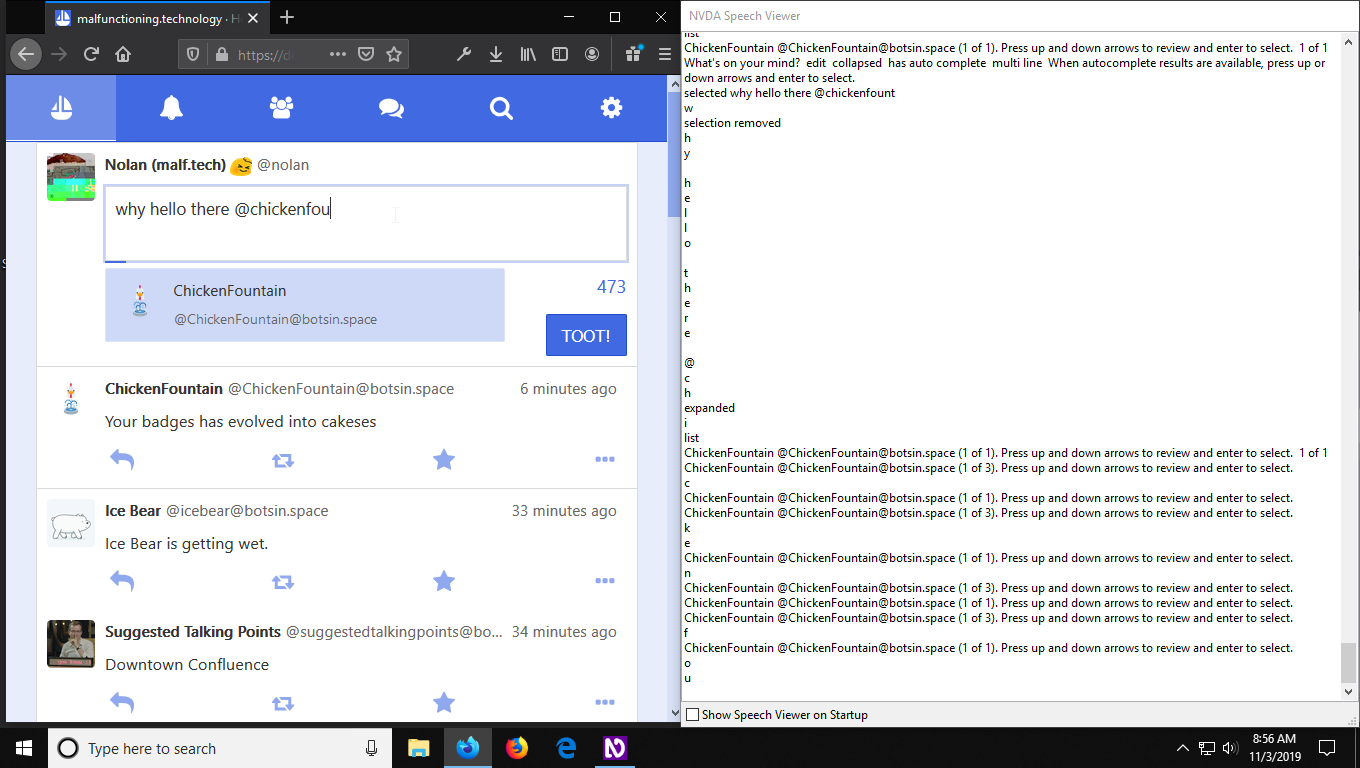
NVDA can also be configured to do this, but you have to know to go into the settings and enable the “Speech Viewer” option. I would definitely recommend turning this on if you’re using NVDA for development!
Similar to testing screen readers, it’s also a good idea to try Tabing around your app to see how comfortable it is with a keyboard. Does the focus change unexpectedly? Do you have to do a lot of unnecessary Tabing to get where you want? Are there any handy keyboard shortcuts you’d like to add?
For a lot of things in accessibility, there are no hard-and-fast rules. Like design or usability in general, sometimes you just have to experience what your users are experiencing and see where you can optimize.
Conclusion
Accessibility can be challenging, but ultimately it’s worth the effort. Working on accessibility has improved the overall usability of my app in a number of ways, leading to unforeseen benefits such as KaiOS arrow key navigation and better integration tests.
The greatest satisfaction, though, comes from users who are happy with the work I’ve done. I was beyond pleased when Marco had this to say:
“Pinafore is for now by far the most accessible way to use Mastodon. I use it on desktop as well as iOS, both iPhone & iPad, too. So thank you again for getting accessibility in right from the start and making sure the new features you add are also accessible.”
– Marco Zehe, October 21 2019
Thank you, Marco, and thanks for all your help! Hopefully this blog post will serve as a way to pay your accessibility advice forward.
Thanks to Sorin Davidoi, Thomas Wilburn, and Marco Zehe for feedback on a draft of this post.
Footnotes
1. In the course of writing this article, I was surprised to learn that, for server-rendered pages, pressing the back button restores focus to the previously-clicked element in Firefox, Safari, and Edge (EdgeHTML), but not Chrome. I found a webcompat.com bug describing the browser difference, I’ve gone ahead and filed a bug on Chrome.


 Read the Tea Leaves